Thanks for the info. It’s something I feel like I should have known.
(I’d “Heart” your, and many other, replies but Hearting only works before I’m logged into the forum. So I’d have to logout and in again to heart a reply. I made a topic on this issue once.)
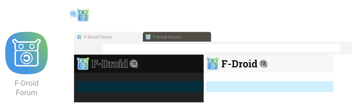
This might be a good time to talk about how people wish to progress with the bespoke forum icon that Hans indicated might be desirable. We can update it at this time.
The below is based on work done collaboratively previously in the forums here. I’ve just improved it by introducing a gradient of analogous colours (and removing the speech bubbles from the app icon that were cluttering it). These kinds of gradients have become a web standard of sorts over the years. Feel free to tell me what you think:
App icon
I’ll update the Merge Request if people like it. Suggestions welcomed as usual.
I don’t really have anything against any specific logo, they are all beautiful, the only thing I find weird is the ones where the copyleft logo doesn’t fully fits within the belly of the android, but maybe it’s just me.
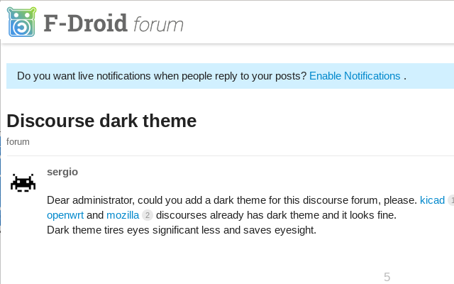
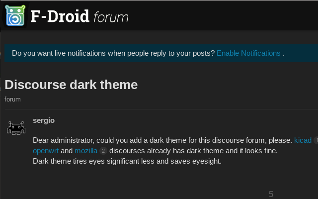
Agreed, and updated (see below). As stated today in the dark theme topic, I only did this for the favicon and was lazy in re-using it. The 16x16 is where it will stay, 24x24 or larger and the (C)left symbol can be normal size.
Thanks + Ah, that’s another holdover from a “design drawing” motif that is supposed to imply an engraving, Yes the problem with that was couldn’t follow through with this and do the same for the ‘C’ and so there’s an inconsistency there (fixed).
 App icon