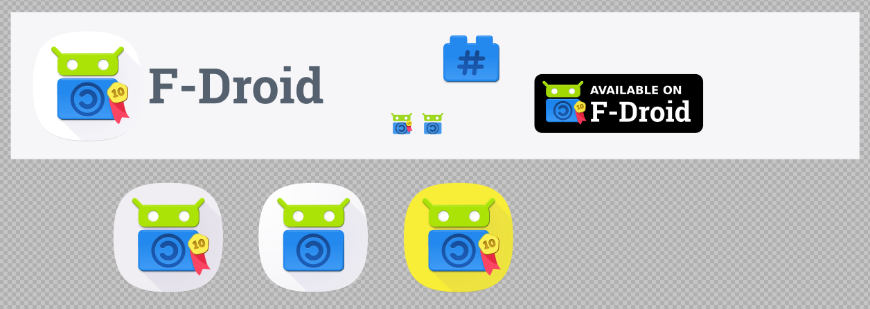
Thanks Hans. I took leaves out of Font Awesome icon design principles for form. For colour I realised I could introduce small quantities of yellow and red to enliven the design for the year ahead.
Yes, the shiny look is designed to evoke cleanliness and newness to the new users that I feel F-Droid should start to appeal to. I think they will respond positively to the shiny look. Its not supposed to dominate any renderings of the icon. I’ll re-render the icons later today large and then shrink them in a raster image editor to emulate proper sub-sampling. Inkscape renderings can be temperamental, notice how the “GET IT ON” badges don’t show the shine at all! If the shine is still too white at 128px I’ll reduce it’s opacity.
Shininess has long been used in marketing to entice people to buy things that are bad for them (and their privacy), I feel like fighting the fire with fire, frankly.
Hi @Hans, good call. I had two shines overlapping each other in the fdroid_logo.svg file, when I removed one it looked better.
I’ve edited the above ‘Medal ribbon’ post (only) to show this change. Note that the GET IT ON badge now has a visible shine after using the technique described in the preceding post. The rendering problem is among problems that I should report to the Inkscape dev team because it disrupts workflow significantly. Again tell me if you need me to generate the image files for the app.
No changes were made to the favicon despite the History dialog suggesting it.
Windows XP uses a popular colour combo, blue and green, but F-Droid logo is already blue and green. XP never entered my mind at any stage.
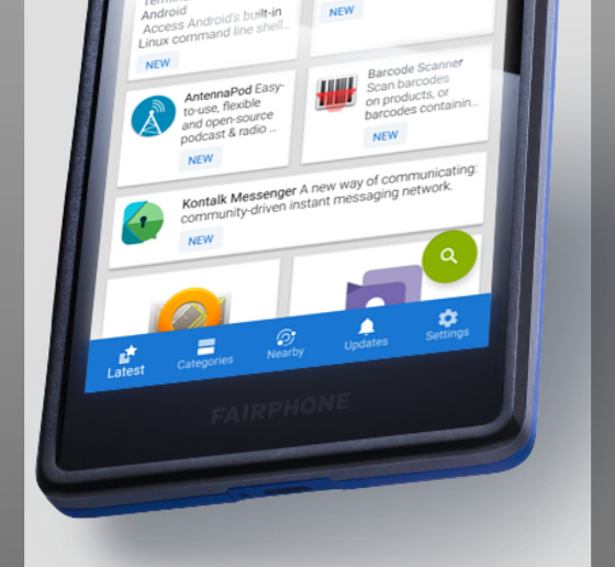
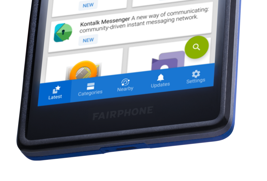
Btw, @Pander (or yourself) may want to validate how I edited the F-Droid screenshot very slightly months ago. I separated the icons in the bottom bar from their text by a couple pixels and reduced the icon size by couple pixels. I did this because margins are a quick (often subconscious) quality cue for many people. Margins that are off-kilter can illicit a messy or confused feeling.
(Also made those icons duotone and the grey background of the content pane a couple shades darker for more pronounced separation. If you like what I did with the icons I can edit them myself if you’re busy).
It also might be worthwhile to put a darker shade of blue behind the menu item that the person has selected rather than change the position and scale of the icon and it’s text. BTW I just noticed that the menu text doesn’t return to it’s original size after a person selects a different menu item (a very minor omission but alas one that might now be addressed with a slight improvement in the UI).
The bottom nav could use some polish, the tricky thing is considering all the variables. For example, the tab title word lengths vary widely between languages. Chinese is usually 2 characters, while many other languages have all long words. That’s why the margins are tight and the zooming animation was deliberately removed.
In terms of margins my suggestion involves mostly changing the icon, and not the text (ie. making the icons a bit smaller etc).
These days tend to see icons the current size in the ‘line’-icon style rather than the solid-icon-style.
In the case of Chinese it seems the minimum number of pixels that will be needed are 12x12 (simplified characters - Lowest pixel resolution needed to support Chinese? - Chinese Language Stack Exchange), however depending on the characters they say you may be able to get away with 8x8. Are all phone screens that F-Droid support, higher resolution (aka retina-like), if so you may be able to get away with 8x8. At 8x8 hopefully other languages will not expand too far horizontally into each other?
You may want to double-check that, the text grows in size when a user taps the item, but it doesn’t reduce in size after the user taps a different menu item.
EDIT: I agree that the text should not grow and shrink. What I would say is double-check that, stop the icon from moving vertically when selected, make the icon 2-3px smaller, separate the icon from the text a tiny bit more to match this image, consider a darker background for the selected menu item (added below).
The following may not be needed (I didn’t do it in the below image but you may need to if Chinese text needs to be bigger): Consider increasing the height of the entire blue menu by 2px or so.
Result would approximate this (the only difference is I added the dark region):
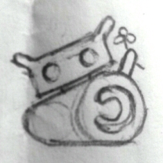
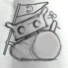
If I made this, I’d call it the F-Droid Copyleft Crusader, but I don’t know where we would use this icon, it’s a bit too militant for everyday F-Droid usage.
(Had this piece of scrap paper floating around my abode for a while so thought I better post it up so I can clean house, lol)
I’m worried about the Copyleft Crusader F-Droid’s back, holding up all that stuff above his shoulder, maybe the flower can attach to his antenna. Then the flag can go in his left hand and he can hold it higher… really high, eg. make the flagpole long. Maybe forget about the image being an icon size and imagine the little crusader appearing briefly in a kind of splash screen when the user boots up some special function in F-Droid, like Contribute or Donate, etc.
Dunno I just threw it out there.
@hans if you want to remove the white highlights from the icon design, I will welcome it, from anyone. Based on your feedback I made them half as bright. I think they make F-Droid pop out nicely but you are more experienced and my eyes might be biased.
Will do. I’ll make it a separate layer that is turned off by default. If you look at the latest landing page design I removed the shine when the icon is small because it did actually bother me. It’s one of those things that looks good when the icon is large.
Have an event today so expect something in a couple days.
Awesome work, @webDev! It’s a wonder this isn’t in production yet.
This may not be doable, but what if there was a small “10” on the cup on the badge, just to clarify what the badge is about. I understand this might look ugly on smaller logos, but it may be pretty legible at this size.
EDIT: Just wanna say, what a great thread! It’s like being at design meeting/brainstorming session. I’m learning so much.
Thanks buenalabs. I understand that big changes need to go through a bunch of Contributors before they go live… and actually on second thought I havn’t done a Merge Request for the latest changes to the icon!
Some people might not like having legible characters in the icon but I think it’s great (for a celebration year). I’ve kept the cup in a working layer in case someone wants it. A ‘10’ inside the cup would’ve been too small and fiddly, I also find with simple icons that when you start to add things to them the icon can start to look like other unrelated things.
I’ve just logged into the forums for another reason and had a notification here. I’m seeing this “10 badge” version with fresh eyes and my concerns were right. It simply looks strange. I think a “10” on it’s own is odd-looking.
If worse comes to worse, I’ll put the cup back into the design. (It is still in the file but in the working layer so I just need to swap it around, the colour of the cup will match the colour of the “10”, ie. it will not be as dark as the above linked version.)
Hi @webDev,
Sorry not to have followed recent posts, I was on a new development.
According to me “10”… is simple and can be understood by a lot of people.
Rem: in some games (PSX), CoD, it’s the same.
A number does have to be translated.
I do think that there’s a difference between a “10” in the title of something and what we’re trying to show here, however the 10 is a number that implies something positive (eg. 10/10) and it is actually more legible than the cup at small resolutions so…
Well, in general numbers need translation. Not everyone uses Western Arabic numbers (1 2 3) like Europeans do. Arabs, for example, use Eastern Arabic numbers (١ ٢ ٣). They also write right to left. So “10” translates to “٠١”.
See Eastern Arabic numerals - Wikipedia. Not sure how important is this though as any modern person (especially on the Internet) definitely understands Western Arabic numbers.
 Our ambassador of open source on Android
