Thanks Izzy, haha. Yeah, I personally prefer the blueprint version also. Twas a good suggestion by @hans to keep F-Droid in the picture/icon.
To a Marcus: (I received a message from a Marcus over Gitlab. Is it one of you guys @marcus77, @Marcus or @Bubu? You wanted to see the progress but gitlab wouldn’t show you svgs.)
So here’s what I’m ready to push, if there are no major objections.
EDIT: Tues 10 Dec (boosted contrast (blue body lighter so copyleft is more visible)
Icon for website (hero):

.
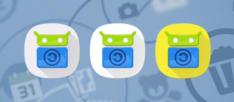
App icon with layer choice of white, grey or yellow background:
 . . . . . . .
.
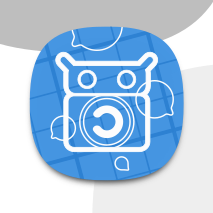
In-app art asset for when app icon is not yet loaded:

.
Default notification:
![]()
.
Updates notification:
![]()
.
Favicon:

Favicon in context:
.
Available on F-Droid

.
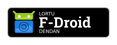
Get It On F-Droid:


.
Privileged Extension

.
Forums app icon (ONLY FOR FORUM APP AND FORUM WEBSITE):
.
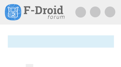
Forum website icon in context (mobile):
.
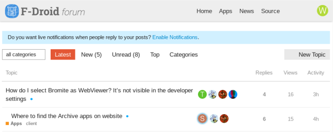
Forum website icon in context (desktop):
.
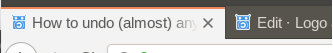
Favicon for forums:
Any improvements @contributors? If so, I’ll edit this post, if not I’ll push.