I’m not sure if I’ve done the pull request properly, tbh. Please read the contents of the push request for further info. Also the git commits (included on the page. The git commits could be worded a bit clearer in hindsight but do read those too if you want to understand what is updated and why etc).
Thoughts, comments and suggestions are very welcome, as always. It’s best to do any upgrade with some critical analysis.
All your icon updates look good except the first picture under “Forum:”. I would suggest that you only use the second picture under it for all F-Droid Forum logos, because it looks very much better then the other.
Then I also have a suggestion about what you could update on the main/first F-Droid page (https://www.f-droid.org/). It would be good if you expand the lists of “Last Updated” and “Latest Apps” into showing five instead of three apps.
It would also be good if the text of “Last Updated” and “Latest Apps” contained links to show all F-Droid apps in order after latest update (with the most recent updated app first and oldest update last) and after app creation date (with the latest first and the oldest last).
The idea to have the text of “Last Updated” and “Latest Apps” as links is a good idea, and one that I would hope to implement.
The new page will have a lot of info about F-Droid and why its so good, so it will be difficult to add more apps to the page without overwhelming the user. Here’s the current design. Please add your suggestion in this thread for my future reference because I can no longer edit post 49 to add your suggestions.
The reason that the F-Droid forum header for desktops looks bad is probably because it’s one of those things that is better to see in context and the forum doesn’t allow me to put enough white space around things. I could be wrong. I was thinking about a design with more ‘breathing space’ for the desktop users. See below:
It would be great to have a version specifically for the Forum that isn’t just the regular F-Droid icon. @uniqx has an forum reader app, and it can be a Progressive Web App, so it needs a separate icon to avoid being confused with F-Droid itself.
Isn’t the Material Design spec all about flat icons?
I think that the colors of the droid are less “waw” than the droid with the wave inside.
The droid with the wave is perfect
Maybe you need to put more brightness in the droids for the forum, but @hans has another opinion, so you have to take the decision together and also with @NicoAlt
Another remark about the forum logo, is that “forum” should be aligned right on F-Droid or simply centered, or left lol, but not as the actual version.
@hans, thanks for the heads up. This is actually a bit of a design challenge in a way and I’ll need to play with ideas a bit. A “wireframe” idea did come to me while trying to font pair “forum” with “F-Droid” so I am thinking that a wireframe bot on a blueprint blue background could be a fun way to approach the problem. Will give the idea some extra percolation time. As an aside, how is F-Droid going to integrate Progressive Web Apps (PWA) with their open-source prerogative? From what I have read the code (pre-compiled?) is downloaded from (EDIT for clarity) any random server that wants to serve a PWA? It seems an app-signing-nightmare.
Material Design does allow for some bending of the rules I believe, but on the whole they do strive for simplicity. Simplicity suits smaller displays. The larger the item is, the more designers can embellish, and break the rules, but not too much.
@hotlittlewhitedog Very much agree on brightening the favicon! It can be brightened and kept flat, yes. I was actually going to do it earlier but another topic absorbed a lot of my attention and time.
If you don’t use TSL 1.2 or TSL 1.3 security for your website and app it’s not safe. I suggest that you update the encryption to at least TSL 1.2 if you don’t have it yet. because all sots of SSL, TSL 1.0 and TSL 1.1 are outdated and unsecure.
If you already have this encryption, nevermind. I just wanted to check if you’re aware of this and have modernized your connection security.
Make sure that all people working on the F-Droid webpage and the app reads about this because it is important for keeping high security in connection between your services and all users and prevent hackers, security holes and any form of information-leak.
Take a look at F-Droid’s Security Model here if you can.
We should be careful not to detract from the original purpose of this thread, which is to assess the new 2019 icon for F-Droid. On that topic I’m unable to use the PC at the moment, but should be able to soon.
hi , I’ve uploaded new browser on fdroid with favicon support in search bar jQuarks viewer | F-Droid - Free and Open Source Android App Repository
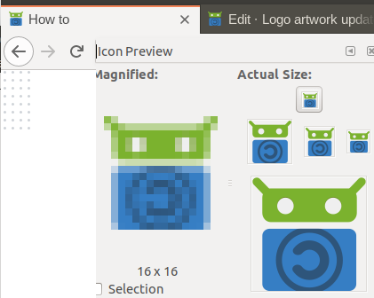
Now, after latest 76->77 webview upgrade, I noticed many url’ favicons are blurred like ddg fdroid wikipedia youtube, but not others like Google SearX StartPage Maps…
Do you believe the F-Droid favicon should be somehow updated ?
Interesting. Please provide a screenshot. Maybe they are downloading a resolution without factoring in whether the screen is a 1x, 1.5x or 2x display (ie. retina)? Maybe I’m not understanding the problem at all.
Have you been able to start a dialogue with the developers of the Ameixa app about an orange and green theme? I still think that it would be a good idea to talk to them.
NOTE: I’m unable to work on the project at this time as I’m away from a reliable PC, but hopefully will be able to soon.
Today, fdroid favicon is okay with webview77; guess some did change it (youtube & wikipedia are still blurred)?. These icon/bitmap are located in <head> first webpage section. @webDev , there is still a kind of miss with Shortcut android : the fdroid droid icon is uglify, probably due to non adaptive design : Adaptive icons | Android Developers (?)
@oF2pks Adaptive icon doesn’t necessarily mean pretty. On older phones I’ve seen Adaptive icons that are smaller than they should be, but sharp. On other older phones the same icon can be larger but blurry. I’m not an expert in this area but it may come down to how careful the deveoper is to account for all the different phones, sadly. I’ve heard that apparently even the official documentation and tools don’t do a complete job either, but again, I’m not an expert in this area, yet at least.
 fdroid-logo.svg
 fdroid-logo-privileged.svg
 default-app.svg


