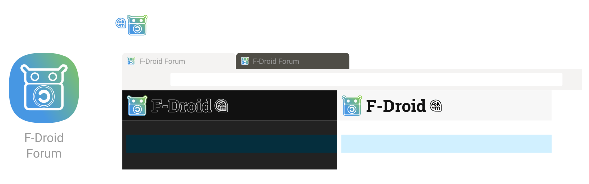
I’d say it’s not superfluous to the unacquainted visitor. Would we want a potential new user to be confused as to why the supposed F-Droid website just looks like some forum where people discuss apps or something?
By making it clear that the user is only on the F-Droid Forum they are able to infer that this is not the official F-Droid website.
If the user is already somewhat aquainted with the F-Droid icon, the blueprint-style icon might also help imply this site is a “formative part” of F-Droid’s experience, so to speak.
For myself, I find switching between the F-Droid Forum and Official website tabs in the browser can be quite confusing at times so I’m actually looking forward to a different (fav)icon for the two sites.
Please click the designs to enlarge them to 100% scale. Having said that I’ve made the bubble larger now (see below). EDIT: If I were to make it any larger, I’d do improved outlines for the bespoke typography.
I removed the background grid in the above version, but yes I can see why one might prefer the version without the squircle in the header location (see below)
All fine points. I only did make the symbol larger and bolder for favicons initially and I started reusing that method for the “forum icon” variant but in hindsight I agree with your critique.
UPDATED BELOW (favicons unchanged) (EDITED 20 mins later: “forum” typography slightly improved + spaced better from 'F-Droid"):