Upgrade of F-Droid logo\icon for 2019

Haha, Yes something like that.
Rem: it’s a droid coming for peace, not to kill :slight_smile:
F-Droid Copyleft Messenger of Peace

droidofpeace

:smiley: Our ambassador of open source on Android

@Bubu [ It’s a reply to your recent email ]

That’s cute.

I’m worried about the Copyleft Crusader F-Droid’s back, holding up all that stuff above his shoulder, maybe the flower can attach to his antenna. Then the flag can go in his left hand and he can hold it higher… really high, eg. make the flagpole long. Maybe forget about the image being an icon size and imagine the little crusader appearing briefly in a kind of splash screen when the user boots up some special function in F-Droid, like Contribute or Donate, etc.

Dunno I just threw it out there.

@hans if you want to remove the white highlights from the icon design, I will welcome it, from anyone. Based on your feedback I made them half as bright. I think they make F-Droid pop out nicely but you are more experienced and my eyes might be biased.

Removing the shiny affect would make me personally happy, but I’m just one vote. I think you should get more people to state their opinion.

Will do. I’ll make it a separate layer that is turned off by default. If you look at the latest landing page design I removed the shine when the icon is small because it did actually bother me. It’s one of those things that looks good when the icon is large.

Have an event today so expect something in a couple days. :slight_smile:

1 Like

Howdy folks here’s how the new version looks. :slight_smile:

As stated in the commit:

Icon and badge improvements

  • Removed the shines (also from Privileged Ext.)
  • Removed the reflection from the head area
  • Added handles to the cup (award icon)
  • Made the award badge flat
  • Made the eyes below the reflection line pure white for stronger contrast
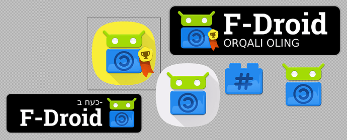
5 Likes

GO FOR PROD :fire: :muscle:

Awesome work, @webDev! It’s a wonder this isn’t in production yet.

This may not be doable, but what if there was a small “10” on the cup on the badge, just to clarify what the badge is about. I understand this might look ugly on smaller logos, but it may be pretty legible at this size.

EDIT: Just wanna say, what a great thread! It’s like being at design meeting/brainstorming session. I’m learning so much.

Thanks buenalabs. I understand that big changes need to go through a bunch of Contributors before they go live… and actually on second thought I havn’t done a Merge Request for the latest changes to the icon!

Hmm… I like your thinking. How about this?:

Some people might not like having legible characters in the icon but I think it’s great (for a celebration year). I’ve kept the cup in a working layer in case someone wants it. A ‘10’ inside the cup would’ve been too small and fiddly, I also find with simple icons that when you start to add things to them the icon can start to look like other unrelated things.

Thanks again for the feedback and great idea!

EDIT: Here’s the newly updated Merge Request.

2 Likes

Awesome!

Thank you. Really, really good work! :smiley:

Thanks again, @buenalabs.

I’ve just logged into the forums for another reason and had a notification here. I’m seeing this “10 badge” version with fresh eyes and my concerns were right. It simply looks strange. I think a “10” on it’s own is odd-looking.

Maybe " 10th " will look better. @hans Please don’t merge until people have had a chance to have their say on this concern. (@Bubu, @redplanet, @Licaon_Kter, @hotlittlewhitedog )

If worse comes to worse, I’ll put the cup back into the design. (It is still in the file but in the working layer so I just need to swap it around, the colour of the cup will match the colour of the “10”, ie. it will not be as dark as the above linked version.)

1 Like

Hi @webDev,
Sorry not to have followed recent posts, I was on a new development.
According to me “10”… is simple and can be understood by a lot of people.
Rem: in some games (PSX), CoD, it’s the same.
A number does have to be translated.

1 Like

Maybe you are right, @hotlittlewhitedog

I do think that there’s a difference between a “10” in the title of something and what we’re trying to show here, however the 10 is a number that implies something positive (eg. 10/10) and it is actually more legible than the cup at small resolutions so…

Do you mean “doesn’t” have to be translated?

Yeah let’s keep the “10”.

2 Likes

Well, in general numbers need translation. Not everyone uses Western Arabic numbers (1 2 3) like Europeans do. Arabs, for example, use Eastern Arabic numbers (١ ٢ ٣). They also write right to left. So “10” translates to “٠١”.

See Eastern Arabic numerals - Wikipedia. Not sure how important is this though as any modern person (especially on the Internet) definitely understands Western Arabic numbers.

Totally agree.

1 Like

Thanks for the info. It’s something I feel like I should have known.

(I’d “Heart” your, and many other, replies but Hearting only works before I’m logged into the forum. So I’d have to logout and in again to heart a reply. I made a topic on this issue once.)

Good to be in agreement, also. Cheers

1 Like

Happy Easter time, folks. Ok so a minor issue has popped up with the dark theme, people can’t see the black text on dark.

This might be a good time to talk about how people wish to progress with the bespoke forum icon that Hans indicated might be desirable. We can update it at this time.

The below is based on work done collaboratively previously in the forums here. I’ve just improved it by introducing a gradient of analogous colours (and removing the speech bubbles from the app icon that were cluttering it). These kinds of gradients have become a web standard of sorts over the years. Feel free to tell me what you think:

forum-app5-light

forum-app5-dark

forum-app5 App icon

I’ll update the Merge Request if people like it. Suggestions welcomed as usual.

1 Like

I don’t really have anything against any specific logo, they are all beautiful, the only thing I find weird is the ones where the copyleft logo doesn’t fully fits within the belly of the android, but maybe it’s just me.

Same here, those double circles are strange.

Thanks @Aaron_Swartz,

Agreed, and updated (see below). As stated today in the dark theme topic, I only did this for the favicon and was lazy in re-using it. The 16x16 is where it will stay, 24x24 or larger and the (C)left symbol can be normal size.

Thanks + Ah, that’s another holdover from a “design drawing” motif that is supposed to imply an engraving, Yes the problem with that was couldn’t follow through with this and do the same for the ‘C’ and so there’s an inconsistency there (fixed).

UPDATED:

Based on all this quality feedback I’ll do an MR (Merge Request) now.

(EDIT: Merge request now ready)

1 Like

This topic was automatically closed 60 days after the last reply. New replies are no longer allowed.