Does anyone (@NicoAlt?) have any objections to making the media screen breakpoints match up closer with Bootstrap?
Currently the breakpoints are max-width 500px for ‘phone’ and max-width 750px for ‘tablet’. Were these chosen for important reasons, as I would like to increase these numbers so more screens are considered ‘phone’ and/or ‘tablet’.
Below are the bootstrap breakpoints:
// Extra small devices (portrait phones, less than 576px)
// No media query since this is the default in Bootstrap

// Small devices (landscape phones, 576px and up)
@media (min-width: 576px) { ... }

// Medium devices (tablets, 768px and up)
@media (min-width: 768px) { ... }

// Large devices (desktops, 992px and up)
@media (min-width: 992px) { ... }

// Extra large devices (large desktops, 1200px and up)
@media (min-width: 1200px) { ... }
As such I would like to match F-Droid’s site closer to these numbers. So max-width 575px for ‘phone’ and (because we only have one other break-point I’d like to balance the “tablet” one between the 767 and 991, meaning (767 + 991)/2 = 879) max-width 879px for ‘tablet’.
I’ll change it and see how it goes, but if anyone has any thoughts or concerns on this please speak up.
EDIT: I am a bit tempted to also switch the logic around to be mobile-first, so we test min-width for ‘tablet’ and min-width for ‘desktop’ but this might present compatibility issues with the jekyll-fdroid plugin which will need to be updated too, perhaps.
EDIT EDIT: Just tested the current breakpoints in a few ways and I’m surprised that prefer the current thresholds! In terms of optimising the site to be mobile-first, I doubt load/rendering times are greatly impacted presently and it can likely wait until after the landing page is produced. Moving on?
I don’t have any objections to changing this or any other logic that you
find worth to change. Feel free to move forward as perceived best by
you. Thanks a lot for working on this, really highly appreciated!!
@webDev I worked with Bootstrap 3.
Don’t really know the new changes but do you think we could use several themes easily? (for next update) Light=this one, dark and maybe other.
Up until yesterday, I was going to use Bootstrap but for a number of reasons I’ve decided against. If however the css tricks don’t work in other browsers then I’ll use Bootstrap. I’m aiming for all major browsers younger than 5 years to be supported, so maybe I’ll need bootstrap.
In terms of a Dark theme. This project is really about improving the landing page (but if other things improve then all the better). The new landing page will have an equal balance of light and dark sections, so light and dark themes are unlikely to compliment what I’m currently doing.
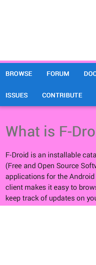
Here’s a mildly annoying problem, it appears that in Firefox for Android, when a website asks for ‘Roboto’, Firefox simply serves the user a different font! Maybe it is to save bandwidth on mobile phones, but the font is quite different, completely different kerning! I really do not see why they did this. See below (notice the different ‘i’ and ‘R’ characters, as well and the kerning differences, and height):
The really annoying part is the only way to force Firefox to use the real font is to ditch any attempt to use a local version of the font (ie. give the font-family a different name ‘RobotoNoShowInFirefox’, not great if we want to save bandwidth but in all fairness the font is only 20kb and one of 4 others.
This is actually happening on the live site. If anyone else gets the wrong font in Firefox (as shown above) then I’ll definately force the download.
(The other extreme would be to have all the 5 css ‘@font-face’ declarations under -moz, -o, -webkit and IE selectors. That would be awful CSS, but I’ll do it to save bandwidth.)
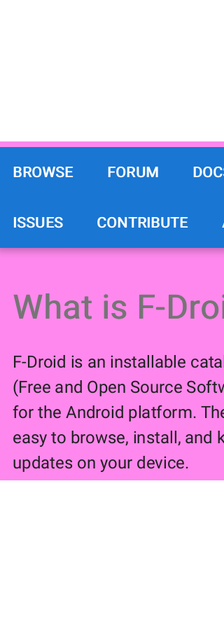
I tried it with Firefox, Fennec, Brave, Duckduckgo and Chrome. I get the “wrong” font in all of them (they all look the same, the R has an angled rather than a vertical stem.
It’s for consistency and adds typographic style. I find a few good fonts offers infinite opportunity to bring in some enjoyable style.
In fact, you’re getting the correct one. Thanks for doing that. I had success in other browsers too. Based on your success I had a friend come over and we isolated that its definately the older Android OS with Firefox that causes this. It might be worth reporting to Mozilla as a bug.
I don’t expect I’ll fix it. Localhost testing is a different story, but the problem might be too niche to warrant a heavy fix.
…and Roboto Regular is designed to pair with ‘Roboto Slab’. That’s how the current site is designed and that is nice. We are just taking it to another level.
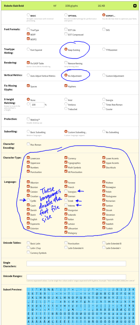
BTW I used that FontSquirrel site’s Generator to get the filesize of the Roboto fonts (including ‘Roboto Slab Bold’) down from 160Kb TrueTypes to 20 - 26Kb each!
The options I used to get the file size down are below. You’ll see I removed four language character-sets, otherwise the filesize for the fonts would have been double! The browser may find good defaults for those languages but if not I may edit the css so for those languages the browser fetches the font files that are double the size.
Okay… I didn’t intend to do the app pages before I did the landing page, but once I started I couldn’t stop.
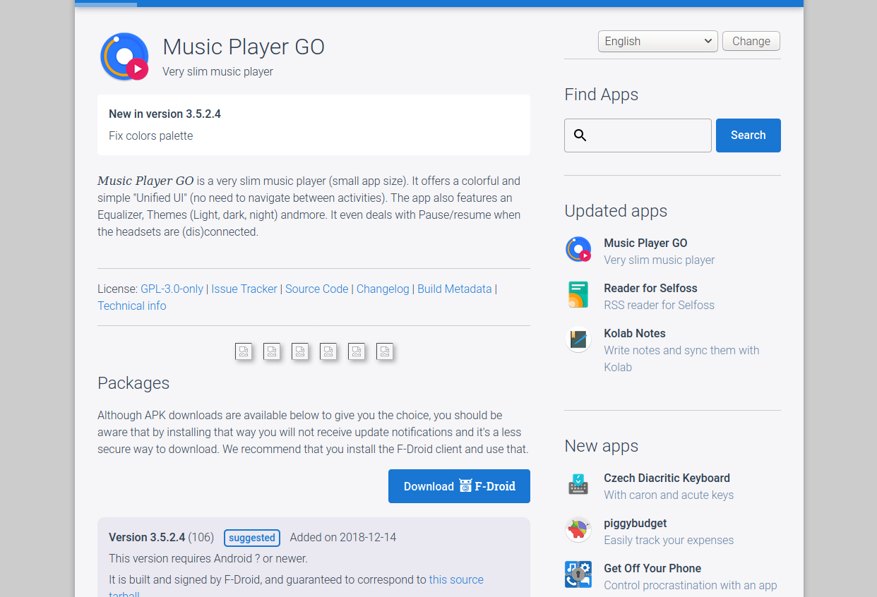
This is just CSS. A couple font changes (font-weight: 400 => 300 or 500), a few margin tweaks and a complimentary grey background. Ignoring the fact that the buttons, header image, and screenshots are unchanged, and the feature image of apps is still not being used, do people prefer this change?
This is the progress made on the site, which is a good little warm-up activity. As you can see I’ve tried to check the changes over multiples pages, which was important for some CSS classes that are reused across the site in different contexts.
Maybe people like it? Should be able to push a commit to gitlab sometime soon.
.
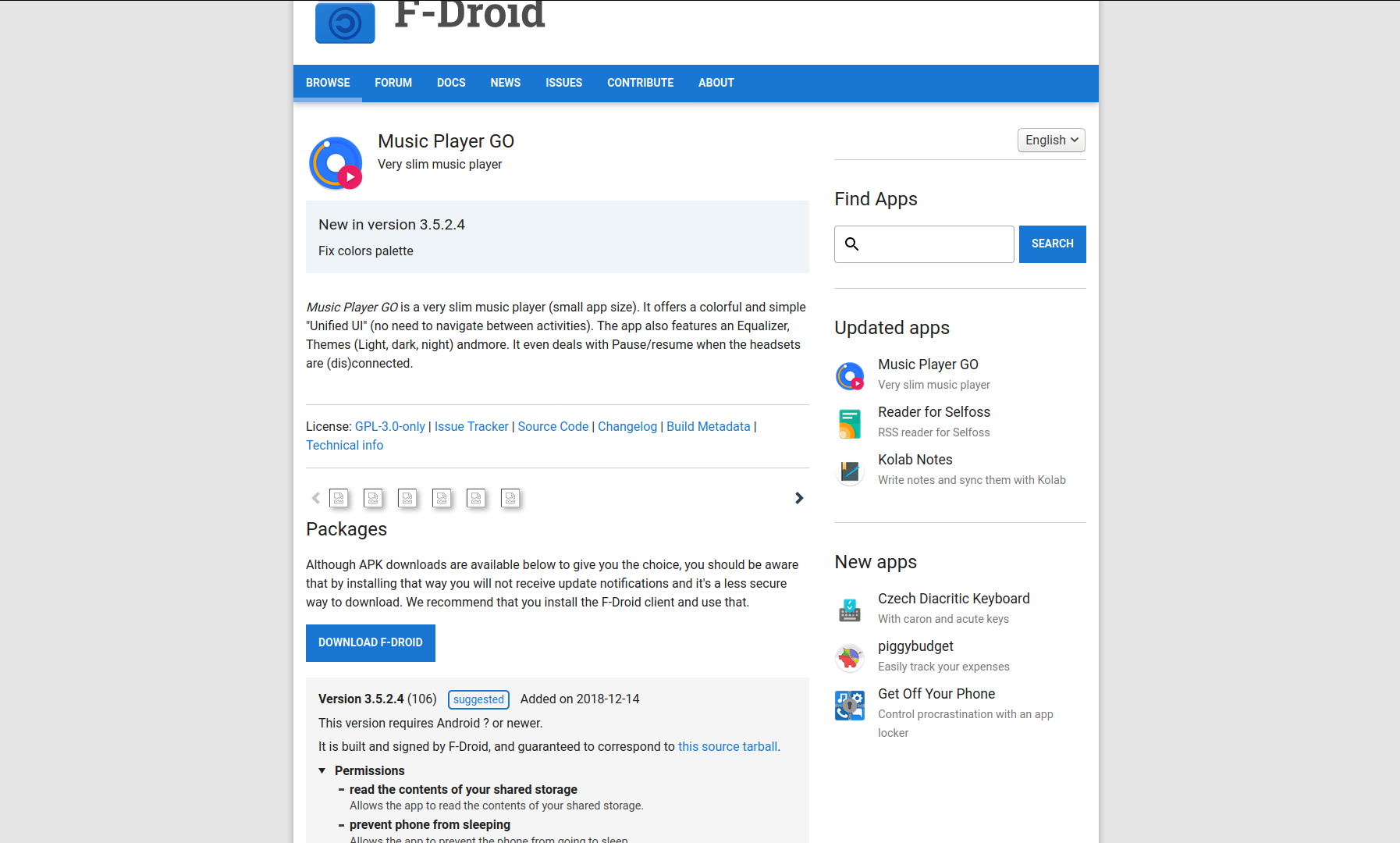
Heading 2, Download and search buttons improved, italic is a nicer serif font, browser defualt @hotlittlewhitedog , also semantic html improvement (the paragraph under “Packages” heading is an <aside> :
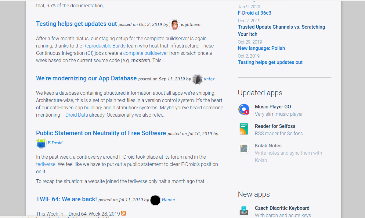
News page semantic improvements (article element for each article, small details on the same line as the heading helps to tighten the layout, adjoining paragraphs are not as widely seperated, circle avatars:
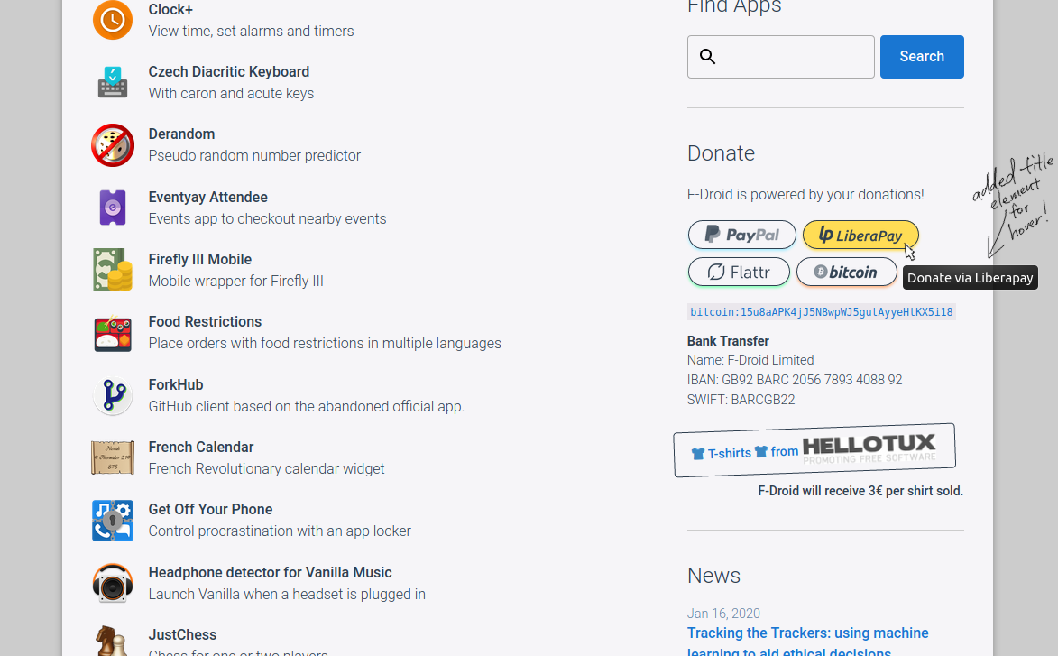
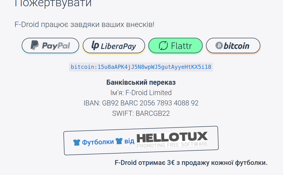
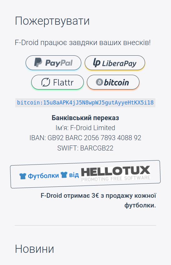
Haven’t done the Donate sidebar section, the :before pseudo element in css (for the F-Droid icon in the button) conveniently switches to the right side in the right-to-left reading direction:
May have time to do the donate pane tonight. I might have found another bug in firefox, I tried putting a suggested-word-break <wbr /> in the bitcoin address so you don’t end up with one character on a new line, but it didn’t seem to work in Firefox (EDIT: in a couple browsers actually)
@webDev I prefer the “before (style)” lol.
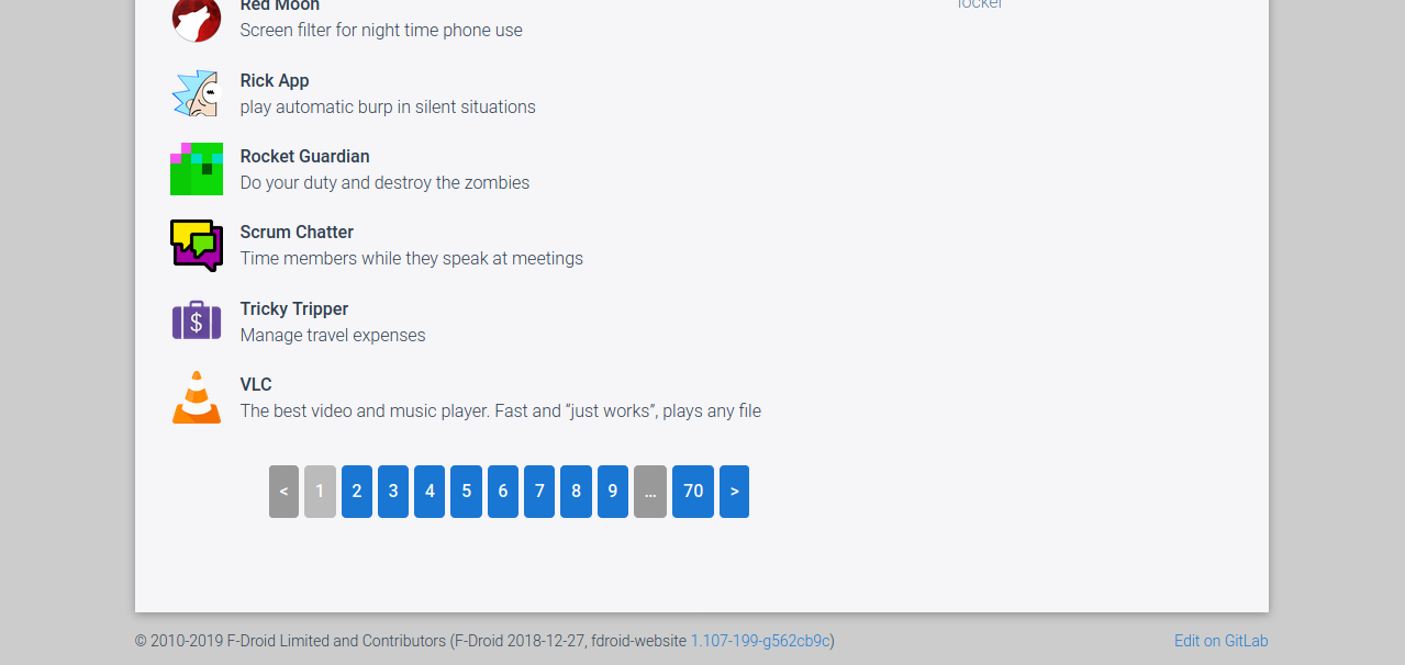
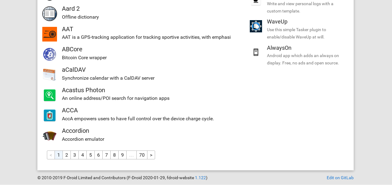
Rem: I think that pagination is not necessary on this site and this way to get info has ~20 years old (with the start of ASP). I would see another way to scroll apps like Discourse or Facebook do: when you are at the end of page, it loads automatically next page. I also don’t see the interest to go to page 20 based on the search field.
Infinite Scroll is a possibility for people who use Javascript but the only thing I’m doing is trying to improve what is already displayed in the website before I do the landing page. Maybe in future, infinite scroll will be something that I’ll do (for the javascripters).
My above post has one like. Can tell me what you prefer with the “before version”. I might be able to cater to your preference, despite pagination being 20 years old
In other news, I’ve tweaked the Donate pane see below. I added the protocol name to the bitcoin address. And added a title element to the donate buttons so when people hover over them they get the “alt text” (already translated for the visually impaired and if the button images aren’t loaded).
EDIT: I worked out what was going on with the <wbr> (word break) element not working. There was a CSS break-all property on it. There’s no way to add the HTML element in the markdown so I gave up on the idea to break the bitcoin address in a good place.
I really like the new design of the landing page, especially this proposal. I don’t have the time to read all discussions, but adding more padding to the sidebar and content elements seems to be a good idea. The darker background color was also necessary. Thanks!
I just checked out the package pages and wondered why you use different border radii for the buttons and the .package-version elements. I’d suggest to use either 4px or 5px for both.
The idea of unifying the donate buttons on the landing page is good. Can you take a look at the donate options on the app pages, too?
white color of the buttons is better than dark blue
small buttons have a better look and I don’t like button pages with too much height (of course the buttons don’t have to be tiny, impossible to click…). Think at squared buttons. Personally I don’t like the gaps between buttons. Another solution is to create rounded buttons with small gaps and a blue border around the focused button (hover event) and not more than 10 buttons. Limit to 5 buttons (1, 2, 3, and left, right).
Now, I have an assessment of ~2 hours, I come later
Yep. Great suggestions. Will do something with these. Thanks!!
Rounded buttons might mean a bigger visual gap between them, but will look into it.
The system already truncates the number of buttons to 10 and I like that amount, but perhaps 7 buttons is a good compromise. Will look into. Thanks again.
Thanks for the feedback. Good to know.
Neither would I.
Agree, margins are amazing (I had the best home-room teacher in Year 9, and you could say he was obsessed with margins, lol <3).
Thanks again, good to know.
They are different because the material buttons are small and bold, whereas the package version elements are large and pale. Imagine that a material button was in a corner of the package version element. If they were the same border-radius it would look odd.
Thanks.
I didn’t remember to do those because not all apps have that section. Thanks for reminding!
(aside) Thanks for bringing up my page on Gitlab!!! I assumed that it wasn’t working because I was getting an error to the email a week ago.
 Thanks for doing that. I had success in other browsers too. Based on your success I had a friend come over and we isolated that its definately the older Android OS with Firefox that causes this. It might be worth reporting to Mozilla as a bug.