My gitlab.io site is using the incorrect version of that gem (I almost didn’t notice but the lack of a margin between the app header and the ‘What’s New’ message gave it away). I haven’t been able to find anything in web searches on this topic. I read the 'Local Development' section of the 'fdroid-website/README.md' today, which was very helpful for my localhost workflow, but there’s nothing about fixing the gitlab.io. Maybe there’s a git functionality that I’m not using?
I thought at another type of pagination (sorry I’m late, but inspiration comes later lol):
maybe you can only have 1 button max ^^
> to go forward
< to go backward in the pagination.
Nothing if there is no pagination.
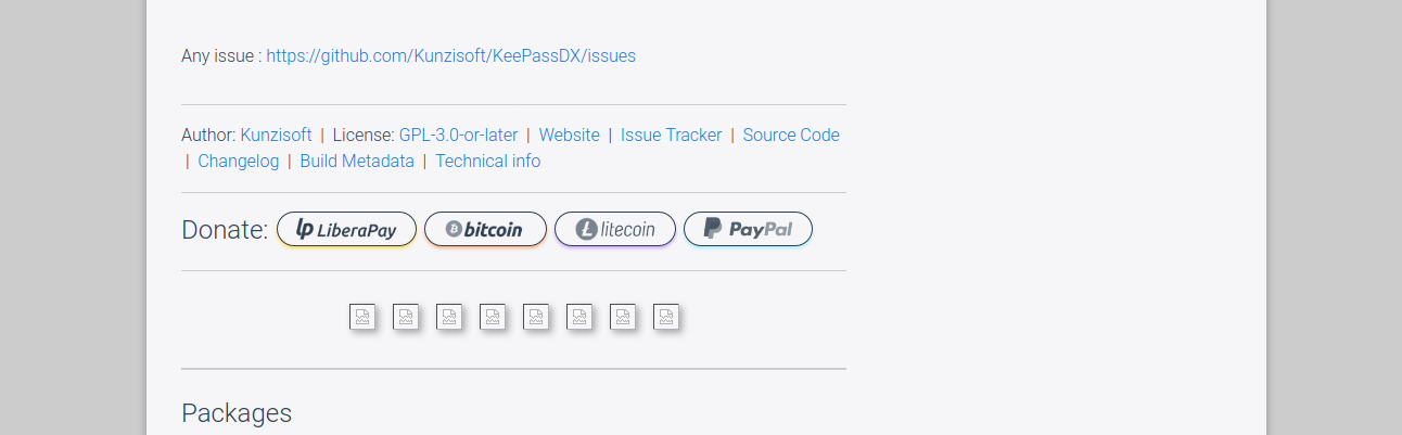
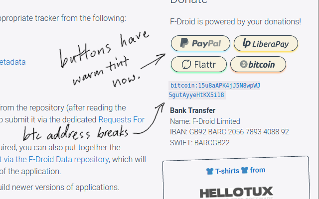
Did the Donate region in the Package page, thanks @Tobias_Groza
WARNING: The on-hover titles (and image alt text) were not outputting to the HTML for some reason!(Eg. {{ strings.litecoin_alt }}, {{ strings.liberapay_alt }}, {{ strings.flattr_alt }} etc ) I’ve not had a chance to look into it yet. The page strings were fine.
(EDIT) Single line ‘Donate’ section,
Added the updated litecoin logo,
(EDIT)made the author field, in the section above the donate section, a <li> element so that a ‘|’ seperator appears after it, to match everything else,
Wrapped the description in <p> tags as I’ve noticed that most apps use line break characters, which stops the margins from coming into effect.
(EDIT)minor spacing stuff.
(EDIT)small italic text after Headings on News page not so small (match other small text on site)
The handwritten “celebrating” message isn’t in the design yet, if we put it in it wouldn’t need to be included in other languages, I could do it for other languages if people suggest how to translate. It might be nice to include alt text on the icon, translated, “F-Droid wearing his Ten Year Medal in 2020”?
You’re totally right! Good point, I didn’t thought about that, thanks. Then I might suggest another way: wrapping each part in a <span> element with the display: inline-block CSS property. It works for me in the title of a site I maintain.
Thanks @Roboe and @ByteHamster for both your input. Yes I decided to add the <wbr> element in the Markdown instead of the invisible character. Unfortunately I couldn’t do this between ` backtick characters so there is now more HTML code in the Markdown to acheive that result. Feel free to give me any special escape character tips but I did scour the internet for way too long on this problem and found nothing to escape from within the backtick quotes.
On a similar topic I added non-breaking hyphens to the some emails and freenode addresses that I/we should test. See bold text below.
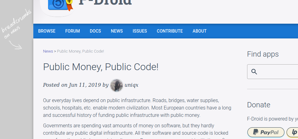
By the way I’ve still not been able to match the gitlab[dot]io jekyll-fdroid repo to the fdroid-website repo. Ideally what I want is to have the gitlab find the matching branch names and pair them together(?) If that makes sense.
Here’s the update over the past few days:
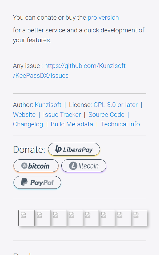
FIXED EXISTING SITE BUG: the donate buttons on the packages pages will now correctly have alt text and title text.
fixed spacing and a double-line problem (I created) on the packages pages,
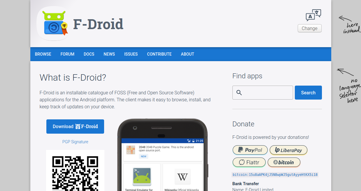
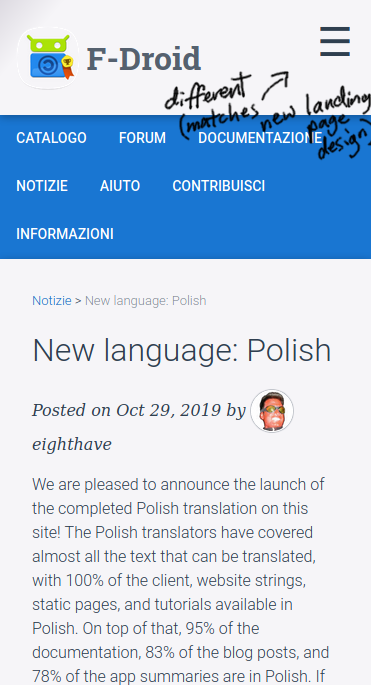
de-capitalised “Apps” in sidebar’s “Find Apps”, replaced the current black svg search icon (no SVG in Tor) with a new one, based on the new landing page design (includes retina display version), added hover feedback on the input field so it feels more responsive.
fixed header so no squash on small displays in case anyone noticed this bug in my previous commit (only tested right-to-left a couple days ago).
Stopped header <picture> element from 'flex-shrink’ing in CSS on super-small displays
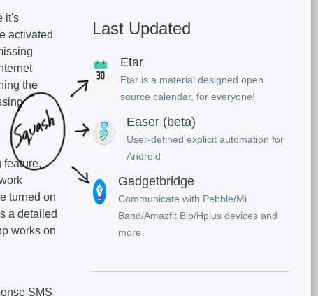
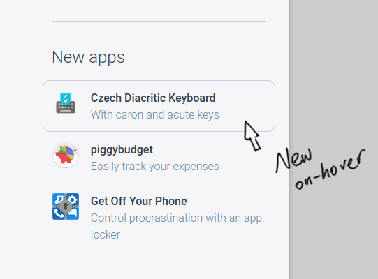
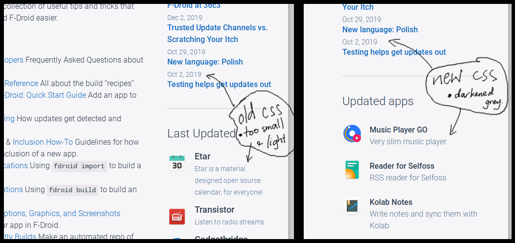
(Hopefully) eliminated the existing problem (shown below) of the ‘New’ and ‘Updated apps’ list’s icons being horizontally squashed (but will keep an eye on this at it has, sort of, been happening at random, maybe depending on the app summary text?)
about page: made some subheadings h2
about page: improved ‘Find a consultant’ button, includes the search icon mentioned above.
fixed how <b> and .strong are displayed on broswers that will not fetch the correct font.
On the ‘About’ and ‘Contribute’ pages, added non-breaking hyphens to email addresses and freenode f-droid‑dev to eliminate any chance of confusion. We should try copying and pasting the email into an email client to see that/they still work.
mouse hovering over app results in a border rather than transparency (see below - also on ‘app list’ pages)
removed on-link-hover transparency, generally, visited links are purpley-blue rather than darker blue,
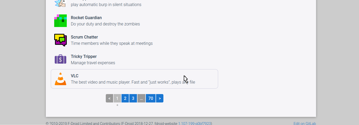
On App Browse (list) pages improved the pagination buttons where possible, based on feedback from @hotlittlewhitedog
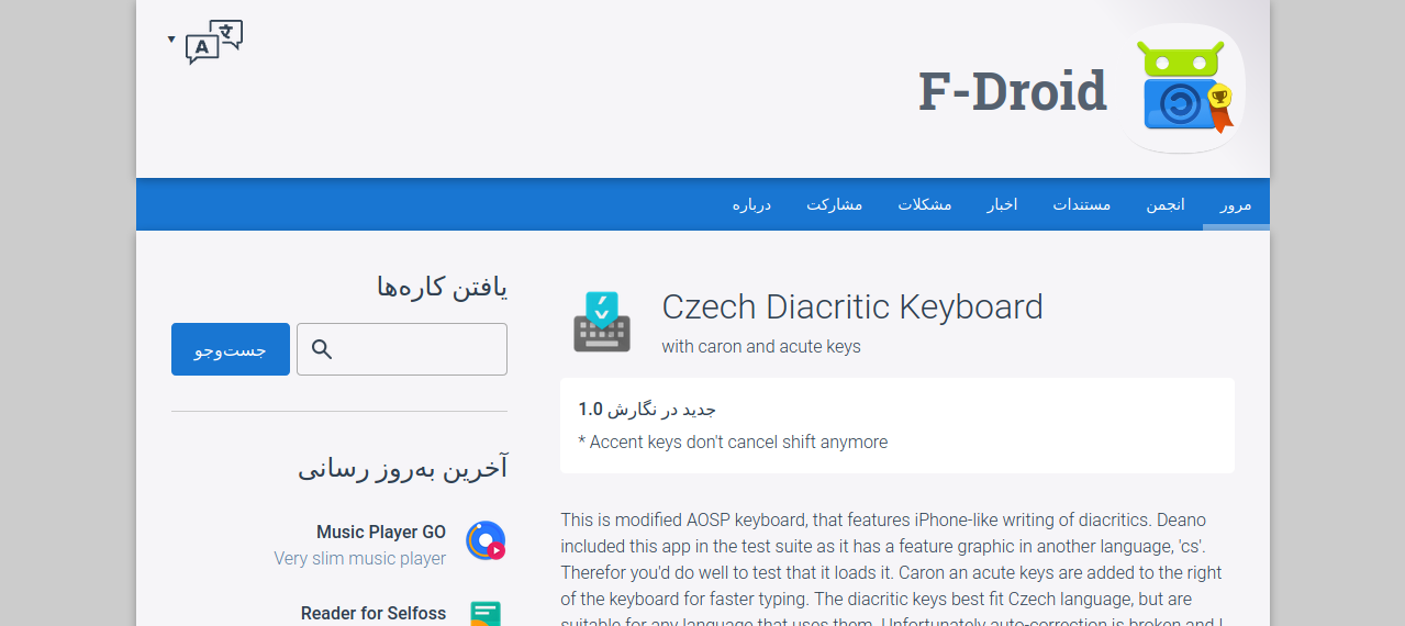
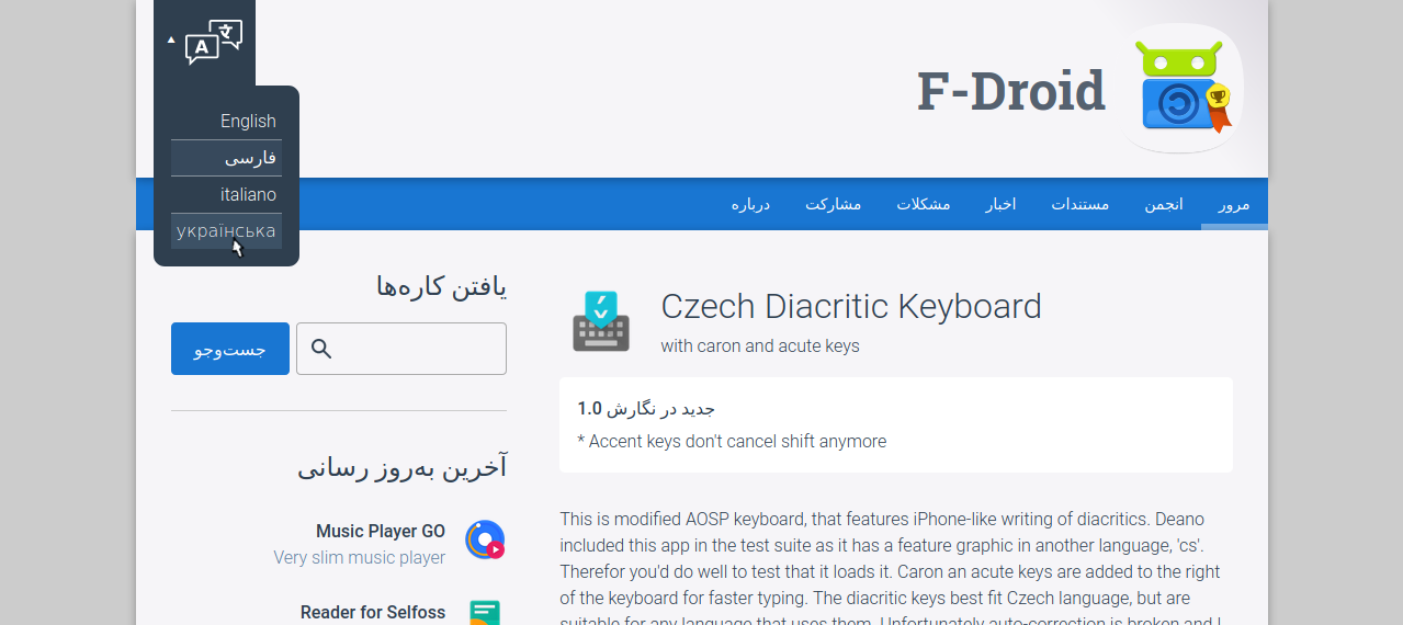
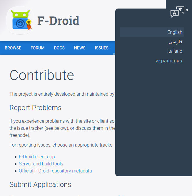
The following commit is added only for posterity. It’s a semi-functional version of an updated language-chooser, which I’ve moved into the title bar and edited it’s style. It’s semi-fuctional because only the first occurance of the language-chooser on the page actually works, which will not be good for my work on the landing page. Regardless a ‘Change’ button is not acceptable for non-JS users. Thus the next commit will employ the ‘checkbox hack’ to show a selection of possible links.
Aside: Tor users might be surprised to learn that web developers and force a custom font to be downloaded and used in Tor by embedding the font into the css as an “application” of type ‘font’!
@font-face {
 font-family:sentinel ssm a;
 src:url(data:application/x-font-woff2;base64,d09GMgABAAAAAFKQA... heaps of data
 font-weight:400;
 font-style:normal
}
Not sure that’s what NoScript and Tor teams were aiming to allow, but maybe.
Progress for thoughts and suggestions:
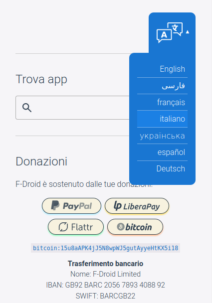
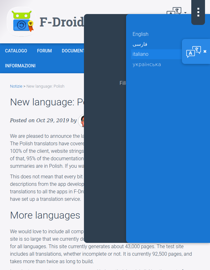
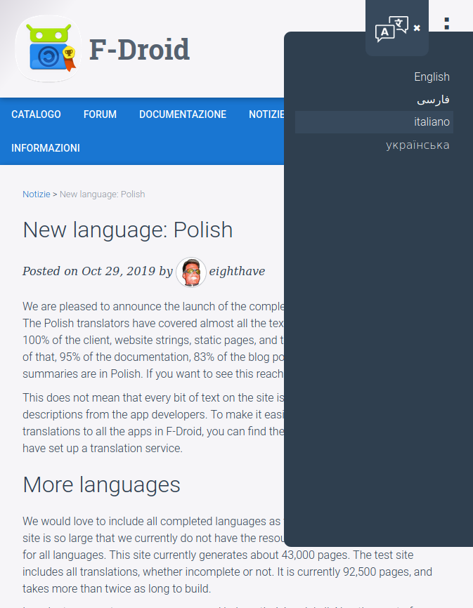
Language selector (with no javascript!) it will take you to the page that you are on but in the other language. It seems that no URL rewrites are needed (but I admit to doing very limited testing).
Mobile (rounded edges when not in header. Also this primary color version is the ‘on-dark’ version. Its the version that I’ll use on the landing page. All versions should work for the three-dot menus too)
.
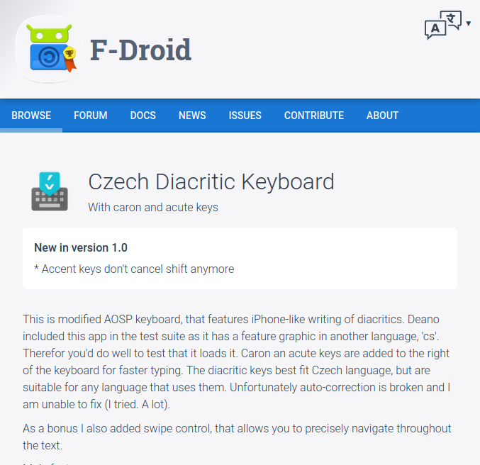
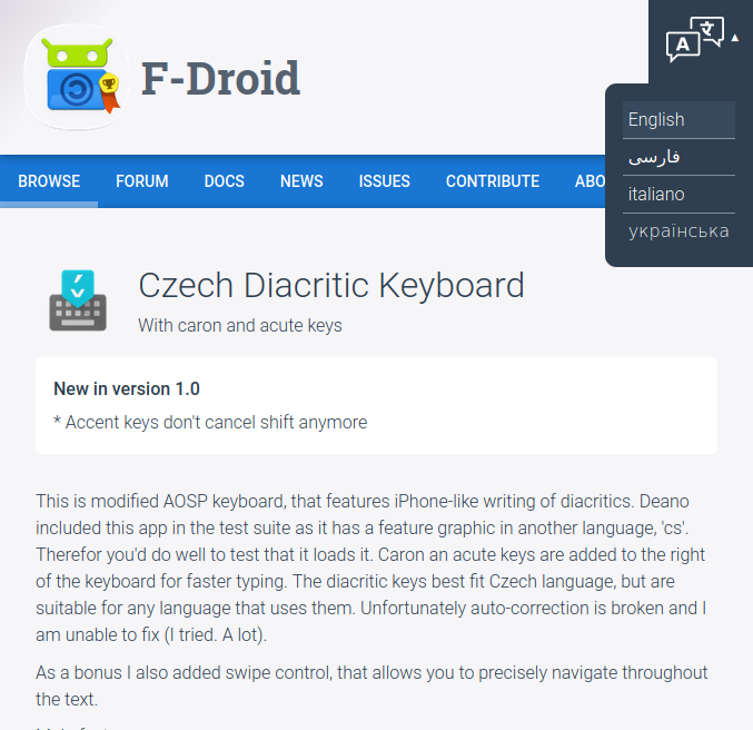
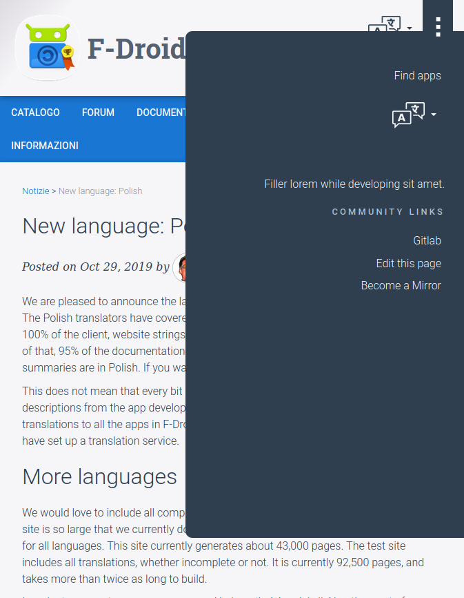
Now, when the user clicks the language-select and other drop-down menus, they will sit in a fixed position on the screen until the user closes them. This improves the UI because the close button is always on the screen and able to be pressed. If the languages list (or any other list) is too long the user will still be able to scroll the list.
its looking quite nice, is there a live demo somewhere where we can try it? If you push to a gitlab fork, it should build and deploy it to GitLab Pages automatically.
wow real progress! Starting to shape up nicely. One bug report: the
URLs in the language chooser are not working. Also, the skinny font is
a bit too skinny, its a bit hard to read IMHO.
Thanks for the bug report re the language selector, I’ll need to work it out.
Re the thin font, what part of the site specifically concerned you? If it was the sidebar widgets then please take another look (or see below), because as mentioned above the new sidebar-widget CSS was not getting used before and it is now.
Re the thinner font, yes it is thinner, thus all things remaining equal, it may make it a tiny bit more difficult to read, but not all things are equal . You’ll see the existing version of the website provides a version of Roboto with a smaller x-height which is suboptimal for readability (smaller x-height is more suited to calligraphic headings). Also we have thicker margins now, so people with any difficulty can zoom in a bit to make the font bigger.
Having said that, we can get far more readable than ‘Roboto’ and I hadn’t really thought about it until now but I’m fully supportive of a broader discussion on the font and with using Fira Sans (developed by/for Firefox) instead of Roboto. Fira Sans is actually a personal favourite and I have used it on previous websites. It’s a ‘humanist’ font and more readable than the ‘grotesque’ Roboto because glyphs are less rounded/geometric, have better spacing and have subtle flicks on the beginning and end of strokes.
I’ve used Fira Sans Light (16px/300) and people who I know with vision problems have not had any complaints even with ‘300’ font weight (regular font weight is ‘400’).
Here’s a few examples of the F-Droid site with Fira Sans 300 (vs Roboto 300).
I’d say this is ‘the ticket’, and we should go with Fira Sans for greater readability. I can implement, I’d have done it already but Font Squirrel is having a fit with the TTF and OTF files I downloaded from Github, saying “The font ‘firasans-light.otf’ is corrupt and cannot be converted.” So re-DLing from Font Squirrel and will have a version up on the staging server soon.
one thing that would make your work a lot easier to merge and deploy is
breaking it up into mergeable chunks. For example, I think we could
merge your language menu now as its own merge request, once the bugs are
fixed.
As for the font, I think we went with Roboto since it is a familiar
Android font and it is a free/libre font. I think the font should
support the F-Droid look and feel, e.g. the “brand” more than being the
most readable. I don’t think most people come to f-droid.org to read
lots of long form text.
(The font is FOSS according to the FSF but yes, I suppose strictly speaking it’s not saleable as a font on its own, and thus may complicate F-Droid’s license with another type of license that is a tiny bit restrictive. I was excited to test it out as I did think that its not just more readable but also looks better, but if the brand and licence will be affected in a negative way then forget it.)
The radiobox nav is being fixed of all bugs. We’ll need “second level” navigation to function and I’ve not yet ironed out bugs with that. Should be done in a few days.
Yes this means two menu clicks to get the language options, (EDIT: or one menu click to see the language button). However on the mobile there will be two other language selection regions, under the body of the text and in the footer (when the footer is done).