Ruby is not a quick language, maybe the reason.
Check also the “nice” priority with top or htop if you are under linux/mac.
You are right it is quite slow, haha. The site finally serves after 40 minutes. The slowness has been mentioned before by Niko so I was expecting it.
I think I’ll build the landing page statically then transfer the static code into the design.
Someone mentioned removing the other languages from the build, I think this might help so will look into that too. I only need the landing page to be built at this stage.
It’s maybe the right time to migrate the site to python ![]()
The green t-shirt is beautiful.
Rem: for info, I’m learning Blender… ![]()
Converting the site to another system is probably a bigger job than anyone is willing to do at this stage, I am doing this on an really old computer also.
I’ll try to work out how to hack ones local repository so the 2000 app pages are not produced, and the other languages are not produced, while I’m developing. This would be a better option than producing a static site and then double-handling the work.
The green tee is really great, I never thought I would ever wear a green tee in my life, but the chroma is not strong. It is now a favourite. If you have broad shoulders or do gym weights, I would recommend going one size up on the size chart. ie. S=>M, M=>L etc, especially if you are between two sizes and not sure which size to choose.
On the side: I’m learning Synfig for 2D animations, an open-source alternative to Flash (today Adobe Animate). It has some minor interface issues, but while I’m going through the tutorials I’m becoming very impressed. Blender will be my next program to conquer ![]()
You can also use Blender for 2D art… ![]()
Hi folks, I am trying to get the site to build while offline.
I have been able to get the site to build very quickly (10 seconds) by removing all the other languages temporarily and by commenting out a bunch of code related to fetching resources found in the fdroid json database(?).
But as a result the ‘Latest apps’ and ‘Last updated’ sections on the landing page are not being populated.
I culled all but 12 random apps from the 7Mb ‘index-v1.json’ file. Now it’s only 180kb. But when I build the site, it doesn’t seem to use that file. I have some more hacking to do obviously.
: )
1 Like
EDIT: I think that I have hacked it enough so it works, now. See EDIT below
(Ignore this) Hit a bit of a Ruby brick wall.
(Ignore this) To avoid having to compress and uncompress the smaller JSON file that I made, how should I edit the below code, during website testing. (Basically I want to do something easier, which is parse a .json file rather than uncompress the JAR file, then parse the json.)
(Ignore this) @NicoAlt, not sure if you can help. The glob() method seems to break the building process when I supply a non-jar file… this is the first time I’ve dealt with Ruby.
(Ignore this) IndexV1.rb
      Dir.mktmpdir do |dir|
        jar = File.join dir, 'index-v1.jar'
        open(jar, 'wb') do |file|
          begin
            file.write(Net::HTTP.get(repo))
          rescue Net::OpenTimeout, Net::ReadTimeout => e
            puts "Timeout (#{e}), retrying in 1 second..."
            sleep(1)
            retry
          end
        end


        Zip::File.open(jar) do |zip_file|
          entry = zip_file.glob('index-v1.json').first
          @@downloaded_repos[repo] = entry.get_input_stream.read
          next @@downloaded_repos[repo]
        end
EDIT: I think that I have hacked it enough so it works now. It appears that I can build the site offline now in 120 seconds with the 7Mb json file. The tiny database (180kb) I cut together is not working yet, I think this is because there is an app in the ‘packages’ table that I forgot to add to the ‘app’ table, so there’s a complaint about a nil object during the .map() method and the build aborts.
The edited IndexV1.rb which seems to work so far:
      # change repo db location to localhost (and its filetype to json)
      # during website testing.
      if @@testing_mode
        repo = URI.parse "http://localhost/index-v1.json"
      end

      Dir.mktmpdir do |dir|
        jar = File.join dir, 'index-v1.jar'
        open(jar, 'wb') do |file|
          begin
            file.write(Net::HTTP.get(repo))
          rescue Net::OpenTimeout, Net::ReadTimeout => e
            puts "Timeout (#{e}), retrying in 1 second..."
            sleep(1)
            retry
          end
        end

        if @@testing_mode
          File.read(jar) do |zip_file|
            @@downloaded_repos[repo] = zip_file
            next @@downloaded_repos[repo]
          end
        else
          Zip::File.open(jar) do |zip_file|
            entry = zip_file.glob('index-v1.json').first
            @@downloaded_repos[repo] = entry.get_input_stream.read
            next @@downloaded_repos[repo]
          end
        end
Success!
Non-incremental builds took 10 seconds when references to the database were removed. Using the existing 12Mb database the build took 116s (or +107 seconds)…
But with the truncated database the testing environment site builds in 11s (or +1 second).
A linear time saving given the test db is about 1% (20 apps) of the existing db (2000 apps) but a massive difference in time and should help during development.
I’ll need to add a few fake “What’s new” messages to some of the apps so that there are different apps in both the Last Updated and Latest apps sections (I couldn’t work out why the same three [of 20 randomly chosen apps] were in both sections until I read the _layout/sidebar-latest-packages.html). I agree that updates without mentioning “What’s New” are slightly annoying.
When I’m done, should I commit the test database into a folder, “testing”?
(As an aside, Download Navi has a really poor summary [noticed today]. It starts by repeating the name of the program and also says “open-source” @Licaon_Kter )
Found a bug.
An app that would appear in the 'Latest Apps’ section should not require a What’s New description. Its just counter intuitive. It might even favour apps that have been distributed in some other app repository before being on F-Droid?
Can commit and push later today if people agree.
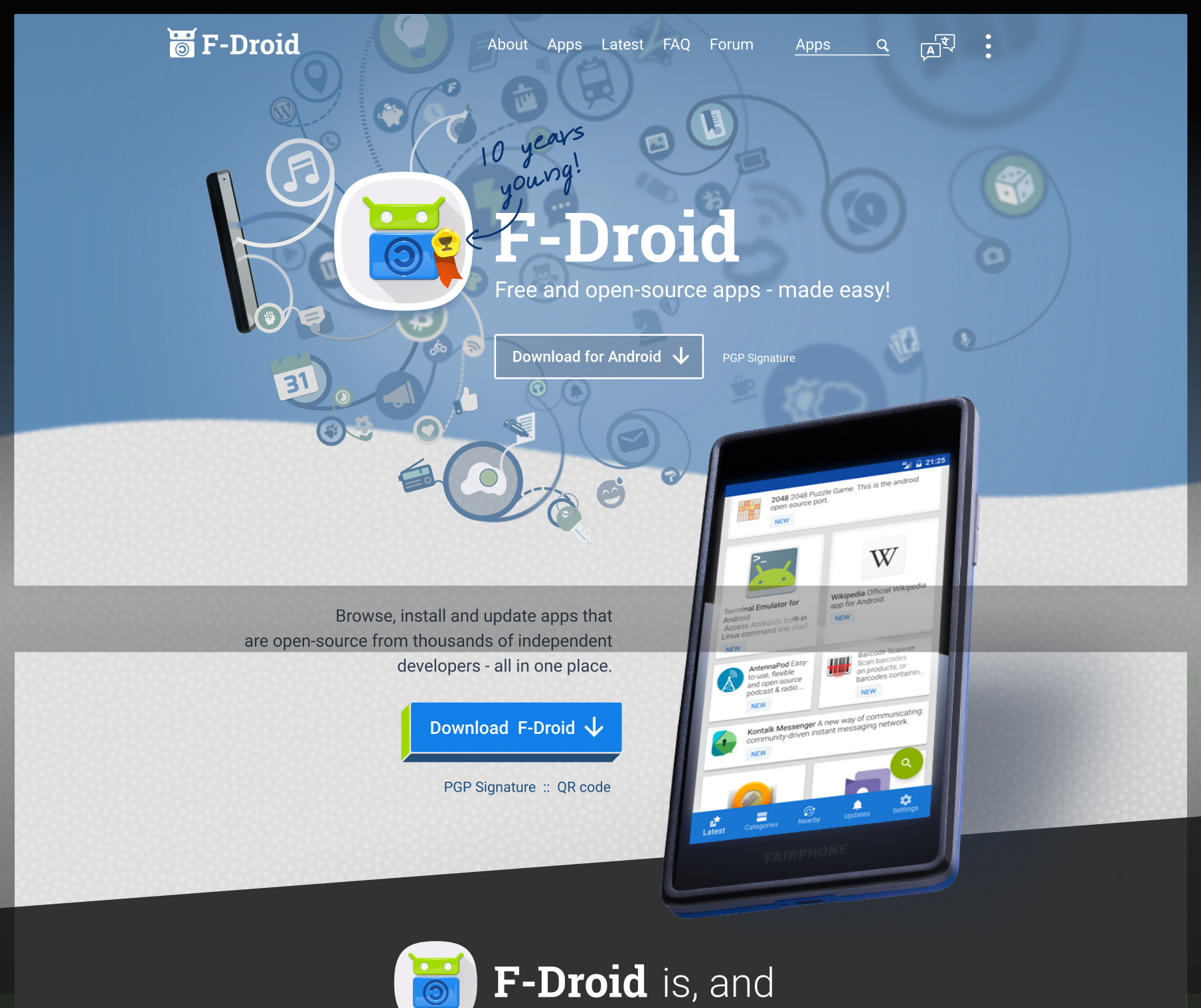
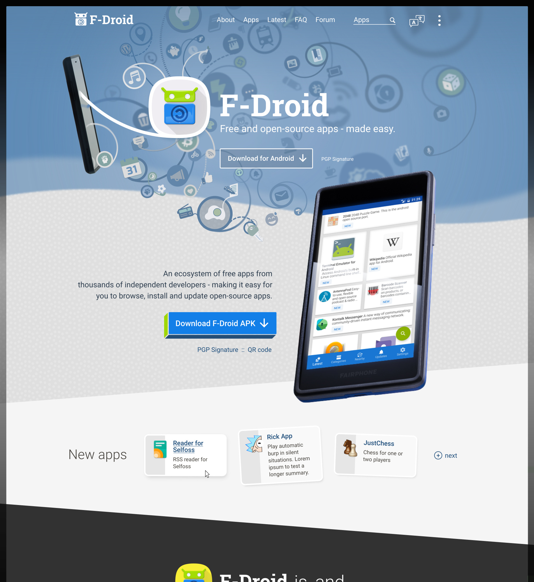
Touching up website before production. This is the desktop version. I made mistakes with the desktop version in the past due to using a terrible old 4:3 monitor.
Please check over. I’ll post up a new mobile version of the website later in a day or so after which time I will need a “go-ahead” from a few people in senior roles.
(See Website landing page revamp - #49 by webDev) for detials of some of the links)
.
MENUS (QR code is now a show/hide (without JS)):
.
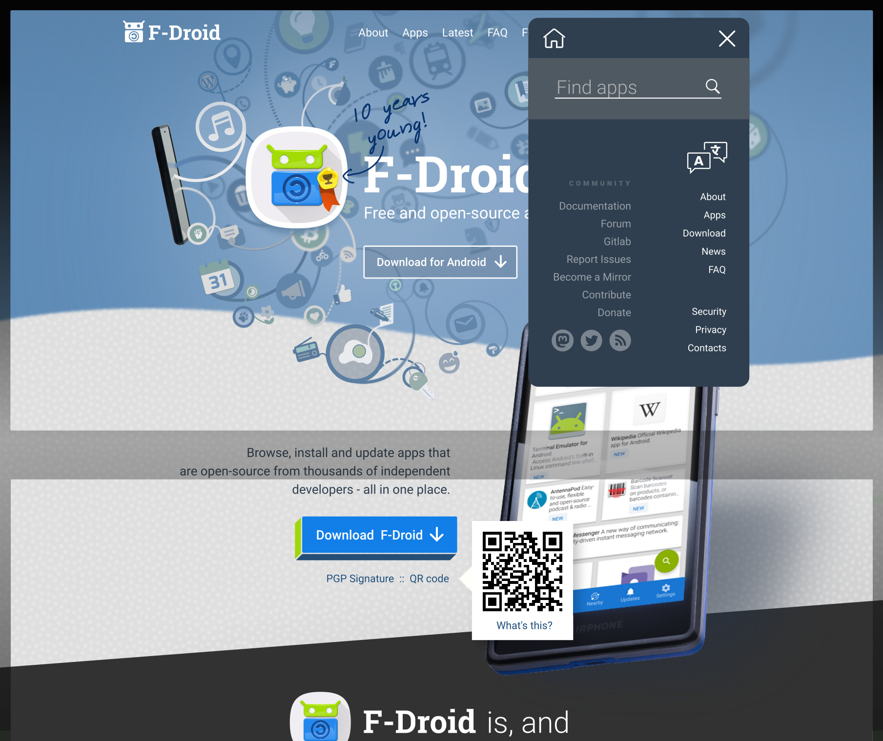
.
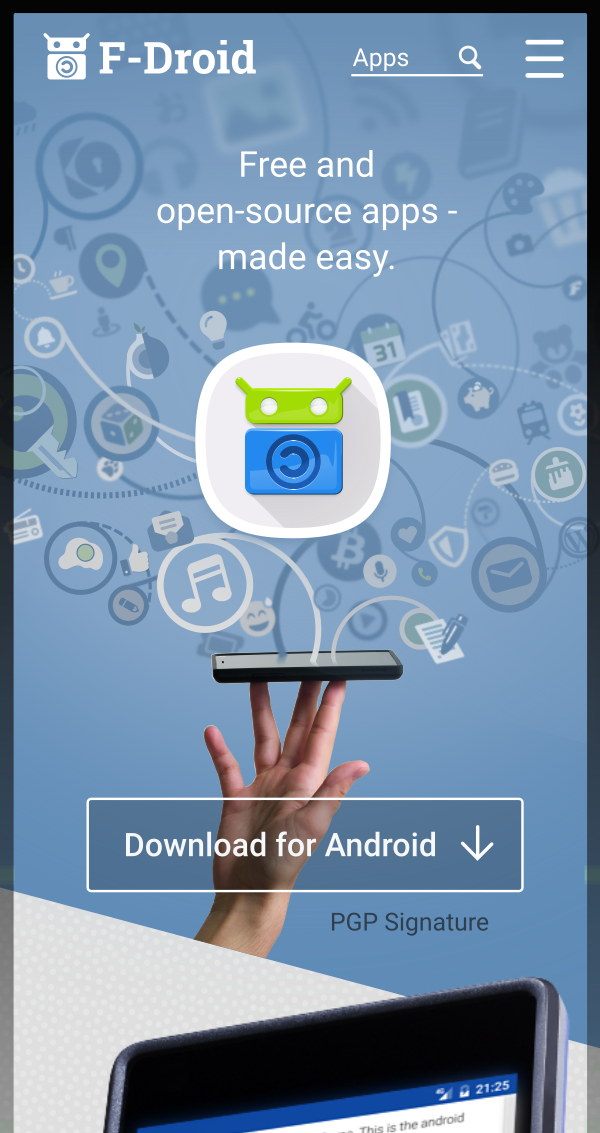
EDIT: In the next pane I used the lively, yellow version on the logo (because it looked nicer on the mobile version), brightened the colours to better match the brightness of the yellow. Improved the text in the pink “Truely free” section.
.
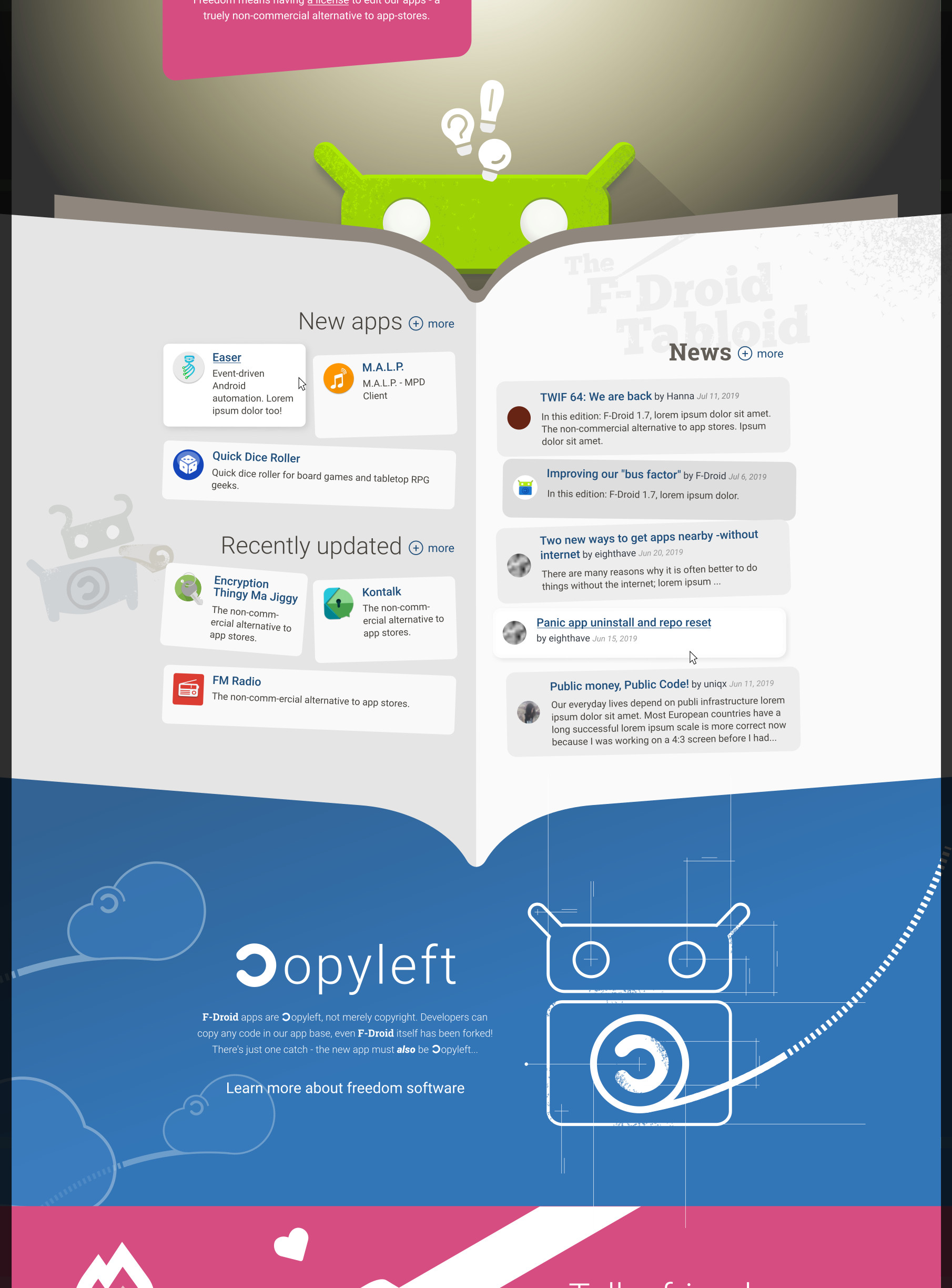
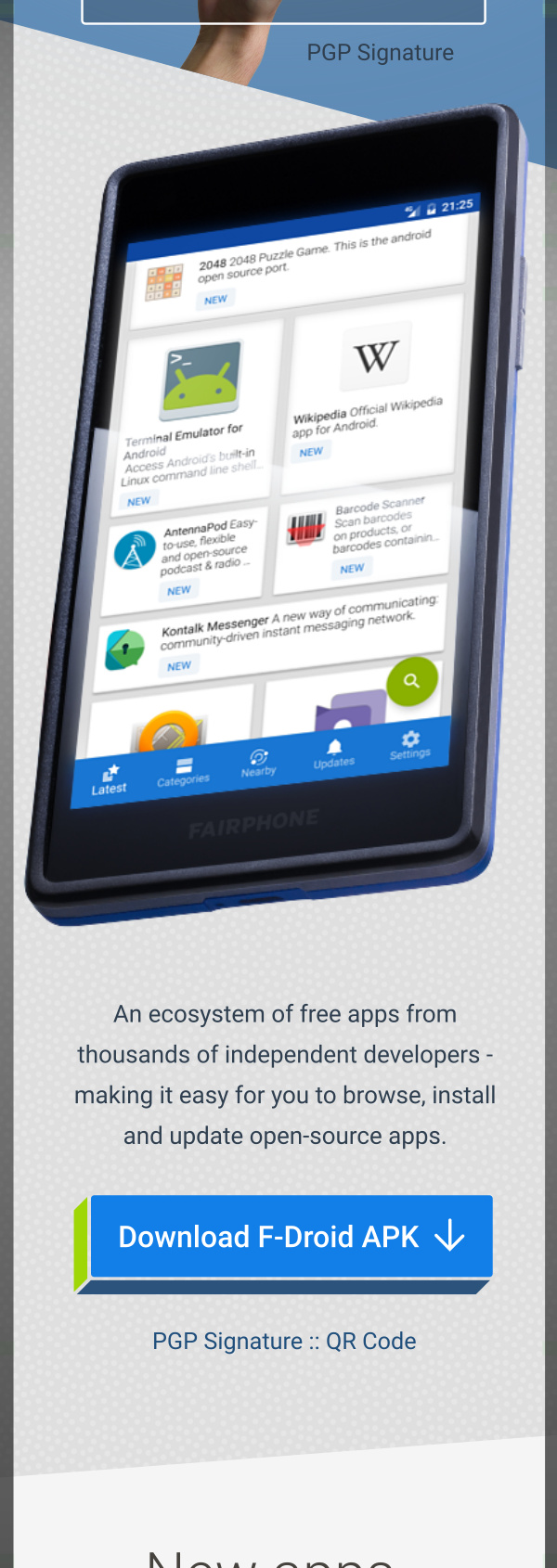
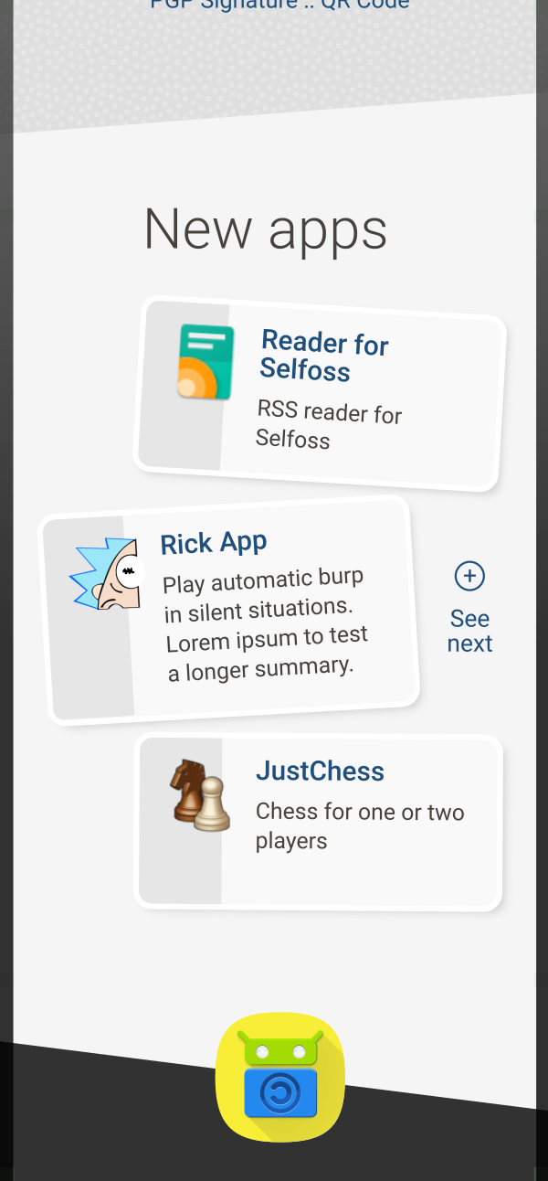
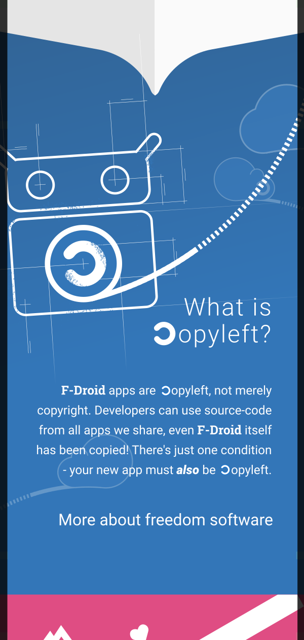
Added a bit of modern texture to artwork. Updated wireframe of F-Droid to new design. After user-testing and feedback (see below) I re-added the title, “News” and put “The F-Droid Tabloid” as a background element instead. Also renamed the app sections to “New apps” and “Updated apps” added “(+) More” buttons after each title. Did a little character illustration. Copyleft text is updated "removed the reference to “forking” as it confused the lay person during testing.
EDIT: Updated Copyleft text again, including the heading, ie. I added “What is” to it. And added a question mark.
.

.
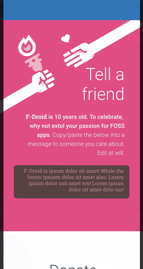
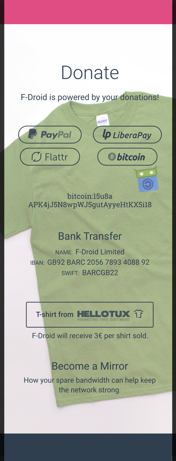
Modern-texturing in artwork added. Real tee photography in background of Donate pane. Also in ‘Donate’ pane moved the bank account details down, based on user test.
.
.
Removed F-Droid logo from footer because it was looking too cluttered. Placed the “final message” after the download button, based on user test, where person did read the button but neglected/skipped over the final message.
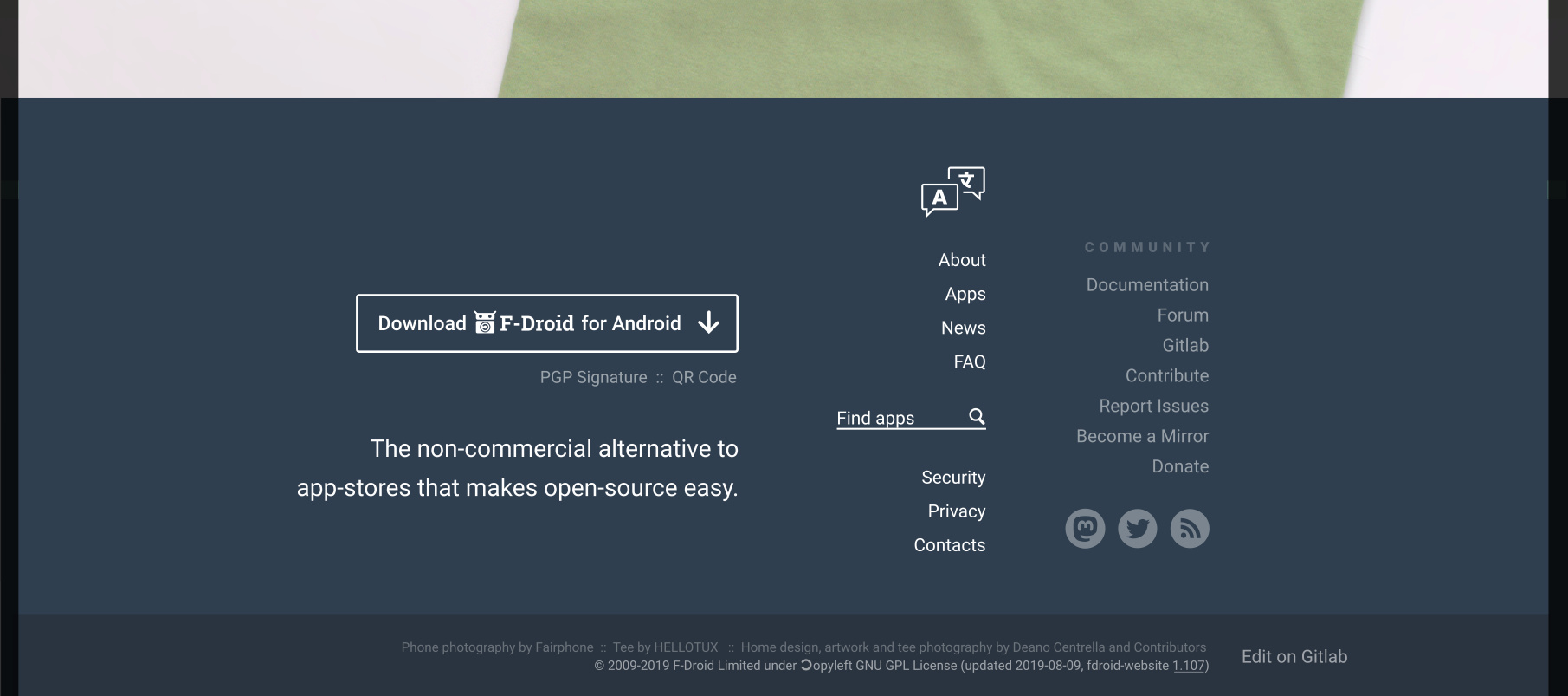
EDIT: If people don’t like any of these changes tell me or I’ll move onto the (arguably more important) mobile version. Please see below also where I implemented a suggestion by @frief, which I think is great but this has implications for the ‘Newspaper pane’. Should the left side of the newspaper feature an additional three “New apps”? This is how I think we should handle it.
NEW links:
- the words, “a license”, in the pink “Truely Free” box will jump down to the ‘Copyleft’ pane/section of the page.
4 Likes
For me as a regular visitor the “Latest apps” section would be the most interesting section.
Developers might also want to see their newly added app prominently promoted.
Having only three entries there (as on the existing landing page) would not adequate.
Could you add “more apps” there (or less addictive) preferably “added last week/month”?
I routinely visit https://gitlab.com/fdroid/fdroiddata/commits/master to find newly updated or added apps.
This gives a good impression of the amount of data that is currently hidden behind/by the three entries.
Hi Frief,
See below. Do you like it.
I’m not sure if others think it is drawing too much attention to new apps, but I like it. I’m thinking that the ‘Newspaper section’ below will then feature the next 3 newest apps? That means we have 6 on the landing page, which is double the existing (3). I have changed the above design also based on a user experience test I did yesterday.
EDIT: I simplified the design removed the “10 years young” arrow and gold medal. I made the phone bigger. Also removed the exclamation point in the header after “made easy”. Improved the text in the second area, added APK to the button so people know what kind of file to expect to use. In the "New apps section got rid of the coloured background bars, and changed “more” to “next” to reduce any addictive triggers. The “next” button will jump down the page to the newspaper section with the next three apps.
What a language! The syntax is a mix of several languages (like PL1) !!!
Personally, I would not add the horizontal grey line (just above Download button).
It seems “too much things” on a screen.
Rem: there are 2 download buttons.
Ignore the grey bar near the top, its to show what is above-the-fold (ie visible without scrolling), similarly there’ll be no black edges.
Maybe I should remove all that stuff to remove any confusion.
So if we scroll, we get part1 or part2 (only 1 button visible) => OK
No you can let the grey bar, just add the info.
Hi webDev,
I really like the look of it, excellent!
From the functionality aspect the page allocates much space for the download option (available twice) and relatively little space to “Latest apps” (the only part where a regular user would find new information).
I prefer “added last week” and “added last month” (or “added since”) over “more apps”.
The latter is probably what nowaday’s users would expect but it conveys less information than the former versions and feels addictive to me;
The user just taps on “more” (mental effort is low) and as there’s no time information the user does not know whether he/she already has scrolled into previously seen/evaluated information - by this you keep him on the site (as you’d expect from a commercial site. Which wants to keep the users on its site - instead of getting the primary interest done (find a new app and use it (thus leaving the site))).
Also “more apps” offers little/no info about how many apps entered recently and does not suggest a recommended reading interval (e.g. week/month).
(yes, I read the book “Hooked: How to Build Habit-Forming Products” ![]()
Hi @hotlittlewhitedog. I removed the black bar (see above). Please ignore the black on the top and sides, they are overflow that will never be seen.
Thanks. If you are a trusted contributor then that gives me some confidence to move forward (EDIT: move forward with coding this into the site. If you are not an official contributor then it still gives me some confidence, thanks). Given your concerns about the word “more” I have changed it to “next”.
EDIT: the “next” buttonwill go down to the newspaper section as mentioned above (in the edited comment). The way the list of new apps is generated, I cannot say “this month’s apps” or “this week” etc
Please see the edited desktop website above. I will attach the mobile version of the site in about 20 minutes so please stay tuned.
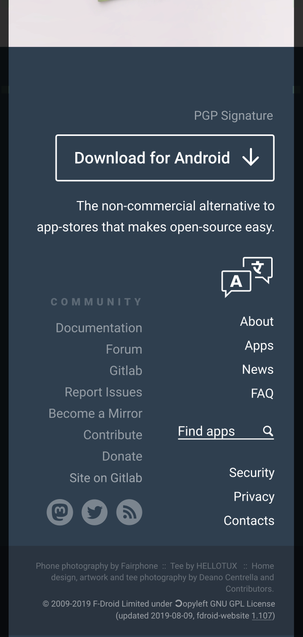
Here’s the mobile version.
If people are happy then that’s great, if you are not an official contributor please tag one that you know.
I will need the go-ahead from at least a couple official contributors so that I’m not wasting time as it could take some time to implement.
If you want to make changes, now is the time to tell me them.


6 Likes
I’ve done a quick search and found that a non-breaking hyphen exists and that we need to use it whenever we write F-Droid.
- U+2011 ‑ NON-BREAKING HYPHEN (HTML
‑)
I’ve noticed that the current website doesn’t use a non-breaking hyphen for the “dash” (‑) character in F‑Droid, therefore there’s a 1-in-20 (approx) chance of “F-” appearing at the end of a line and “Droid” appearing on the next line.
During the above revamp I’ll fix this across the site if people agree.
For example, I wonder if we should setup a global variable $botName and that will output to F‑Droid
GO FOR PROD ![]()