If we start the vote we should do something like 2 weeks. I’d not add more options during the voting phase.
But for this weeks twig maybe we should just announce that we’ll start the voting if no new submissions come in until next …Friday?
If we start the vote we should do something like 2 weeks. I’d not add more options during the voting phase.
But for this weeks twig maybe we should just announce that we’ll start the voting if no new submissions come in until next …Friday?
So, one more week, closing submissions Friday the 8th of June 24:00 UTC (aka Saturday the 9th of June 00:00 UTC)?
Yeah, voting period should be at least two weeks. Maybe it could run until the end of June, or even a full 4 weeks. I like June because it’s memorable.
Then let’s extend the submission deadline until Sunday 10th, 2400 UTC and Voting afterwards until EOJ (End of June ![]() )
)
I’m not a lawyer but I think the icon has to be visually distinct enough from FireFox that people could not possibly mistake the two. This is because of trademark law (at least in the US) which is in place to protect consumers from being duped by a company impersonating another company.
I don’t think the proposed design is distinct enough from FireFox. I’m concerned that Mozilla would ask for it to be changed.
Shape is different, animal is different, colour is different, pose is different, what else is there to change?
Mozilla seemed to agree that the Iceweasel icon was different enough so I think we are good here.
A fennec is a fox; the animal is not different. Both are foxes wrapped around a globe with their tail gripping it. All I’m saying is that people could realistically say “is this FireFox?”
It’s possible I’m being paranoid, just wanted to throw in my 2 cents.
Yea I see what you mean, but for the latter, the Firefox floats in front of the globe as opposed to this Fennec which grips the globe. The old Fennec logo is more true to what you said for sure
I honestly wonder in how many languages Fennec gets called fox, in Polish it’s ust Fenek, without any mention of fox ![]()
I think if Mozilla had a problem with the use of the animal they’d have voiced their disapproval with the use of the name a long time ago.
Any news, when the new icon will be chosen?
Any news?
Even Mozilla will move on soon: Evolving the Firefox Brand - Mozilla Open Design
That looks a lot like the gitlab icon ![]() .
.
Anyway, someone needs to step up and facilitate the voting here. I don’t have time to do it. After that we still need to integrate it into the fennec build, but we can worry about this later.
Some feedback on the pale “fennec sleeping around earth” icon (last one above), in relation to its use as a launcher icon.
In terms of a material design necessitating a redesign of everything else in Firefox, I’d disagree.
Consider the home screen an “application” that benefits from design coherence (since it’s all shown at the same time).
Once the application is launched, the screen is taken over by the application, and so it now “owns” the design language. So actually having a material design launcher icon, then a (somewhat) different application design language isn’t a conflict.
I actually think the first-draft flattened icon is a very good start - it’s a good colour pairing, it works at a small scale, and it’s distinctive. The only thing I’d say is the same re. the egg shape - it would benefit from a tweak to get rid of the apparent egg shape oddness.
Looks like something might come of this: 1479724 - Provide Adaptive icons for Beta and Dev builds
A quick proposal (based on the existing Fennec icon; Earth background adapted from Sam Hewitt’s “Paper Icons” Firefox icon):
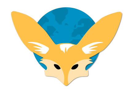
SVG: -svgshare.com
Licence: CC BY-SA 4.0
Please make it round (or square)…the (whole) shape (too long on one side) is the problem (in my view) not the colours.
