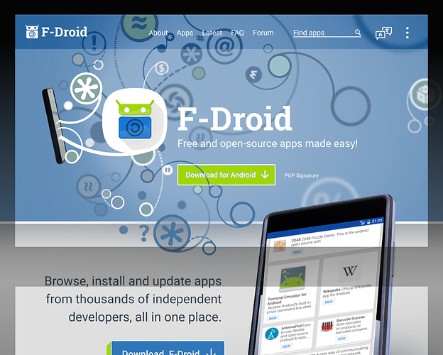
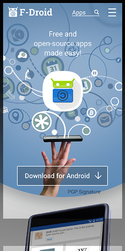
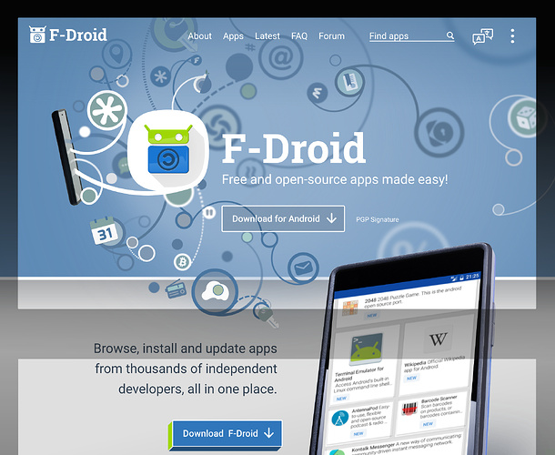
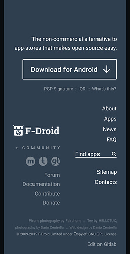
Website landing page revamp

You make a good point, Shubhamttagi.

The hand makes sense on the mobile version of the website because it is clearly holding up the phone in a liberated fashion whereas when I rotated the image 90 for the desktop the hand could be easily interpreted in a negative way, haha.

I’ll add a new version to this comment removing the hand from the desktop version. (The two versions have a slightly different header anyway. There’s a simple embedded-CSS trick to allow the mobile and desktop websites to fetch (immediately) only the image that they need).

Also added the search to the top bars.

Any other thoughts?

I think a Latest section could show the latest 10-15 apps scrolling past, if the user has JS enabled then they can control the scrolling. I think that Latest news might also work in this area too.

I was torn as to whether to rename the News section to Blog, as specified by Redplanet’s friend. Blog has a personal connotation whereas News implies a community. Perhaps I can combine News and Latest apps into a single Latest pane?

Your thoughts are always welcome. Thanks.

Nice… some thoughts…

  • the hand
  • embRaces
  • pls no label on the phone
  • this can be achieved without Javascript?
  • on Desktop the embossed download button looks out of place
  • on Mobile the download button should be on the first screen always

1.Real hand may be replaced with sketched hand.
2.Download button should have text “Download F-DROID” on desktop. On Mobile version it should be “Install”.
3. The phone in hand may be replaced by Download button.

I would have replied about an hour ago but the connection on the Ubuntu is ridiculously sketchy. Retyping this on another device.

Hi Licaron

  • the hand
    Done. Removed from desktop. Kept on the mobile version but flipped it back to the way it was originally approved (I only flipped it horizontally so the lighting matched).

  • embRaces
    (lol thanks)

  • pls no label on phone
    Have changed it from white and extremely high contrast to much lower contrast. Fair call. Keep in mind that we are using Fairphones photos for free, and all they ask, according to their website is that they are attributed somewhere.

  • poss w/o JS?
    Yes.

  • Desktop embossed DL button looks out of place
    It’s a 3D button that I can do with CSS. It is supposed to look like its extruding out of its place, when people hover over it will half press and feel very smart.

  • on Mobile the download button should be on the first screen always
    Done.

Hi Shub,

I feel that adding one handdrawn element might compete too much for the users attention because it might look out of place.
2. I’m trying to avoid all caps. For consistency and legibility.
3. Kinda done, ;), thanks

Here are the two with fixes described in previous reply.

Click to scroll down

7 Likes

The first button (and the general look) is not very 3Dish, hence this one thing looks out of place, imho.

F-DROID is only for Android!

Why button have text “Download for Android”?
It should be simply “Download” or just “Install Now!”

The hand i am referring to is hand vectors.

Hmm… the two buttons match in terms of font, icon and even the white border, the colours match the current interface alongside and the F-Droid logo. Its not matching in terms of size. It could be the size that is throwing your expectation off. Innumerable sites have differently stylized download buttons that reflect the region/pane that they are placed in. For example what I needed to do in this region is match the other bold and high contrast elements and shapes.

I dithered about a bunch of things in this design, but that region is one that I thought just worked. Maybe I’m wrong. There was another guy on here who suggested a 3D button might be neat and so that started as a response to his request and I actually really liked it when I did it.

Shub, have you read this guys Communication Strategy (F-Droid: Communication strategy)?

EDIT: Vectorised fist holding a phone is a cool idea if we were to focus on the ‘take back your privacy’ aspect in a future header image. Maybe for people who have JS enabled we should do this, solely BECAUSE they have JS enabled, :wink:

Yes, I just changed the size of the paragraph (to match the slogan in the top header) and also the button to match the other button and it does look better. Thanks.

One is flat and one embossed/3D…far from matching…

I really like that design.
As developer it’s always hard to get a good design or UI, so I’d really appreciate this.
You wrote earlier that you’re waiting for people to reply: I haven’t had any idea what to say, as I’ve got nothing to contribute to this :wink:

1 Like

Hi Licaron, Matching design elements is maybe more correct, yes. You’ll see the design soon, then you can tell me if the resize is effective.

Thanks Ox0p54, haha understood.

Not far from having an initial design.

EDIT: N/A see below.
(Does anyone have F-Droid apparel from Hellotux that isn’t black that they can photograph from above? If so lay it down on a white or grey surface. It doesn’t have the be a great surface because I can trim the it from the image if needed. You don’t need to get the entire piece of apparel in the shot either, I’m thinking portrait shot that gets neck hole, 1.5 shoulders, 0.5 sleeve and F-Droid icon should be fine. Throw it down so the folds appear somewhat natural.

NA (I need it for the background of the Donate pane. If you are willing and able to photograph it, tell me and I’ll wait for it. If I don’t get an affirmation from anyone here I’ll see if Hellotux can do it. )

EDIT: Gabor of Hellotux has very kindly offered me an item to photograph and I have chosen the green tee. Hellotux are to be commended. In the meantime I will use a placeholder image.

1 Like

Hey @webDev,

I’m agreeing to @Ox0p54. I also just want to chime in shortly and say that your screenshots posted 5 days ago look absolutely amazing! Thanks a lot for your work on this!

Thanks Nicoalt,

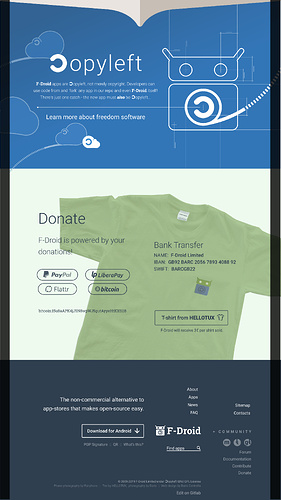
A full initial design is below. I expect people to have ideas to improve it.

I felt the copyleft symbol would need explaining for the new user so I also did that. The learning more button will load the GNU page. The only external link.

Still need to finish the top artwork and properly place the app image onto the phone.

I assume that the footer can be improved/made more hekpful? Redplanet, your friend? Also will put the (c) 2010 2019 F-Droid Limited and Contributors. Is the website also copyleft?

7 Likes

Wow, @webDev, I love your proposals! They looks so refreshing yet not overwhelming.

Some outstanding questions I have:

  • Does everything work without JavaScript? From my personal webpage (mobile version) I know those navigation bars can be expanded and closed without JS.
  • How do we start to implement it? I have absolutely no idea on how to do it. How did you design those proposals? I guess we need to collect your graphics somewhere. Do you also have some CSS/HTML stuff we can use or did you make it completely with image manipulation (Gimp, Inkscape etc.)?
3 Likes

Thanks NicoAlt,

Yes the plan is for this to be fully functional without Javascript. Thanks for the link to your page. Yes I have explored a couple of JS-free menus, so your example is another helpful addition to that. Thanks. I look forward to exploring your website in more depth.

Inkscape is what I used to get this done. I anticipate that after some consolidation and touch-ups, I’ll be ready to start building it.

During development the page address should be something that search engines cannot easily find. Maybe landing-page-dev then some random numbers “24578” dot F-Droid.org? Then in PHP I will tell search engines if the URL is that one, that they should not index it or crawl it, if they do see it.

Also, the tee in the photo is actually not a Hellotux tee. I just did some basic masking and colour overlays, to fake it, until I photograph the genuine article.

Wow, that’s even nicer! Thanks so much for working on the web page!

Regarding my web page, that’s the theme I’m using:

It’s licensed beyond MIT, what means we can freely use it for our purpose at F-Droid (while mentioning its creator). Even if it’s just the tiny little navigation bit.

However, our website is still based on Jekyll. If I remember correctly, the plan is still to migrate to Hugo, but we aren’t there yet. This leaves you in a difficult situation: should your design get implemented in Jekyll, which sooner or later gets dropped, or should you start with Hugo, which puts the burden of finalizing the transition from Jekyll to Hugo on you. I opened an issue to check and track the progress on the transition, but so far I haven’t received any feedback. To recap what happened in the past for you shortly: @Coffee started to create news.f-droid.org (source repo) with the intentions to one day move all Jekyll stuff to Hugo. At the same time, they also moved the website of the Guardian Project (source repo) to Hugo. When working on the transition, @Coffee at one moment stated that the build time of F-Droid’s website dropped from some hours to some seconds. Differently said, the website only needed less than 10% of the time to build. This makes it really worth to migrate to Hugo.

Hopefully, @hans can comment on this.

If you fork fdroid/fdroid-website on GitLab, it comes with a nice goodie: it automatically creates and deploys the page with GitLab Pages. See Hans’ page for example: eighthave.gitlab.io/fdroid-website. Therefore, no need to create something at f-droid.org.

I’d say that the non-JS menu on Nico’s web is not only an example of the checkbox hack, but a quite elegant one, from those I’ve seen.

1 Like

I like the design as a whole!
I’d just highlight the menu (background) and download button a little.

Desktop:
9760d5130a096fc3e9d2e31f9b3697922649a5f0_2_624x500

btw. I have registered especially for this purpose

NOTICE:
sorry, as a new user I can’t post more than one picture.

4 Likes

Response to everyone with pictures has been penned on another device but Wifi is playing up. Expect a response soon, or in about half a day.

Thanks NicoAlt for your help with this background info.

The gitlab site deployment thng is neat, so basically I can treat it like a git branch? That is useful.

I will need to learn more about this Hugo from the resources that you’ve provided. I am happy to use Hugo but didn’t really intend to do any “model” changes (model as in Model View Controller/MVC) if I do have to do any Model changes I may probably request that someone else do it or that the code/SQL(?) patch be checked by someone, just because I’m not familiar with the architecture of the website nor the app. If there is up to date documentation on the model and architecture then I’ll read it.

It will be soon be time for me to start reading the docs and code.

Yes @roboe, the Hugo example is a nice example indeed. On Tor the Hugo theme does seem to run into a few problems, Font Awesome is not great for Tor users, so I’ll do the hamburger icon manually with span elements.

Similarly, the social links, if we want to use them (see updated footer design below) will need to either not use fontawesome or have an appropriate fallback, as shown in the updated design.

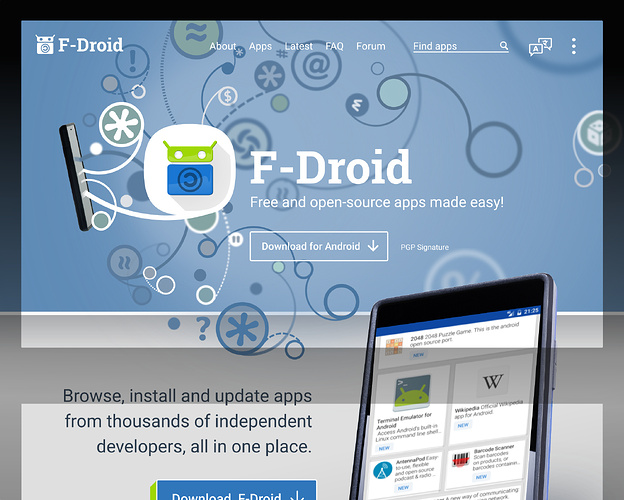
Hi F-D fan, good suggestions! With the top bar I have added a blue grdient to ensure that the text is legible. The topbar is not really supposed to be attention grabbing at all, so I am avoiding a hard background. I felt that we need to exude and open-sky simplicity. I did the same on the mobile version and I really like it there especially because it guides the users eye downward towards the “Open source made easy” message. Great suggestion.

Re the Download button I understand your interest in helping it to stand out a bit more. I have updated it to match what I did with the mobile version (ie. put in that dark-glass effect). I know that you wanted to use a bright green colour but there is a bolder download button in the pane immediately below. You may need to click the image above to see that. That button is designed to get attention if the user does happen to miss this one. For the very thorough, who read the entire page, there’s also a DL button in the footer.

Updates…

Updated Header with FD-fan’s ideas integrated.

Footer updated (plus matched the Copyleft content on the desktop to the more recent content I wrote, woops)

10 Likes