F-Droid: Communication strategy

The following post is written by a friend of mine
(I’m posting it for him because there is a limited amount of allowed attachments for new users)


Hi! I’m an advertiser and communication designer based in Vienna. As part of a small work for work deal among friends, I was tasked by @redplanet to take a look at F-Droids web-presence and kick off the development of a more thought out and unified line of communication. (Context)

This will basically be a dissection the current website, focusing on the front page, and the overall structure of the site. The goal is for me to provide you with a professional outside perspective, and hand you the tools to extrapolate from there. All drafts provided here are meant to illustrate different talking points - not Screen designs. Heads up: There’s gonna be a lot of marketing lingo.


Let’s dig in:
F-Droid has become the household name to source FOSS-apps, built and supported by a highly involved user base. The outward appearance of F-Droid has grown accordingly. It is very much geared towards a technically adept crowd, that largely already is part of the open source community and F-Droids user base.

Currently, little explanation and a lot of information that isn’t meant for newcomers generate a high psychological barrier of entry. Potential users that may have heard of open source software, but have little to no touching points, might be put off by the usual stigma: It will be hard. It will be inconvenient.

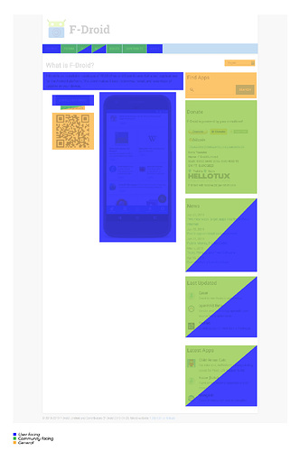
Word of mouth, merch, tech-press… Except for third-party hosts, it always leads to the website. As this is the way for F-Droid to acquire new users, convincing them they should try it, should be the first priority of the website. Marked in blue is the part of this process we are trying to streamline.

With hallmark open-source apps on more and more android screens, and online-privacy being a public concern, the time is right to spread the gospel of FOSS-Apps and grow F-Droid. Entry-level nerds, part-time technophiles, ex-facebook-users. There is a lot of potential F-Droid users.

In order to achieve that, the website needs to communicate in the simplest way possible what F-Droid is, and what sets it apart.


What are others doing:

Notice that both follow a similar structure:

  • Simple, unintrusive Navigation

  • Headline and lead text: The concept broken down in the simplest way possible.

  • Explanatory image: App in action

  • Call to action (download)

  • References (anchor to what new users are familiar with, who they trust)

  • Bullet points and features: Illustrated and simply explained.

  • Mastodon goes on and gets more into depth, but essentially repeats these elements.

It’s essentially an elevator pitch.

Signals approach is very simple. Mastodons approach is slightly more technical. I feel the sweet spot for F-Droid is somewhere in the middle.


User Behaviour:
Assume that new users know nothing about F-Droid. Assume they don’t care. They have no investment, and are unwilling to spend a lot of energy to understand. On the other hand, users have no problem scrolling, clicking, and navigating content themselves - as long as they’re able to intuitively find what they need. When it comes to apps, they are looking for things that will make them live better lives, and make their lives easier.


Structure and Navigation:
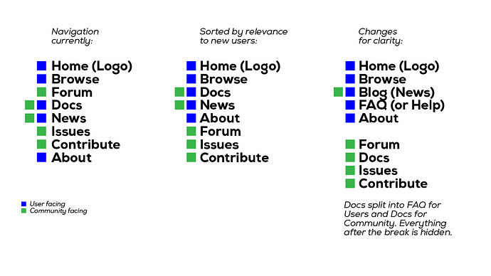
Let’s try applying this to our case. Currently the navigation feels organically grown, but not logical. (To clarify: I am using „community“ as a shorthand for everyone who has downloaded and tried the app, and is willing to actively interact with F-Droid or the people behind it, by contributing or donating.)


Information meant for new users, and information meant for the community should be seperate and visually distinct. Here are some examples of what that could look like:


Front Page
The front page is the place to tell F-Droids story in a quick and simple format. To explain what F-Droid is, and what sets it apart. So what’s special about F-Droid?
_

Core values (All of the initial communication should revolve around these):

  • makes open source easy (Not the technicalities of open-source, but the advantages and principles)

  • independent, for the people - by the people

  • secure

  • the non commercial, alternative to app-stores

_

Secondary values (These should be implied, as users have come to expect it):

  • trustworthy

  • professional

  • convenient

  • fast

_

Antivalues (Connotations to be avoided):

  • hard, complicated

  • corporate


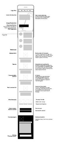
Here’s my take
… on a new structure and wording of the frontpage.
Disclaimer: English is not my first language, and I’m not an F-Droid expert - So no guarantuee.


That’s it. I hope this was useful to everyone involved in reworking the website.
I will be lurking here for a while, so feel free to ask or critique.

Cheers, Roman
10 Likes

Hi Redplanet,

Good to hear back from you! This is brilliant. I especially like the copywriting. Your friend is a skilled english communicator. The copy really distils a bunch of thoughts and ideas I was hoping to bring together.

I assume your friend uses F-Droid?
He sounds like a native.

I’ve spent a bit of time incorporating the ideas into a design.

Will post images in the coming days.

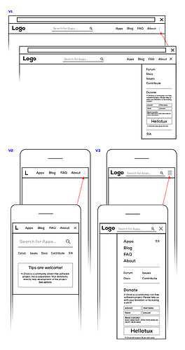
The three dot menu button is not quite legible in the design that I’m doing, I’m trying to have no top bar background colour.

I think is might be nice to show the Forum link in the top bar on the desktop view because it shows the existance if the community.

I doubt that I’ll be able to fit the donate content in the mobile menu, but we’ll see. Some mobiles are tiny.

Yes, the language button is so much easier than drawing a flag for every language. I came across that idea a few days ago and swiftly adopted it, on the desktop I want to put it just to the left of the menu hamburger. ie. not in the hamburger. Is that okay?

In my design I’m doing something like the first example. I’m put some artwork at the top but there’s a hint of a mobile phone displaying the interface. The person scrolls a bit to see it. The interface has contrast that might compete with writing that we try to position over it. Does that make sense. I also think that the current UI in the app is not perfect yet also. The bottom blue bar icons and margins need a tweak, imo. Also I think that FDroid is so special that good artwork will highlight how great it is.

Its an exciting time!

In my opinion we also have to define userroles as Personas to see the needs, permissions and duties of different types of usergroups.

Different dimensions:

  • Android+GPlayStore: novice, non-technical-user, technical-user, android-developer
  • FDroidStore: novice, non-technical-user, technical-user, non-technical-contributor, technical-contributor( android-developer),
  • Security/Privacy: not-interested, novice (interested but no deep knowledge), advanced, expert, developer

Possible personas:

  • The current f-droid website is mainly from the perspective of a technical-user/contributor, Lets call this user “Teresa Technocrat”
  • The new f-droid website should make it more easy for non-technical-novice-users to enter the f-droid-universe. Lets call this user “Nicky Novice”
  • “Anton Activist” a non-tecnical student of political science who wants to learn more about “Security/Privacy”
2 Likes

Yes k3b, I do see the use case for Activist Annie.

I’ve added this bullet point to the bullet points in Reddragon’s friend’s post, “Private: With Orbpt and Tor Browaer, on F-Droid, you can take back your privacy from Biy Data. Learn more” or something to that effect. I also added the bullet point "Fast: (something about the large decentralised network of nodes that’s always growing).

If you have further ideas, pass them on.

I’ll publish the work Ive done soon.

1 Like

BTW I wonder if in one pane we can inspire interest with a few big numbers. I know that F-Droid serves a lot of people. Any approximations, as to nodes, people served, daily apk serves?

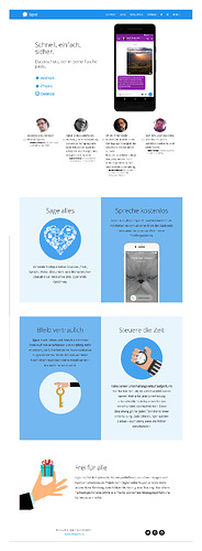
Here’s the design so far.

Thoughts and suggestions welcome.

:wave:I think redplanet made some good suggestions how to improve structure and navigation of the website, which is clearly in need of a new design.:wave: I totaly agree that the website needs to communicate in the simplest way possible what F-Droid is, and what ist sets apart. But I’m afraid, the actual drafts are more simple than possible and deprive possible users the information necessary to make a decision for frdoid.

redstone writes: "Assume that new users know nothing about F-Droid. Assume they don’t care. They have no investment, and are unwilling to spend a lot of energy to understand... they are looking for things that makes their lives easier"

Users who don’t care about fdroid an are unwilling to spend energy to understand how it works woun’t profit from frdoid and - therefore - woun’t use it. Leaving the fleshpots of google with its plentitude of apps and beautiful UIs is a way that leads directly to the dessert. But living in the dessert doesn’t make life easier. It makes life harder. There is no transcendent shine of a promised land behind the horizon. The dessert is all fdroid can give to you.

Rahter than thinking about new users as stupid and unmotivated consumer, we should assume this:

The new user has heard the call. He is willing to follow. But he’s technicaly unskilled. He doesn’t know whom to follow. There are many wrong prophet out there selling placebos for freedom, privacy and security. That means, the knew user needs information to make a qualified choice. But a qualified choice needs more information than fit in two or three senteces.

Experienced fdroid volunteers are, as restone pointed out, often blind for the unknown unknown of new not technical users. On the other hand, the extend of presented information should not be to much reduced. How the landing page shoud look from my perspective as a not technical user:

Fdroid - claim*

button: what it is |button: how to use |button: who we are

what it is

Fdroid is an android appstore for free and and open source software with a focus on security and privacy.

security

  • While playstore aps are compiled by the developers, all apps in frdoid are build from source by frdoid. This guarantees…

  • Most of the builds are link:reproducible (don’t know, if that’s true)

  • Before the first build the frdoid team inspects the source code for privacy and security issues. link:extent of testing

  • Since the establishment of froid in … there has never been a known case of distriubted maleware

privacy

  • The source of all apps in the repositry is audited for pricacy issues. Apps with privacy risks are marked as “contains features you may not like” link: list of anti features

how to use

  • The intendet way is to download the frdoid apk. After installing, you can use frdoid like any other appstore.

  • Installing fdroid requires “allow unknow sources”. → here needs to be explained, why this is not a genuine security issue

  • If you are a technically gifted, you can avoid allowing unknown sources by installing frdoid OTA. Link:how to

  • Alternativly you can download apk via the website. But in this case you need to install updates on your own.

  • Why is frdoid not available via playstore like other apps? → needs to be explained

kown problems

  • Due to FOSS only the selection of apps is significantly smaller compared to other app stores.

  • Some apps are out of date. We are working on a way to inform users about outdated installed apps

who we are

  • fdroid is a non profit ltd (really?) runed by volunteers and donations

  • how to donate

  • contributers

    1. Nico Alt
    1. Laura Arjona
    1. Ben Arnold
    1. Michele Azzolari
    1. Danial Behzadi
  • where to get help

  • form, chat

*What about
Fdroid - leaving the fleshpots of Google?

Very compelling ideas, @RuudRon While Redplanet’s friend has done a phenominal job, it was not 100% complete. I think that this was purposeful, to give the community a chance to provide their insights. Redplanet’s friend provided the bones and it is now on us to flesh it out.

What I like about your ideas are the focuses of security and privacy.

I have attempted to relay similar information in this design Website landing page revamp - #35 by webDev in the area with the colourful backgrounds I added something about Privacy.

Tell me your thoughts. The icons for each coloured space are placeholder icons btw. They are rough.

We need to be careful able what we say about others. If we have lack positive things to say about someone else or some other entity, it is maybe better to say nothing at all?

I also like your quote “Since its founding in 2010, there has been no known cases of distributed malware on F-Droid.” I’d also add that where there’s security concerns or known issues these are clearly shown and it’s easy to see how up to date the app is, by using the info on the app’s screen.

Although the above points are not directly made in Redplanet’s friends idea, I do think that it is succintly encapsulated by the phrase “open-source made easy”. So I have repeated a variation of that phrase in the footer.

I like your ideas regarding installation instructions, “How to use/install”. To try and make this landing page as clean as possible I put a link under the download button, “What’s this?” , with the intention of linking to a page with Install instructions and tips on how to verify the download using PGP signatures etc. Tell me if you think the footer should instead have a link, “Installation Guide”? I’m actually not privy to all the install methods so will be depending on an existing knowledge base.

This topic was automatically closed 60 days after the last reply. New replies are no longer allowed.