Touching up website before production. This is the desktop version. I made mistakes with the desktop version in the past due to using a terrible old 4:3 monitor.
Please check over. I’ll post up a new mobile version of the website later in a day or so after which time I will need a “go-ahead” from a few people in senior roles.
(See Website landing page revamp - #49 by webDev) for detials of some of the links)
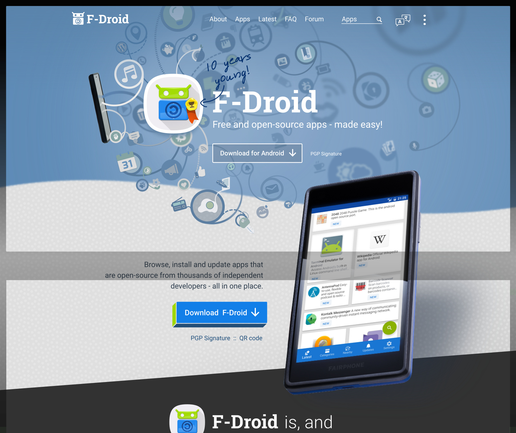
.
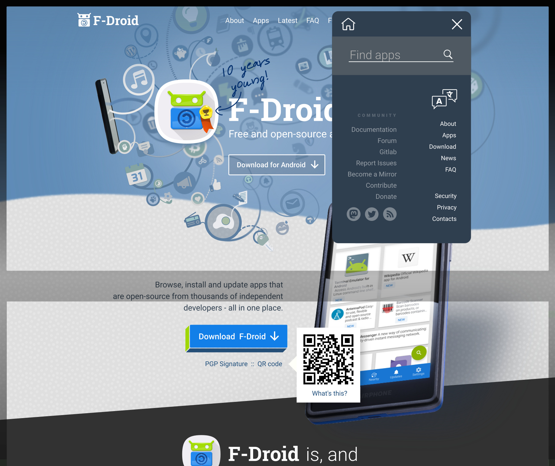
MENUS (QR code is now a show/hide (without JS)):
.
.
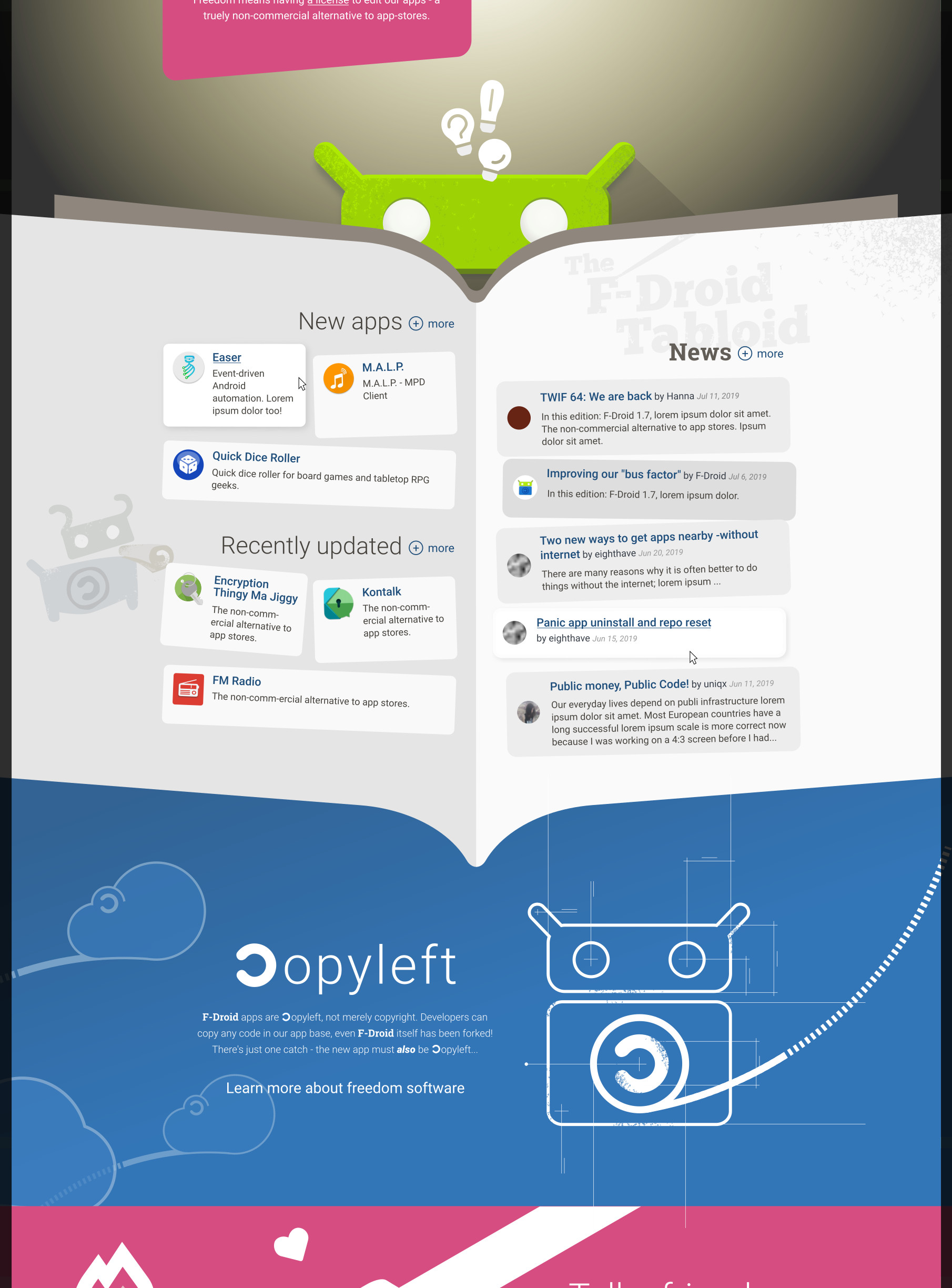
EDIT: In the next pane I used the lively, yellow version on the logo (because it looked nicer on the mobile version), brightened the colours to better match the brightness of the yellow. Improved the text in the pink “Truely free” section.
.
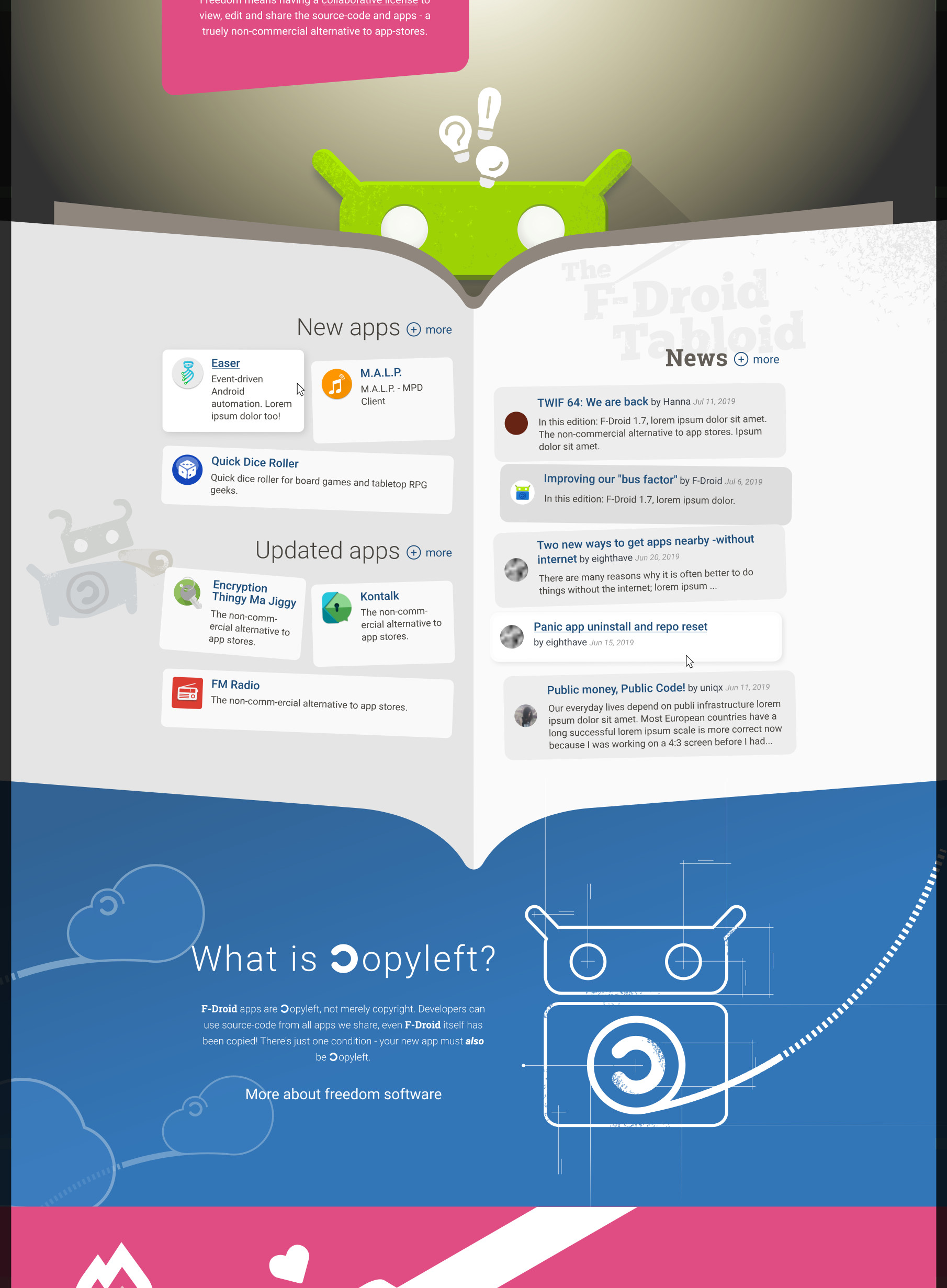
Added a bit of modern texture to artwork. Updated wireframe of F-Droid to new design. After user-testing and feedback (see below) I re-added the title, “News” and put “The F-Droid Tabloid” as a background element instead. Also renamed the app sections to “New apps” and “Updated apps” added “(+) More” buttons after each title. Did a little character illustration. Copyleft text is updated "removed the reference to “forking” as it confused the lay person during testing.
EDIT: Updated Copyleft text again, including the heading, ie. I added “What is” to it. And added a question mark.
.
.
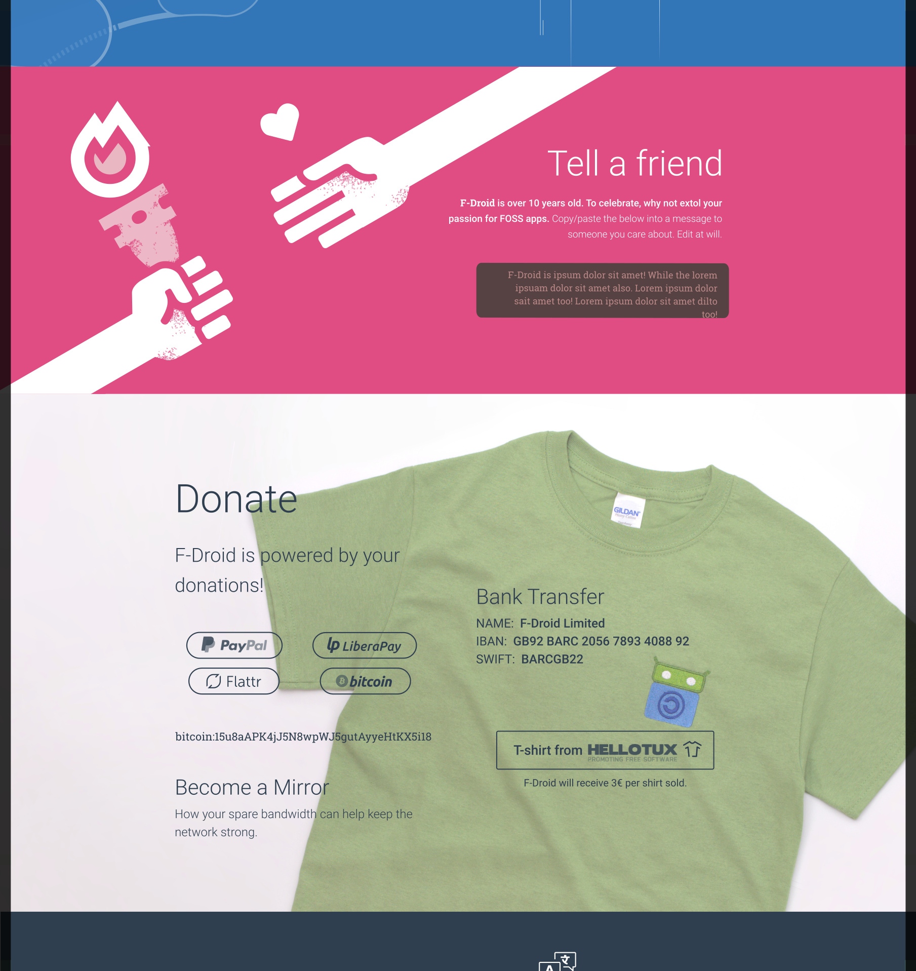
Modern-texturing in artwork added. Real tee photography in background of Donate pane. Also in ‘Donate’ pane moved the bank account details down, based on user test.
.
.
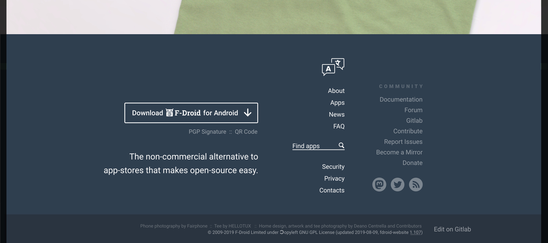
Removed F-Droid logo from footer because it was looking too cluttered. Placed the “final message” after the download button, based on user test, where person did read the button but neglected/skipped over the final message.
EDIT: If people don’t like any of these changes tell me or I’ll move onto the (arguably more important) mobile version. Please see below also where I implemented a suggestion by @frief, which I think is great but this has implications for the ‘Newspaper pane’. Should the left side of the newspaper feature an additional three “New apps”? This is how I think we should handle it.
NEW links:
- the words, “a license”, in the pink “Truely Free” box will jump down to the ‘Copyleft’ pane/section of the page.