@hans I spent a bit more time thinking about what was important for the forum icon and more time working on the final result.
.
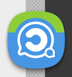
Mobile app icon:
.
Website (desktop):

.
Website (mobile):

.
Favicon (16px):
![]()
If people like this design I’ll push it to the branch.
So the choices for voting are:
a) Don’t like anything,
OR
b) Like the icons for F-Droid,
AND/OR
c) Develop the faux-3D forum logo, or
d) Develop (or push for merge) the white-bubble forum logo.