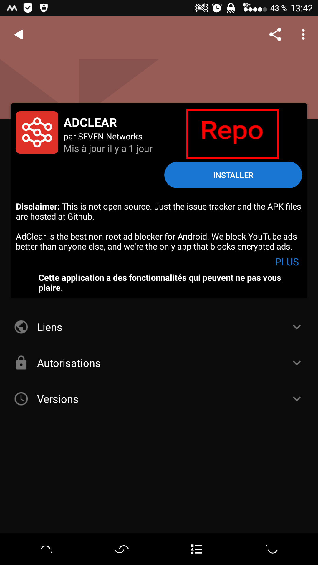
I added a new repository this morning and after updating all the repos, I thought it would be great to have the related repo on each app info screen.
2 Likes
I think it would make sense to add the repo URL to the Links (Liens) section. The link would be to the root of the repo, e.g. Guardian Project Official App Repository. We’re working towards making an auto-generated index page there that people can then add more info about the repo. The tricky part would be whether all of the repos that have that app should be shown, or only the current active one.
I upgraded to 0.103* and it was completely unusable. I had to downgrade to the awesome 0.102.3. Please don’t destroy the quite good user experience. I really like the efficient UI of 0.102.3. The new UI lacks many great features and the user experience is disturbing, poor and time consuming.
e.g.:
- In 0.102 I could see what applications are under F-Droid’s control. I can’t find that in 0.103. This is a deal breaker. It makes the interface a lot less usable.
- The new screens are disturbing and I can’t find new stuff, because “What’s New” and “Recently Updated” are mixed to a mess. “What’s New” was an efficient way to find new stuff. Now this is spammed with all the updates of apps. When I decide once, that an app is not for me, I won’t change my mind with the next update. So I don’t like to be bothered with it again and again.
- The list style in 0.102 is very nice. The disturbing Windows 8 look of 0.103 is a complete disaster.
- The “Update” screen of 0.102 became hidden in a strange way with the 0.103 update.
- Icons never load in 0.103, except for the first couple of apps
- With 0.103 F-Droid started to download 1,42 GB of data within a few days. Why? (This stopped after returning to 0.102)
Please go back to the 0.102 interface. You can improve this. E.g. the “F-Droid” text in the top left corner could be replaced by a search box.
6 Likes
Dear Folks,
thanks for your great work. I use f-droid a lot.
But I am not so happy with 0.103.
I find it hard to use and downgraded to the old version. In 0.102 I could easily see a clear list with the new apps, apps needing upgrade and apps I had installed, which was what I found the most useful features. I speacially miss “What new”
0.103 uses too much space and it´s confusing and not very clear.
Please bring back some of the old design.
8 Likes
Sorry, I totally agree with SubSi.
Thanks anyway for all the work done, I like very much to use fdroid and its apps!
By the way how is it possible to add banner and preview images to a certain app?
This is a known issue (see #1027). There is a fix for it which will be released in the next
Thanks for the feedback. I think this may be related to some slowness that was experienced on the https://f-droid.org website (see this issue). In addition, we’ve worked on some stability improvements that make the download canceling/progress/notifications less buggy which should be available in the latest alpha 0.103.2 and also the following alpha yet to be released.
It is. We are encouraging people to get them added to the upstream repository, rather than managing them via the F-Droid metadata. You can find more info in the All About Descriptions Graphics and Screenshots at the new documentation website we are working on.
Hm can you give an example for an app that uses the fastlane thing?
@hans, any pointers? I know that Open Keychain attempted to do so but there were some hickups. Any apps in the main F-Droid repo with screenshots now that index-v1 is published?
I’m using f-droid since the day I got an Android phone ![]()
I’ve tried the new version 0.102.3 but after 10 min I went back to the old version 0.102.3 - much faster and easier to use! ![]()
Hope the new version gets better with time!
7 Likes
The last thing preventing apps from using descriptions and summaries in
their own git repos is fixed in this merge request:
Just waiting for @anon25111075 to merge it.
Hello all,
unfortunately i am not so happy with the new UI (0.103.2).
i understand that part of it is just my usage habits + nostalgia etc. - i read through this thread, but i still have issues that haven’t been addressed yet:
-
it didn’t take me too long to find that repositories are updated by dragging from the top down, but it is a little unclear why this functionality is a) available only on the latest apps “shopping window” and b) there isn’t an additional button for it (even if it was only in the settings).
-
i cannot find apps in the manner as i used to: by categories AND search terms
-
i cannot simply browse apps by categories anymore. while it is still possible to browse ALL apps, it requires what i perceive as a detour: press the search button first, then press back to make the keyboard go away.
-
i often search categories by keywords (just like it was asked here in this thread; search category system for firewall etc.) - i just found out that this is still possible by a) choosing a category => view all, b) squeeze a search term after the tag in the search bar - is it only me, i feel it requires one more step than in the old UI, and a category header + a normal searchbar under it would be more logical to me?
-
i like the feature to separate download and installation, however… recently i downloaded an app, but decided against installing it. however, now f-droid will nag me about a pending update! not good. and the only way to get rid of that was by manually setting “keep cached apps” to the lowest setting (1 hour) and then put it back to what i like to use one hour later.
3 Likes
Hi all,
A quick presentation: I’m new to the forum, I’m the developer of Bible Multi - The Light:
The application is not yet in your store but I’ll put the app public asap.
I need to learn Gitlab stuff.
About FDroid, I use it since several years.
- The new layout is a “fresh layout” but I prefer the old layout, because it was clear and easy to find something. Maybe you should find a mix between the old and the new layout or let the user choose.
- What is missing: some screen shot(s) of the app, I see there is a topic on it.
- The Category tab is looking good (beautiful design) but maybe you should sort the applications by the date of the last release. So the last updated applications will be shown first

Your application is really a good application.
Keep in mind that you let a chance to people like me to share their work.
In my situation, making a Bible app is extremely difficult to be visible in the store. The Google rating is a mystery, the users don’t contact me, don’t rate the app… Moreover, there are hundreds of Bible apps and I’m 2000 years late lol.
Another idea, is to share a report of install/uninstall with the developer.
Thanks for all ![]()
1 Like
You can now see translated descriptions, screenshots, etc. You’ll want 0.103.2 or newer. Checkout Kontalk, AntennaPod, OpenKeychain, Silence, Telegram, Wikidedia and others for an example.
There are still many things we want to see implemented in the new UI. For example, the Updates tab can have lots of kinds of updates, like “Like this app, please donate!” Or “this app has a known security vulnerability, remove it or find a source of updates!”. We also want to create an opt-in “Popularity Contest” and other metrics to show things based on popularity.
For all those who reverted to 0.102.3, fork it and maintain it! ![]() Build, release and support "F-Droid Light" (#48) · Issues · F-Droid / Client · GitLab Its free software after all.
Build, release and support "F-Droid Light" (#48) · Issues · F-Droid / Client · GitLab Its free software after all.
2 Likes
Screenshots in 0.103.2 => fake news ![]()
I have seen that even in the newest version of the app, that many icons do not appear even after letting things load. Is anything currently being done to fix this?
Would it be feasible to download all icons when updating the repos as a possible fix for this bug?
Modern? This interface is almost as awful as Gnome 3’s. Is it possible to have an option to use the orginal interface instead? If not, I’ll just stick to using the older version of the app.
3 Likes
Personally I find it ugly and slow and it just might aid in my decision to stop using F-droid altogether. Been using this app for around five years now and the things that I liked the most about it was it’s simple, fast design and the ease with which you can find whatever you are looking for. This new UI has left a very bitter taste in my mouth personally. At this point it’s starting to make more sense to use Aptoide full time because it’s also trying to copy the UI of another app store but at least it’s fast and responsive and can actually root install apps.
I get that maybe others will like it but personally I’m not happy with it at all.
Obviously there’s a group of people liking old client over the new one.
- I suggest them to not panic while the old client works fine
- Ask developers to keep a version of old 0.102 functional, maybe with
different app id.
Piece of cake
1 Like
I like the idea of keeping the old one functional but to take that a step further, would it be too complicated to include both UIs in one app? It could be a settings entry allowing the user to choose between ‘classic’ and ‘standard’ perhaps.
1 Like