New UI / UX of F-Droid app

The new UI is just great. It’s really refreshing, even though I think I’ll actually miss the old interface - but that’s just silly nostalgia. :wink: One thing it seems to help with is the privileged extension interoperability:

I guess those notifications will show up in the “Updates” tab? I was confused by that tab at first - I thought proposed updates would show up there, but it seems like it’s more “Updates performed” and the upcoming updates are in the first tab.

I actually liked the distinction in the old app between “Recently updated” and “New apps”… It looks like the new apps show up first in the list, but it would be nice to not lose that feature: I really like to review the latest entries in F-Droid…

Anyways, this is a great change, I welcome it with open arms and congratulate the F-Droid team on such a bold move. I hope it goes well for everyone and gets the great reception it desserves!

2 Likes

Could we combine the “Installed Apps” page from settings and the “Updates” tab?

3 Likes

It doesn’t seem to work very well on x86 (ASUS phone)


Also very often I get an error when upgrading apps. As soon as it happens again, I’ll post a screenshot.

Yeah, but don’t take away functionality that people are already used to.
Like the new apps list, and a concise list of categories.

3 Likes

Hi, the bottom icon are fine for material is the text that is too close at the bottom of the icon. Here they have more padding than in f-droid. The right padding is to have the same space from the bottom of the icon to the top of texts as from the bottom of the text to the bottom of the bar.

I like the new UI but while waiting to get used to it don’t like the my app page in settings, is not intuitive to me, will like it more in the tabs somehow.
My “dream” UI starting from this new alpha is without the bottom nav and with a lateral nav bar, a good search filter in the main page instead of the categories page
And THE really big missing feat I’m waiting in f-droid is a way to save a list of the apps installed so to restore them after a full wipe of the device, if also with user data that will be really useful to me.

4 Likes

Not a fan of the UI changes shown, the current one seems more straight forward to me. Also it wastes a lot of space, not everyone has phones with huge screens.

7 Likes

As someone using a Sony Xperia Z5 Compact, what @xkero said really rings true for me. A lot of space is wasted in this design. I’m really a simple guy with simple wants. It’s also a bit of a chore to view currently installed apps; maybe remove “nearby” and replace it with “installed”. Finally, when I search apps my corneas are burned by the white background when I’m in night mode. Thank you for all of your hard work!

1 Like

I mentioned this idea a few posts back. @HandMeBacon and @scrax, what if we integrated the “my apps” and the “updates” into one tab? It could show all the apps currently on the phone while setting apart recently updated apps and apps that have updates available.

3 Likes

The new UI is fantastic, a big thank you to the F-Droid team for their hard work.

One paper cut I ran into: if an app was installed from the Play Store, it is not possible to update it via F-Droid. The old UI clearly communicated this, whereas the 0.103-alpha3 shows the update notification, attempts to install it, and silently fails, returning to the updates page with the app still listed as an update candidate.

If you go to notifications, you’ll see that the install failed “due to an unknown error”.

Let me know if I should report this in the GitLab issue tracker.

I am personally ok with that idea. I can imagine it being done in an attractive way without sacrificing functionality. The only issue I can currently think of is that it might make it difficult to elegantly add features such as sorting and filtering installed apps in the future (depending on implementation I suppose).

1 Like

I would like to see some wishlist or favourite feature. I thoroughly miss this feature after using Google Playstore.

Hi,

I believe the new UI has a lot of potential but currently I also see a lot of issues.

Since I am a “new user” here, I get restrictions and I can’t put the 4 images or links that I’ve planned so I’ve had to put a space after the schemes in the URIs and this makes them not directly clickable.

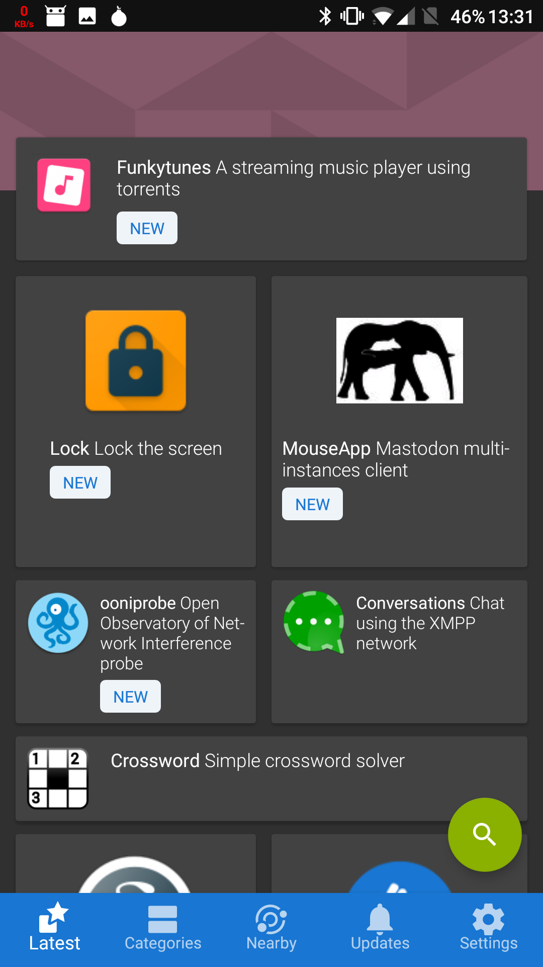
First, I don’t understand the varying sizes on the first page. I have no idea whether the sizes convey any meaning. For instance, are the bigger tiles for applications that are more popular? Moreover, some tiles are horizontally bigger and others are vertically bigger; does that carry any meaning?
Example is shown below:

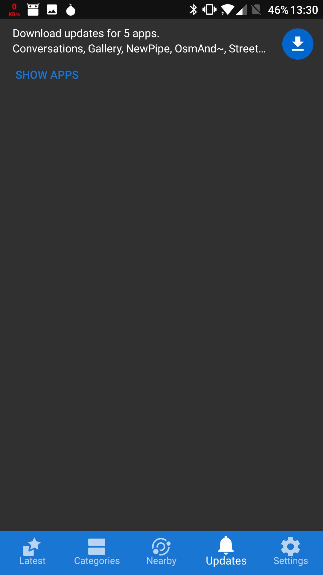
Then, the “Updates” screen should display the list of updates by default and the summary should be removed completely actually. Even on very small screens, the UI is currently empty while not being able to show the full list of updates.

If the default view is meant to be as little as 2 lines, it doesn’t deserve a dedicated page in the UI. One possibility is to move that summary to the first page (i.e. “Latest”) and maybe it could even be added at the top of the page, in some kind of notification bubble, without moving anything else (needs to be checked on smaller screens). Taping on it would then bring to the Updates page in the unfolded form.

I wish the Updates page would show the current and target versions by default. I also wish it could give a link to the changelog if F-Droid is aware of it but that’s very secondary. It is however important to be able to know whether the update is minor or major before updating.

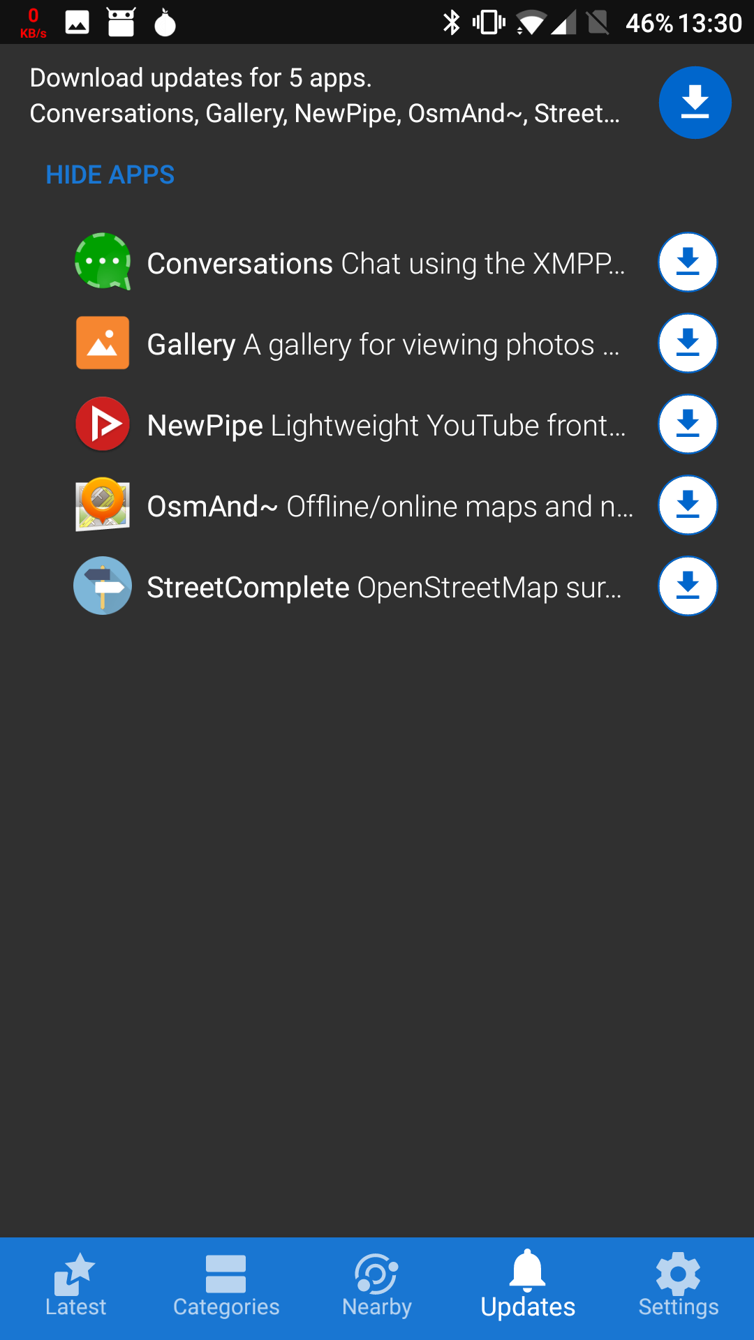
Currently it takes way too many interactions to get information about the update: go to Updates tab, click “show apps” (which is a small button that is easy to miss), and, for each app, click on it, click links to get the changelog (and sometimes, find out there isn’t any), and also click on Versions and try to spot which version is currently installed and compare to the starred one. The Updates page could definitely use two lines
for each application and display info related to the update itself.

I also have troubles hitting the individual update buttons and the one that is currently at the top is better-sized (but again, I wish the UI was always unfolded and the top stuff put in the “Latest” page and possibly replaced with “Update all [button]”).

Last, the “Night” theme has some color issues. See below:

Admin edit: enabled links

7 Likes

Hello,

I want to add some brief feedback on the new UI. I’m running 0.103-alpha3. Overall I think it looks great on my Moto G3. I like that new apps and recently updated ones are combined together on the main screen. The primary thing I do not like is the different sized tiles on this main screen. It’s not clear to me if this is just random or if it’s based on some kind of criteria. I see similar comments regarding confusion over this in the thread and the only reason I’ve seen given for the change is that it’s visually interesting. I don’t find this reason compelling enough to potentially confuse users.

Kudos to everyone involved in all this work on F-Droid!

1 Like

UI looks good overall.

  1. Can you disable pull to refresh? Mainly when I try to scroll back to top in a page from botton; it starts refreshing - using my valuable DATA.
  2. I would like as new setting checkbox, that says. “Do not show apps older than 1 year”. It is frustrating to see some very old apps that are Froyo based.
  3. Why was the decision made to have these icons in the bottom of the screen? I would rather design it like a typical “play store” unless it is copyrighted!

Thanks for your great work!

2 Likes

So I upgraded to .103 and for the way I use f-droid, unfortunately, I find it completely unusable.
I had to downgrade, but of course, I’d prefer to be up to date and have a good f-droid application.

I have two issues:
1)
Here is how I configure f-droid:
I turn off all automatic updates and notifications. I don’t want anything running in the background. In .102, I could simply use the refresh button when I had non-metered (wifi != non-metered), secure (wifi != secure) connection.
In .103, I can’t find a refresh button.
This is a deal breaker for me.

In .102, I could see what applications are under f-droid’s control. I can’t find that in .103. While this is not a deal breaker, it makes the interface a lot less usable for me. The new screens are geared toward finding new stuff. That’s great. But it seems all control over existing apps are gone. Please add the page back.

Regards,
Tuten

2 Likes

In .103, I can’t find a refresh button.

You can “pull-to-refresh”, just like in most email or rss clients.

In .102, I could see what applications are under f-droid’s control. I can’t find that in .103. While this is not a deal breaker, it makes the interface a lot less usable for me. The new screens are geared toward finding new stuff. That’s great. But it seems all control over existing apps are gone. Please add the page back.

Could you explain a bit more here? You have an installed apps view
accessible from settings. Please note that this doesnt imply F-Droid’s
control over these apps.

I don’t know what email client you use. I use K-9, probably the best open source email client, and it has a refresh button. I don’t know what “pull-to-refresh” means. If it’s some sort of unhinted, hidden gesture, then I find that UX to be less than desirable. I tried moving my finger on the update page, but there is nothing responsive. Just a huge white background with a simple text “All apps up to date. Congratulations! All your apps are up to date (or your repositories are out of date)” (my emphasis). There is plenty of room for a simple refresh button here.

Thanks to letting me know where the installed apps page is. Again, the UX, for what I use f-droid for, has taken a significant step back from .102. I didn’t need instructions to find my apps in .102. It was front and center (literally).

Unlike commercial app stores, which are incentivized to push their users to install more and more new apps, f-droid is much more of a “let’s keep what you have up to date”, at least in my usage.

Final remark: I don’t understand why anyone would use the “nearby” feature. Nobody I know even knows what f-droid is, let alone want to “share” apps. If I go to f-droid, because language like “This version is built and signed by F-Droid, and guaranteed to correspond to the source tarball below.” makes me happy, why would I install apps from a random “friend”? Obviously I don’t understand this usage. I’m not discounting that such a usage is possible, but why does all that code have to live inside the f-droid repo app and take up the 1/5 of the available options? Wouldn’t a separate app be a better choice?

2 Likes

Thanks for the continued feedback all, it is all very valuable. Let me respond to a few more comments:

  • @blendergeek (and others): “Could we combine the installed apps page from settings and the updates tab”?
  • This was in our early designs (see this post). However before implementing the designs. The response to these tests was that having “Installed” and “Updates” together was overwhelmingly confusing to new users. Given this, we refined the UI. Our user tests after implementing the 0.103-alpha’s were more positive in this regard.
  • I think it would be worthwhile aggregating feedback about peoples actual use case for viewing installed apps. For example, I’m sure I’m not the only one who thought that having it as a primary top level tab in the old designs was not justified.
  • People may be used to “Updates + Installed” due to Google play, but remember that in Google play, the updates information is not as important as in F-Droid. We are at the mercy of not allowing automatic installation of updates without the privileged extension, and so need to highlight that info. Google play relegates it to a less important screen (on the same level of importance as installed apps) because they are a blessed app who by default doesn’t require user interaction to update apps.
  • @anon24191858 (and others): “The layout looks illogical. App rectangles are arranged strangely. I don’t understand why they have different sizes”.
  • During our latest round of user testing across several users in both the US and Austria, this was the screen with some of the most positive reactions. I understand that it is a big change from the previous F-Droid, but given the user testing we conducted with new users, I’d love to see people give it a try for a bit longer before making any judgements. Some things to keep in mind that may help make sense of this screen:
    • The list of new/updated apps does not change frequently (max once a day for f-droid.org)
    • The number of new/updated apps each day is not huge (maybe 10-20 on a good day)
    • The purpose of a “Whats new” screen should ideally not be to scroll through a list as quickly as possible, because by definition they are new apps that F-Droid has not seen before. Skim reading the list as quickly as possible doesn’t seem to make sense under these circumstances.
  • @Shiba: “It doesn’t seem to work very well on x85”.
  • Could you please elaborate on which parts don’t work very well? The screenshot you posted seems correct to me.
  • @bart9h (and others): “Don’t take away functionality like a concise list of categories”.
  • This also came up in our user tests, and was one of the things people liked.
  • I’d like to see more use cases gathered, because I’m not sure how many people actually start with the premise “I’d like to install a firewall, that means I need to go to the System category”. This is partially due to our categories not being as good as they can be (e.g. is a firewall to be found in System, Connectivity, both, or some other category?). Games may be an exception, where I can envision people perusing the games category to see what is available.
  • Currently when you view a category, it shows a “chip” for that category in the search input. It be great to have the search improved so that it autocompletes categories and lets you add them as new “chips”. Additionally, you could show a list of category chips when a user first selects the search input, so they have the option of selecting one of the categories if they wanted. I think this would greatly improve the categories and the search feature.
  • @scrax: “save a list of apps”…
    • Check out issue #70. It is stagnant, but happy to accept merge requests as it is a good feature request.
  • @tuten1000: “Why would I install apps from a random friend?”
    • This is a very reasonable statement. I’m from a country where I’m lucky enough not to have my internet blocked, and I have good access to the internet in most places. However a lot of Android users are from places where the internet is either patchy, censored, or very expensive. In these countries it is very common for people to bluetooth apks to each other. We want to encourage these users to do so in a semi-formal manner, where they are able to get important features such as notifications of new updates to installed apps, when there is no internet available. F-Droid is the app store for the whole world, and so even though you and I don’t use this feature, it is an important part of the ecosystem.

For those interested, the results of the user test will be published once all of the reporting is done. We strive to be completely and utterly open with our workflow. That means not just code related things on gitlab, but also other stuff such as the user tests we perform.

BTW also when I install apps they are shown as “Update available” a few minutes later and to get rid of this notification I have to install the exact same app version again in the updates tab. This is really annoying.

Well icons never load except for the first couple of apps in the recently updated list and the same happens for screenshots (I posted Orbot because a friend of mine showed me it had screenshots). Moreover almost always F-Droid is unable to download .apk, staying in “Downloading” with the bouncing progress bar forever and forcing me to kill it from Android settings. Occasionally even when apks are successfully downloaded it says something like “corrupted package” and I’m forced to kill it again. This keeps happening with stable .103, even after a clean install.

1 Like