![]()
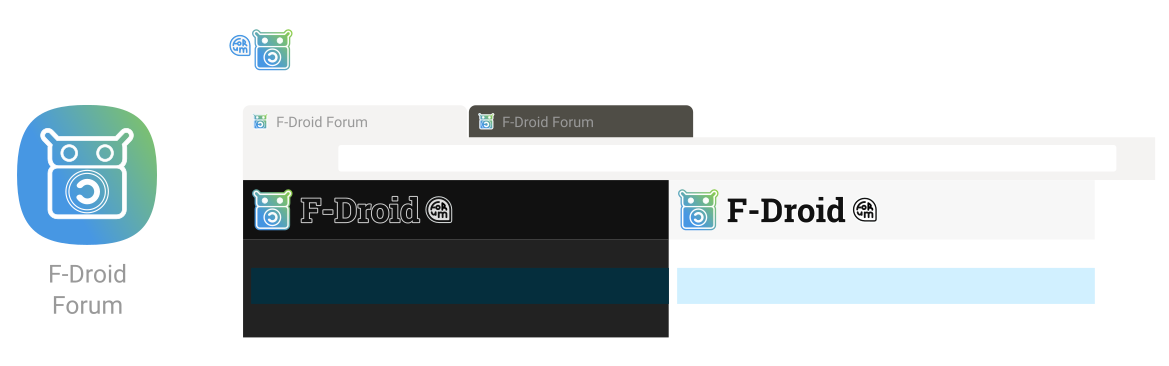
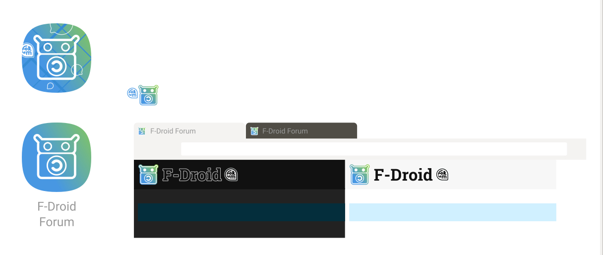
This forum sign looks very strange and absolutely unreadable, sorry ![]()
How about this?:
The word F-Droid without next ‘forum’ looks fine.
But the shaped background is excessive here (leave it for phone icons)
![]()
I’m for this variant:
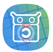
I’m not against the new icon, colors and adaptive style looks fine. The only thing it’s why copyleft external circle touches the top and the bottom lines. Moreover it’s very bold:
I’d say it’s not superfluous to the unacquainted visitor. Would we want a potential new user to be confused as to why the supposed F-Droid website just looks like some forum where people discuss apps or something?
By making it clear that the user is only on the F-Droid Forum they are able to infer that this is not the official F-Droid website.
If the user is already somewhat aquainted with the F-Droid icon, the blueprint-style icon might also help imply this site is a “formative part” of F-Droid’s experience, so to speak.
For myself, I find switching between the F-Droid Forum and Official website tabs in the browser can be quite confusing at times so I’m actually looking forward to a different (fav)icon for the two sites.
Please click the designs to enlarge them to 100% scale. Having said that I’ve made the bubble larger now (see below). EDIT: If I were to make it any larger, I’d do improved outlines for the bespoke typography.
I removed the background grid in the above version, but yes I can see why one might prefer the version without the squircle in the header location (see below)
All fine points. I only did make the symbol larger and bolder for favicons initially and I started reusing that method for the “forum icon” variant but in hindsight I agree with your critique.
UPDATED BELOW (favicons unchanged) (EDITED 20 mins later: “forum” typography slightly improved + spaced better from 'F-Droid"):
1 Like
unacquainted visitor
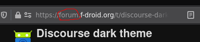
it’s already present in the address bar:
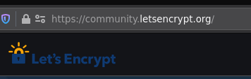
Let’s Encrypt isn’t worries to get confused:
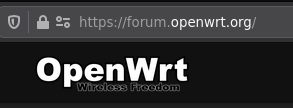
OpenWrt isn’t worries to get confused:
Even discourse isn’t worries to get confused:

It looks better now!
We could argue that F-Droid can, does and/or should have a broader audience than all the entities listed. Apart from https, I don’t believe people check the address bar when browsing the web.
Great! When I get an okay from another main Contributor I’ll push and do an MR.
Thanks for the feedback throughout, too btw!!
I also like the logo with the reduced Copyleft sign more. It looks cleaner when the circle doesn’t touch the rectangular box. Great job!
Thanks @relan, good collaboration here.
Here’s the stuff:
- favicon is sharper offset by 0.5 pixels, and
- an alternate adaptive icon version exists (for interests sake)
- in the ‘working’ layer you’ll also find this…

I thought it was an interesting experiment because it honestly looks as though F-Droid is looking to your left.
The Merge Request is here. Includes image files that should be ready to use, including ‘adaptive icon’ png files for the future app.
If there are any problems with it tell me, and I’ll update.
Ideally the light header in Discourse would be background-colour: #f7f7f7; as seen above. If that can be done in an admin’s interface that would be great. If it’s somewhere like a git repo, pls point me to the repo and I’ll do it.
Cheers
This topic was automatically closed 60 days after the last reply. New replies are no longer allowed.
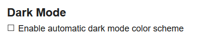
Now discourse support auto dark mode. Could this forum update and support it? The dark mode can be enabled manully curruntly, but has some gliches. The logo in dark mode looks awful.
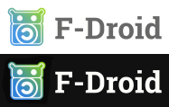
Right, there’s now an extra field for a dark-mode logo. If someone posts one here, I can upload that.

1 Like
Thanks! Should be all good now? Can someone confirm the auto-dark theme is working?
1 Like
Dark mode works…how does “auto” behave?
Via prefers-color-scheme @media feature?
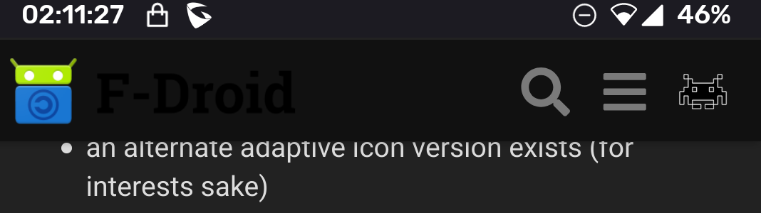
I set theme to Default and it remains dark, so I suppose it works. Dark logo also looks good.
It works well. With win10 dark mode enabled it dark by default. But I have to enable it manually when I log in.