Hello,
Mull’s new logo (Version 104.1.0) looks really awful.
Old logo was far far better than the new one
My humble request to bring back the old logo. Please …
Thanks in advance
Hello,
Mull’s new logo (Version 104.1.0) looks really awful.
Old logo was far far better than the new one
My humble request to bring back the old logo. Please …
Thanks in advance
![]()
Completely agreed. This one really looks nasty.
Don’t look back. Keep moving forward like selected sharks. Keep up the great work. Thanks for the new logo, and thanks for all the fish! ![]()
I’m fine with whatever logo dev seems to fit best, but sure things can develoo even better direction..
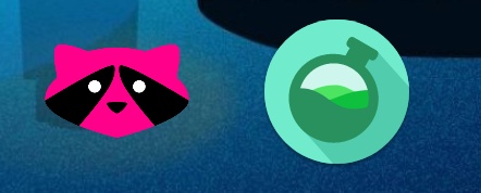
To summarize earlier logo dicussion, here’s what @anon84241408 said at DivestOS thread about logo:
“I was thinking of persisting the theme of the fox, I figure a racoon fits what Mull is:”
There was couple other suggestions after that:
and some more before those messages. I personally like the ones suggested by @StigtriX
I think people with graphics skills can suggest some racoon logos as developer was thinking it fits what Mull is. But anyway @anon84241408 has every right to decide which one to use, including current one.
But little logo competition probably won’t hurt anyone, but deserves separate thread from general DivestOS thread. ![]()
I like this one. I thought the current one is good but the background contrast is too high.
I completely agree with OP. New logo is not looking good.
Old logo looks like a standard browser logo fits perfectly for Mull
If you look at some other forks, they have kinda similar logo with either a fox or wolf (whatever it is) and i feel Mull shouldn’t follow them
“Globe with a lock” oh c’mon, that’s odd and boring ![]()
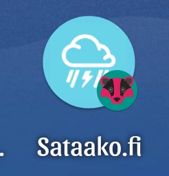
How does it look after you browse to a webpage and “Add to Home screen”? Does it look good combined with the logo of the bookmark? For example, to my eyes, with F-Droid forum, the darker green background of mull clashes some with the lighter (limey?) green of F-Droid. Aside: There is not enough contrast between the green of the Android and its background, so it looks like 2 white circles atop a blue box, with a tiny Mull badger cigar at the lower right. Perhaps the Mull icon would be better with teeth showing and the head turned to face up and left, as if biting the F-Droid Android?
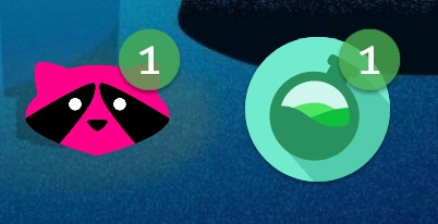
How does it look when there is a notification circle at top right of the Mull icon? To me, it’s OK, except where the ears are located, it makes me think of ear wax buildup, which is not entirely pleasant. Like I really GaS. ![]() Perhaps the Mull icon would be better with teeth showing and the head turned to face up and right, as if biting the notification ball? To accomplish this and the above, however, it would have to be a two-headed monster. Actually that does fit well with the internet.
Perhaps the Mull icon would be better with teeth showing and the head turned to face up and right, as if biting the notification ball? To accomplish this and the above, however, it would have to be a two-headed monster. Actually that does fit well with the internet.
Suggestion: Because of the color clash issues, someone should form a coalition to coordinate icon colors to ensure they don’t clash. Don’t look at me.
The “best” icons have a 3-D look. Handy News Reader has a little, Librera Reader has some, Editor pulls it off kinda, Calyx VPN does it well, Zirco browser does it amazingly.
The “next best” icons are not symmetrical left-right nor up-down. Privacy Browser, Fulguris Web Browser, Tor Browser (fails on up-down), Handy News Reader and Librera Reader again.
Details are awesome, for when people are screen shooting and zooming in to over-examine icon details, like now. KUDOS for the tufts of fur, and realistic eyes with light reflections, on the current Mull icon!!!
Globe with lock reflects atleast the privacy which Mull stands for.
But, I don’t know what a fox or racoon on the log mean for
Many other firefox forks having the same design for their logo and that is boring in my opinion
Good points, not quite sure of 3D though, at least trend seems to be toward “flat” icons/logos. Did quick test, sure result depends site icon, colors you set for notification etc.


I kind of like that, sure at pwa shortcut it shows current default logo, for others I used launcher function to change icon for testing. Edit: Had to pick that first one for testing, was quicker since second version was whole set at same pic.
Speaking of this, does anyone have that icon as png? Depending of launcher you can change preferred one for app, sure for website icon it’s different story.
Haha. Logo make it looks like mull has gone to the dark side. When I saw the new logo I got freaked out and uninstalled it thinking malware had infected my phone.
Good afternoon:
First of all I apologize if this is not the right place for this suggestion.
Also comment that this suggestion, my intention is not to annoy. Or cause mischief. I just wanted to help.
It turns out that in the latest version of Mull changed the icon of the application.
And with the green background is a little weird image. It would be better with a transparent background or the same as fennec from fdroid. Since in my opinion it looks weird or ugly to me.
I know that this is relative to the eyes of the beholder. But I wanted to comment if it is only me or there is someone else.
The application is not looked at by the icon, but by the function and functionality that this gives. And Mull chapo in all aspects. Except for the icon.
Please don’t take this suggestion wrong. But I already commented that for me it was better without the background or as fennec.
A hug and thanks for your time
I’m also here because of the logo. I don’t care if it’s a globe or an animal (globe is more clean) but the colour contrast of the globe was much better. I don’t even hate the colours, just the (lack of) contrast it’s dark on dark on dark. Old colours with new shape would be ok for me. Also I hope we will get monochrome icons support for Android 13, supporting custome colour shemes (Material you) so that this kind of discussions become obsolete.
This topic was automatically closed 60 days after the last reply. New replies are no longer allowed.