More "modern" client interface (again)

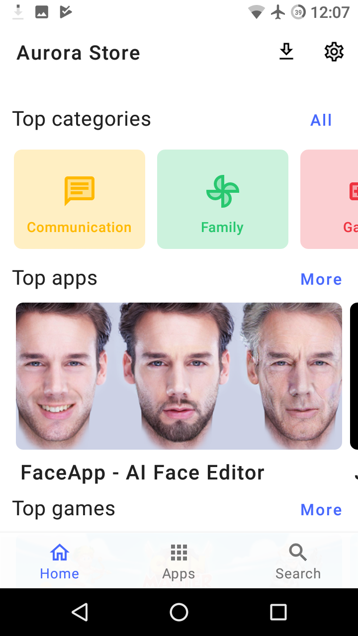
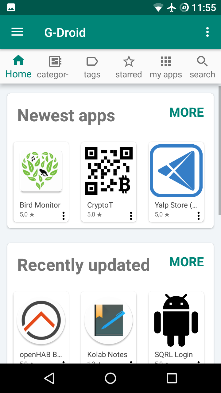
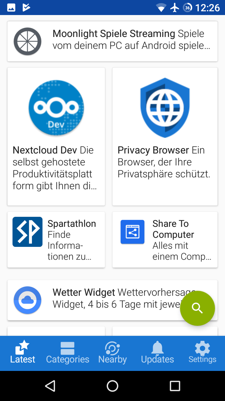
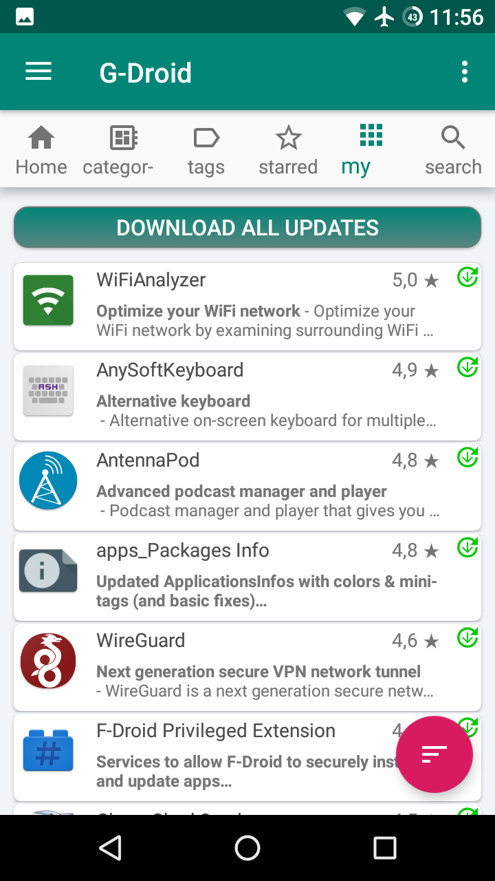
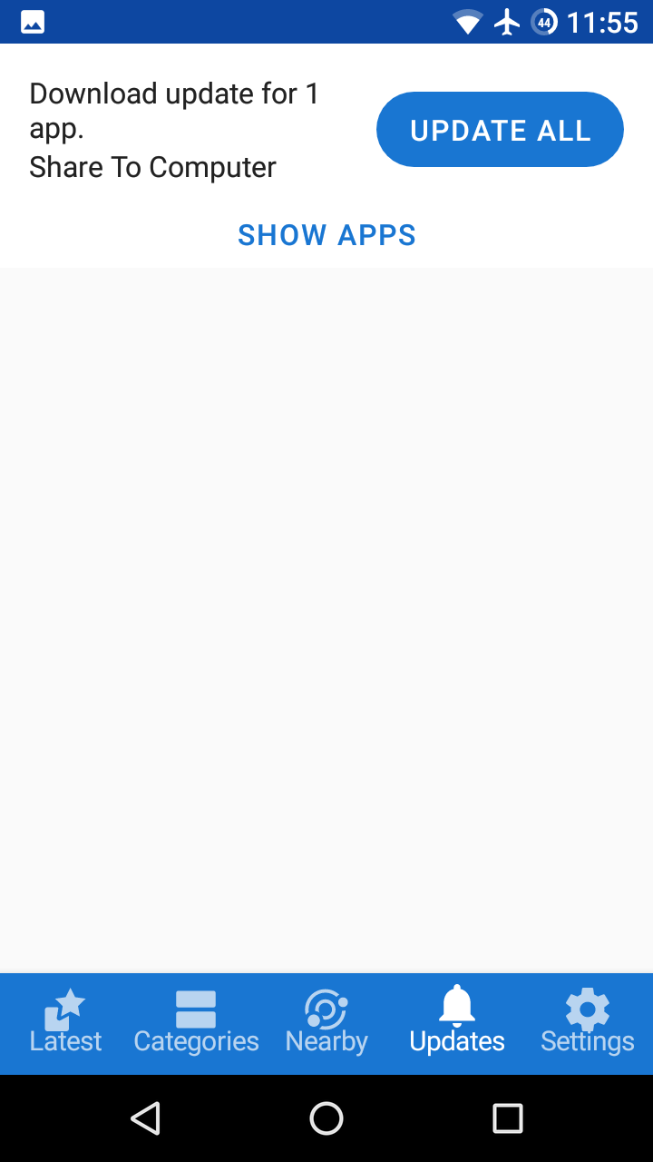
As there are efforts to make the website look more modern, I thought that maybe we could do the same to the client, to be more attractive to new users. Some comparisons: (Aurora, G-Droid, F-Droid)

Start page:

Updates:

App details:

Personally, I think that F-Droid is the least attractive the first two in all cases, in the third one I do not have any preference.

This will confuse a novice user:

My suggestions:

  • use a start page similar to G-Droid’s one
  • Ask @webDev whether he/she would like to do something about the design?
  • Hide “Nearby”
  • Use an “Update” screen similar to Aurora’s one, which also contains the installed apps
3 Likes

What means “Modern” to you seems to mean “Classic” to me (?). New UI / UX of F-Droid app

Can be easily, since Nougat, solved with Icons: Shortcuts & Tiles Support Android 7.1+ App Shortcuts (#1248) · Issues · F-Droid / Client · GitLab

F-Droid original client would be much better if somes could help with missing metadata (screenshots & description per apps) on Gitlab…

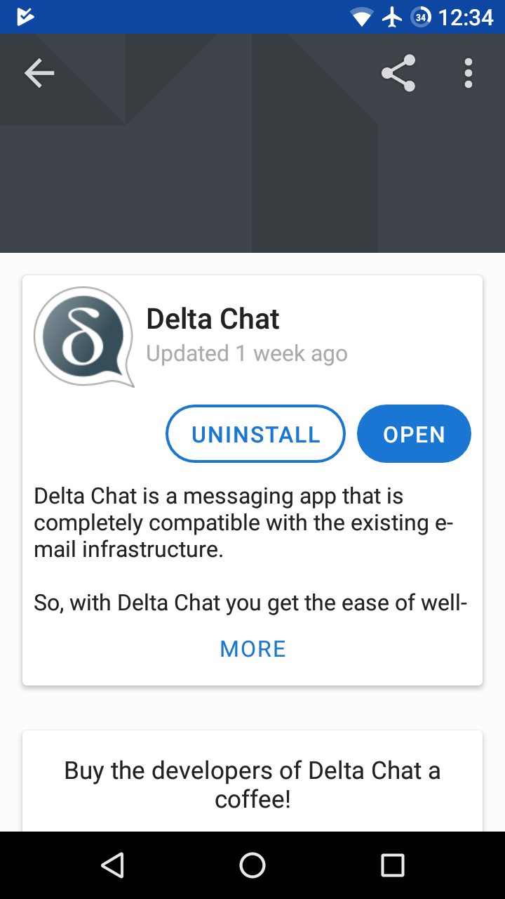
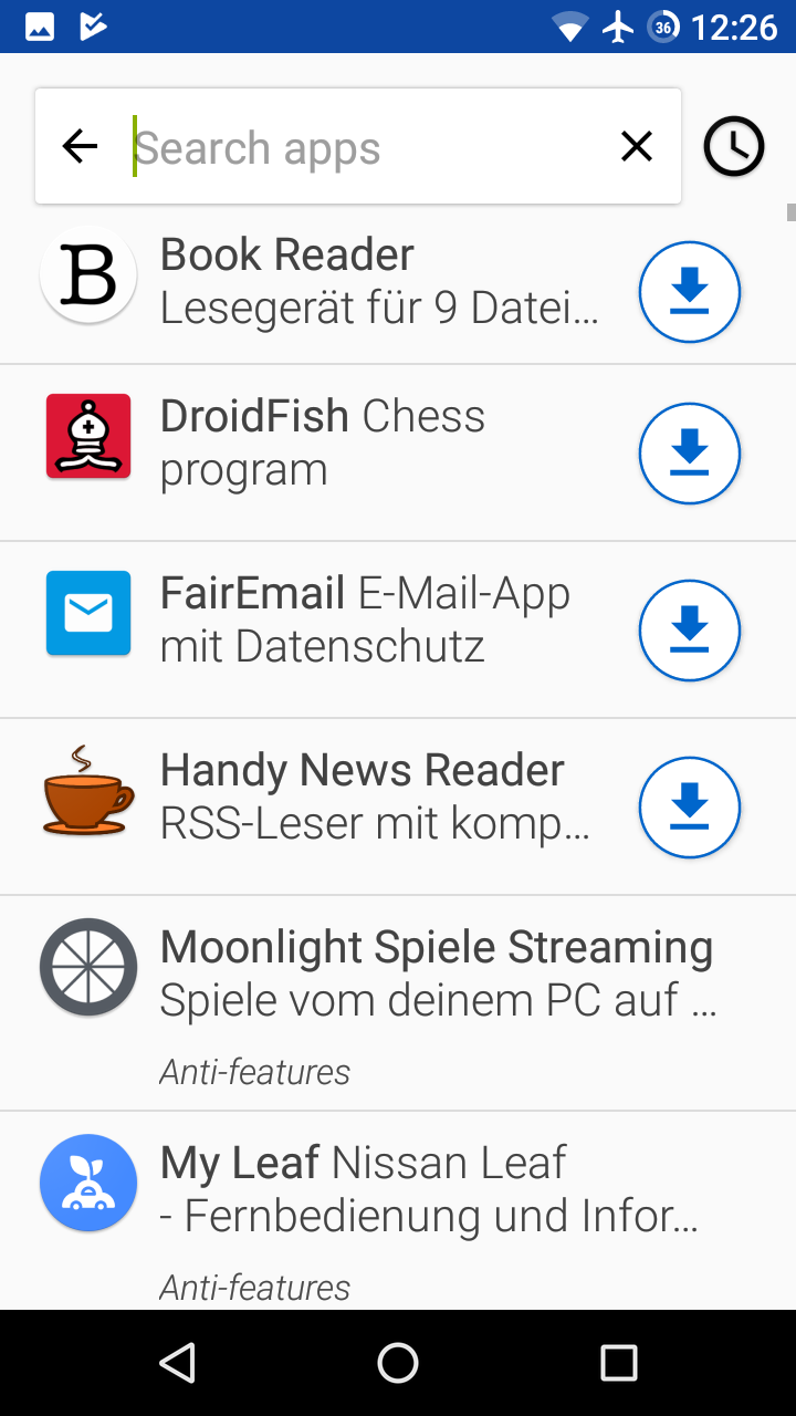
No, I rather thought of modifying the existing one to something more material-like and to something that matches the look of the new website. I’d say that the current design is about similar to the current design of the website.

Yes, but I do not think that it should be placed that prominently.

I’m afraid that especially new users won’t find out about this.

2 Likes

This topic was automatically closed 60 days after the last reply. New replies are no longer allowed.