F-Droid is a key project in the FOSS Android space.
It has matured and established itself as the central place to publish and get FOSS Android apps.
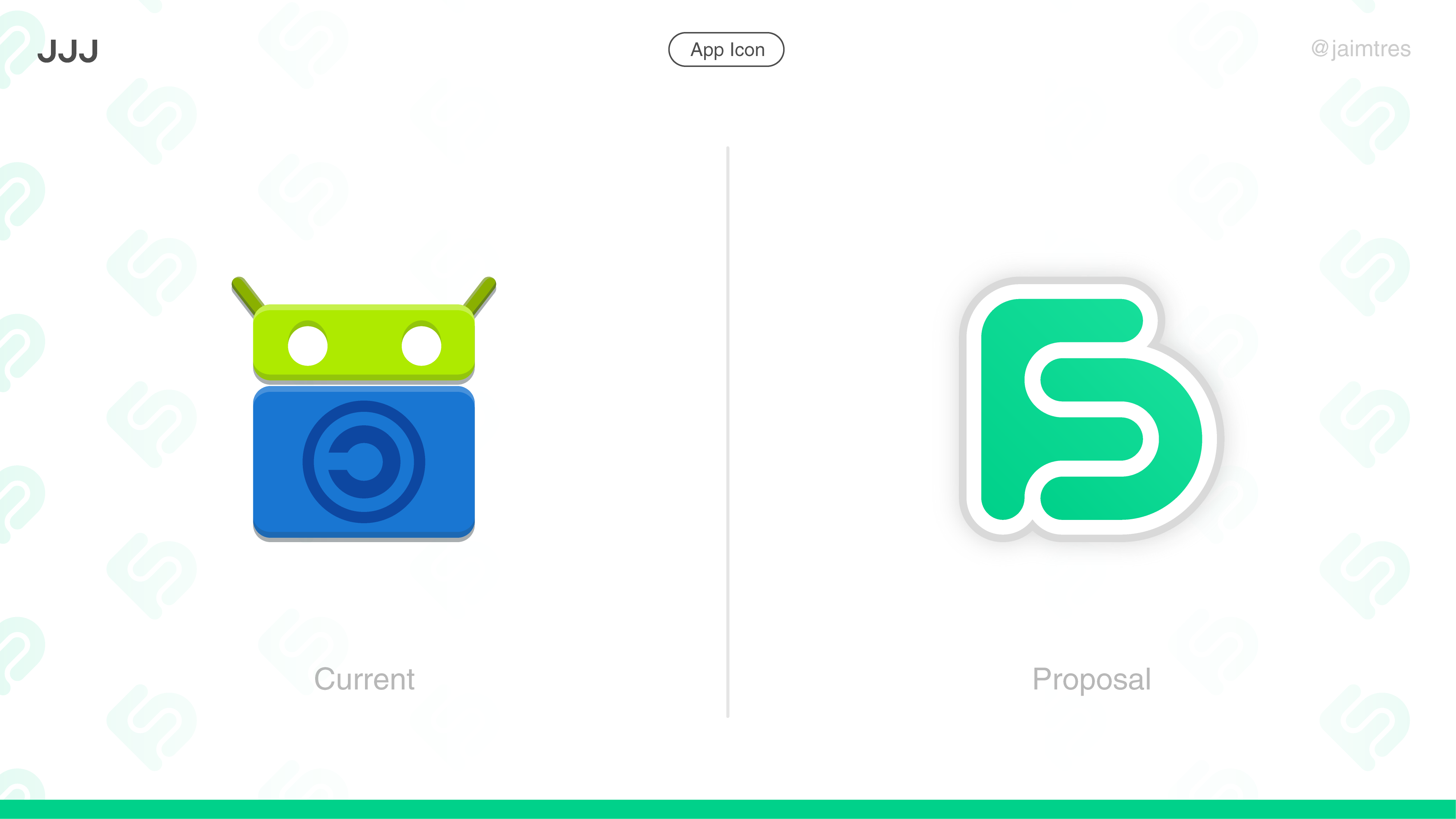
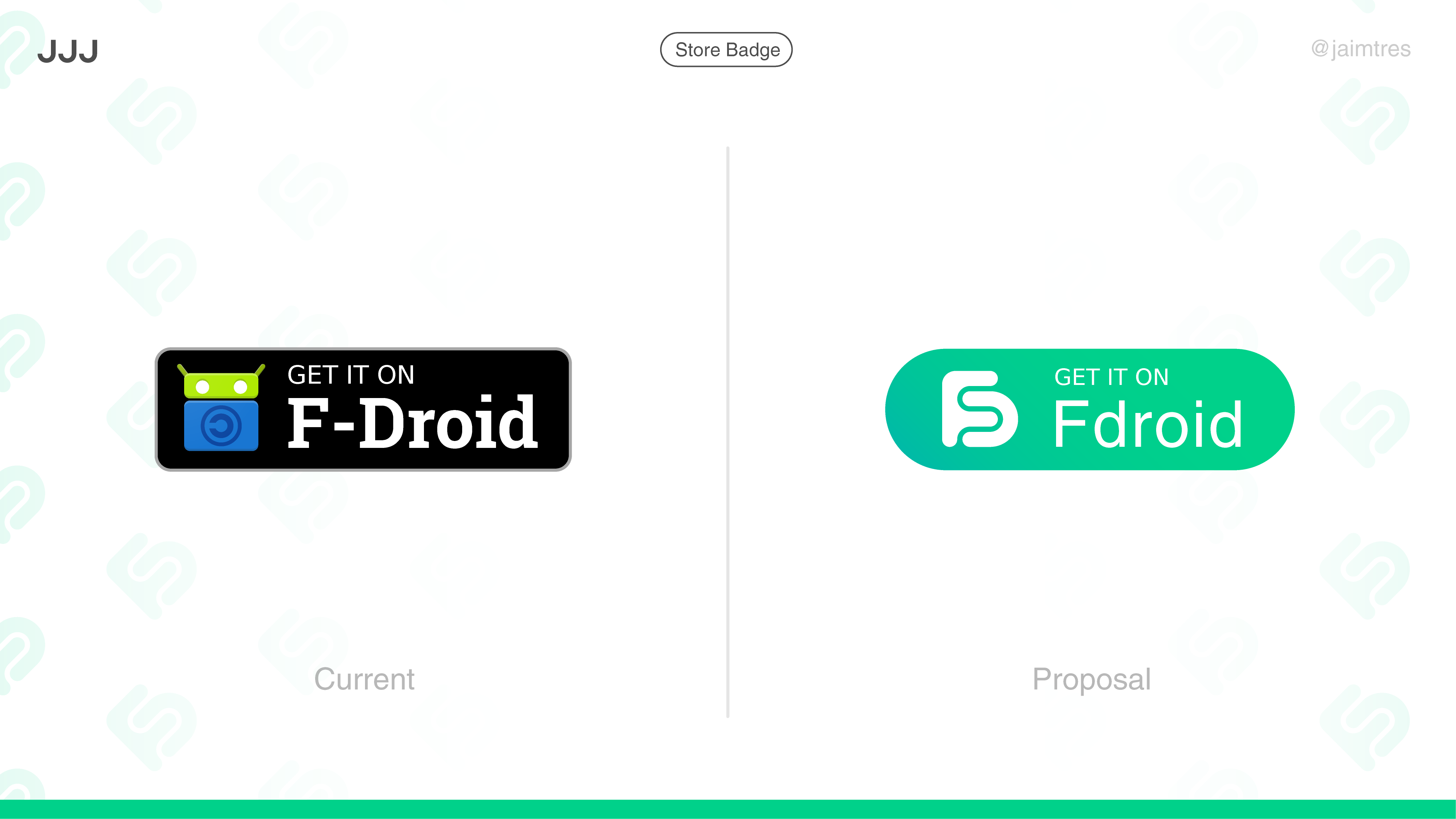
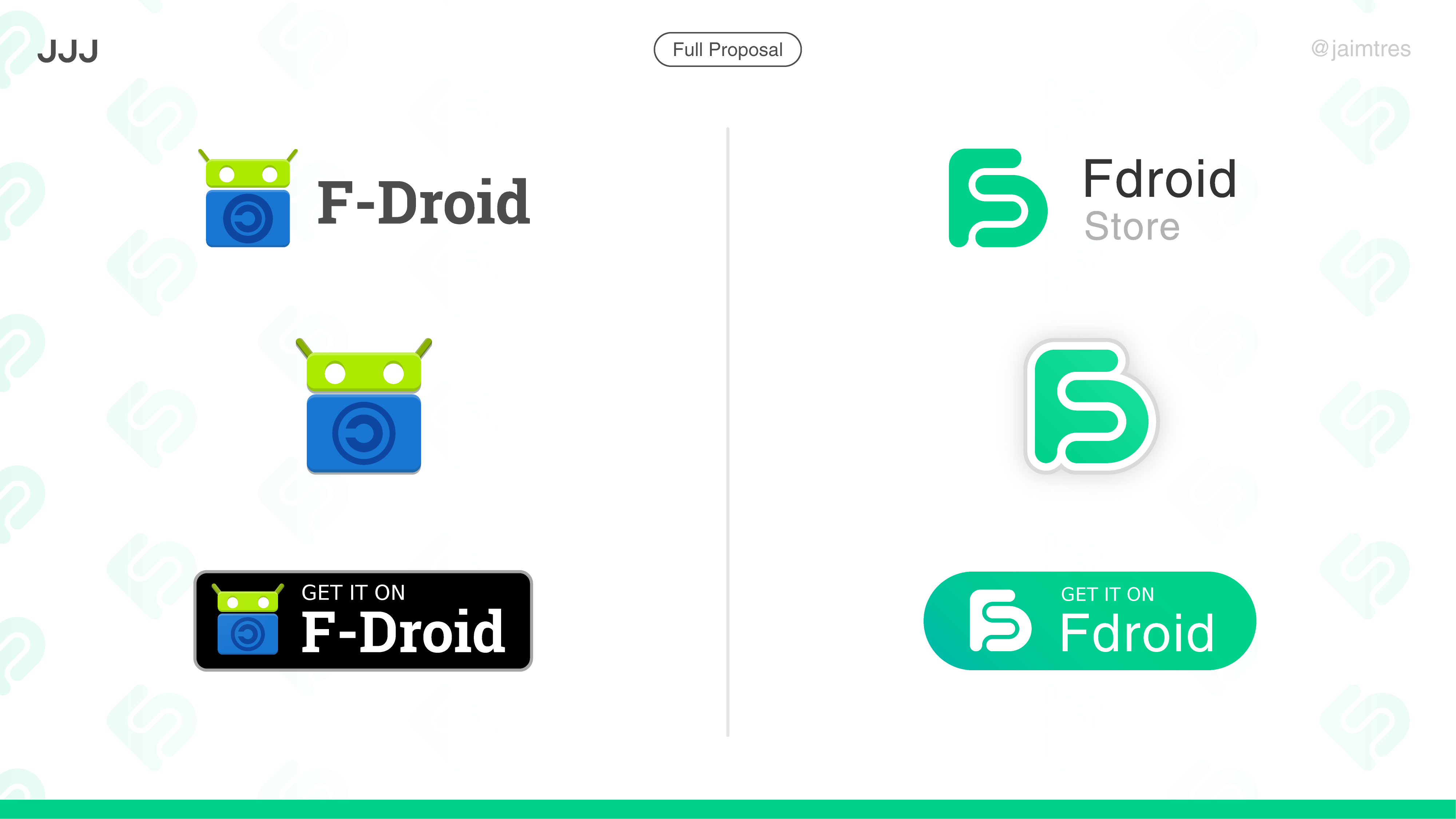
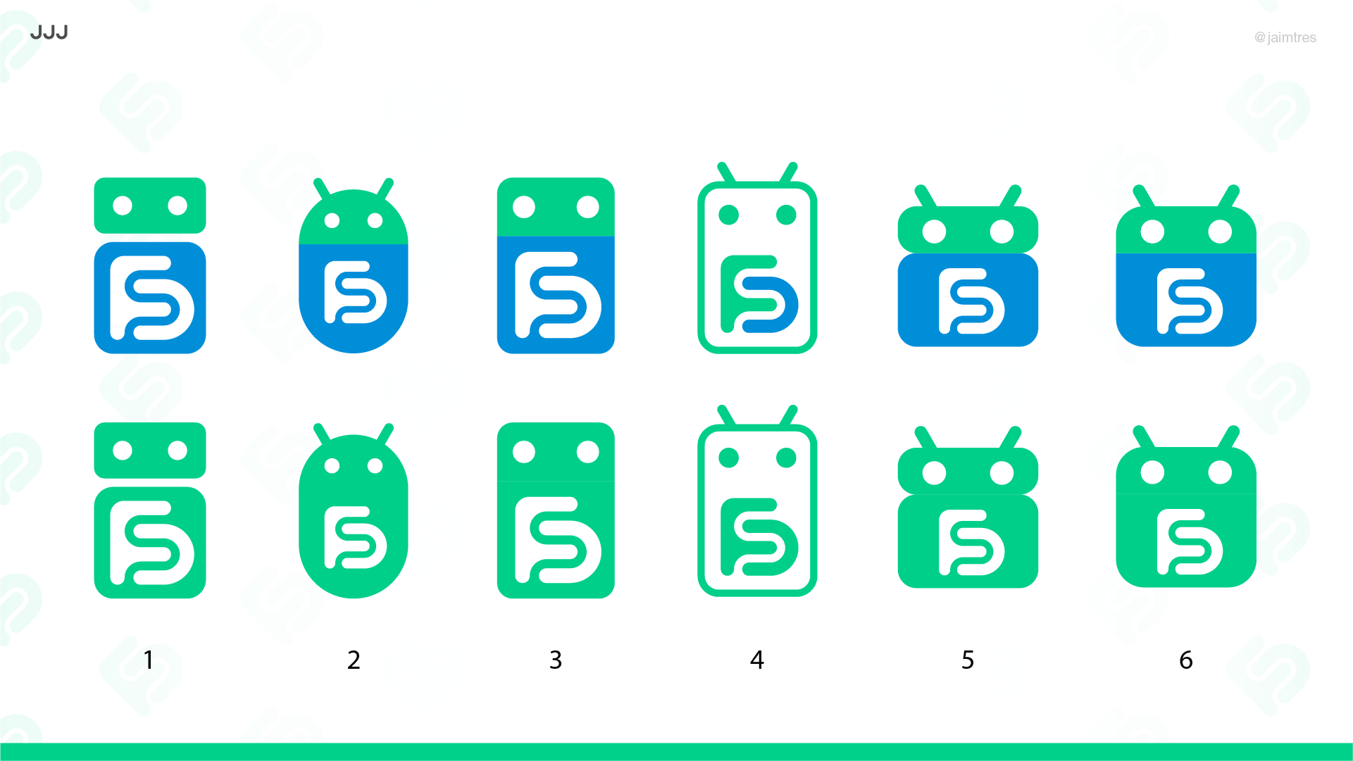
I think the visual brand should reflect that, and part ways with the mascot into a more distinct and mature identity that can reach a wider public. Hence the proposal.
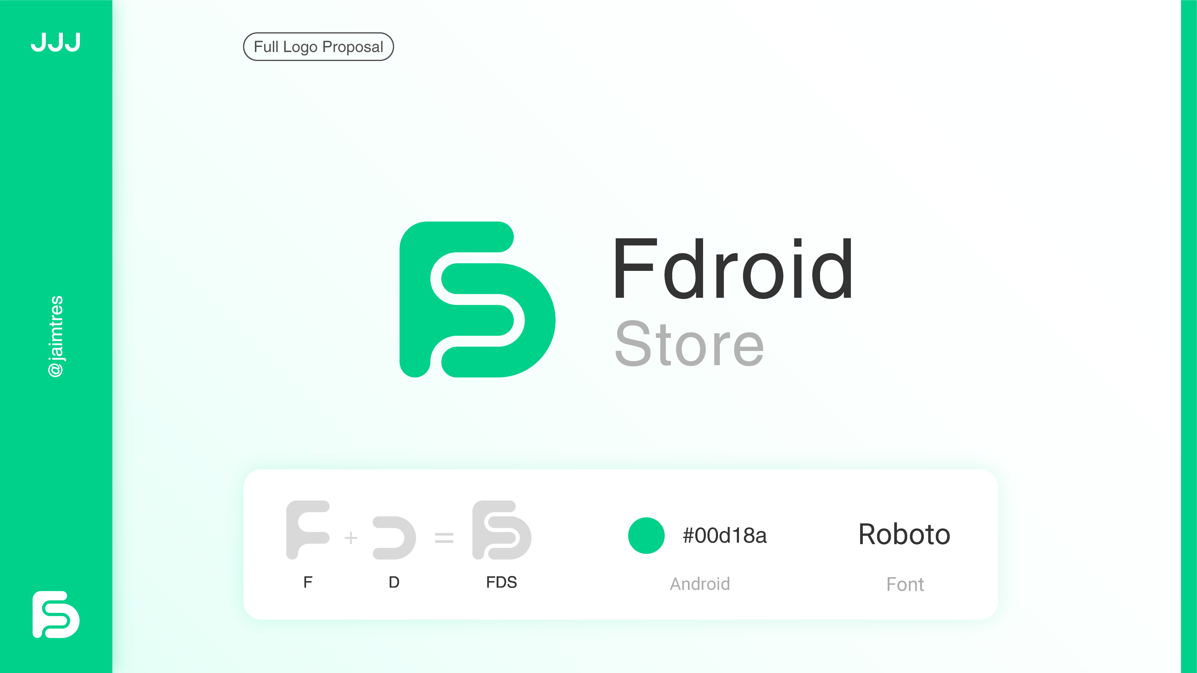
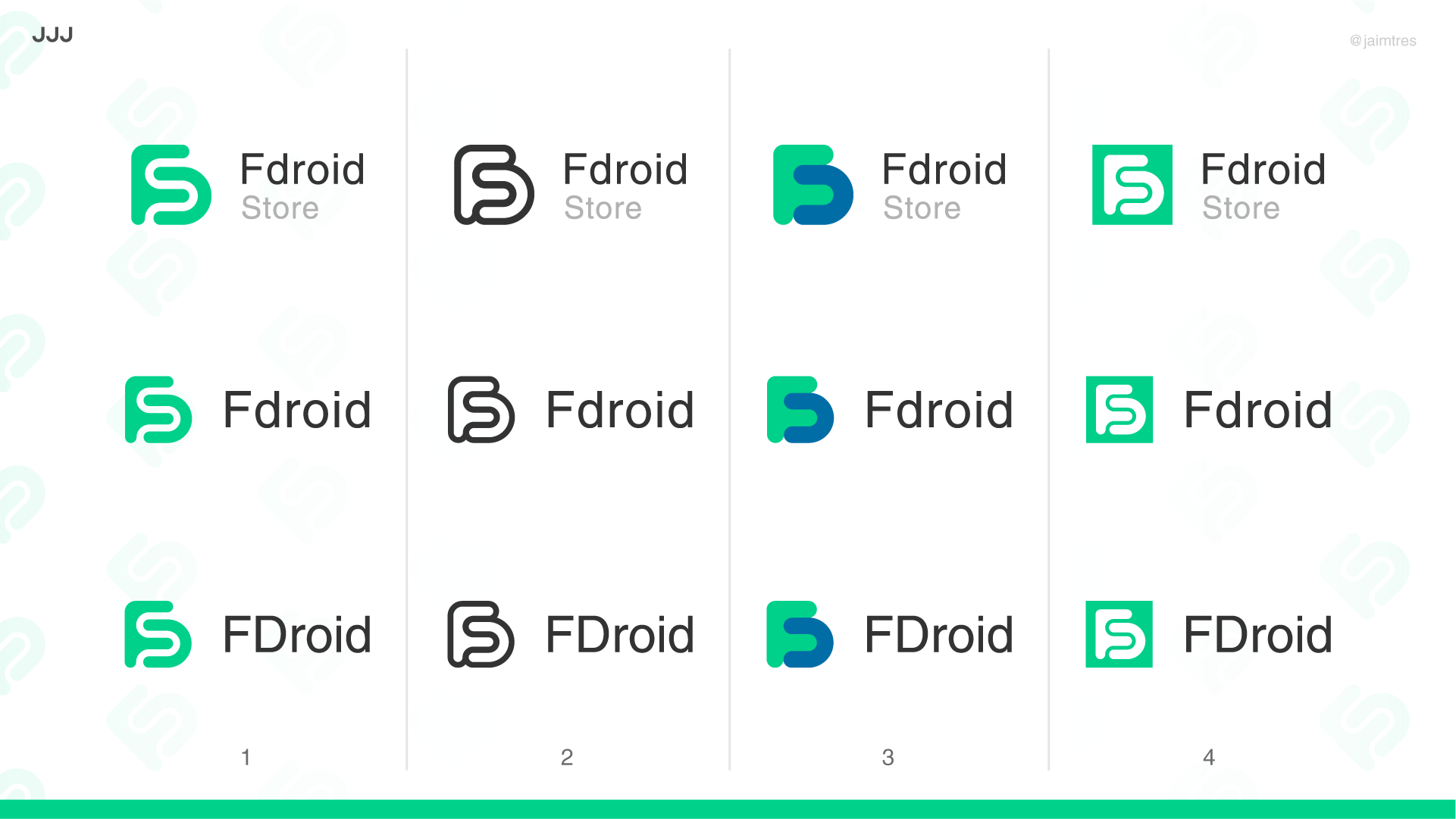
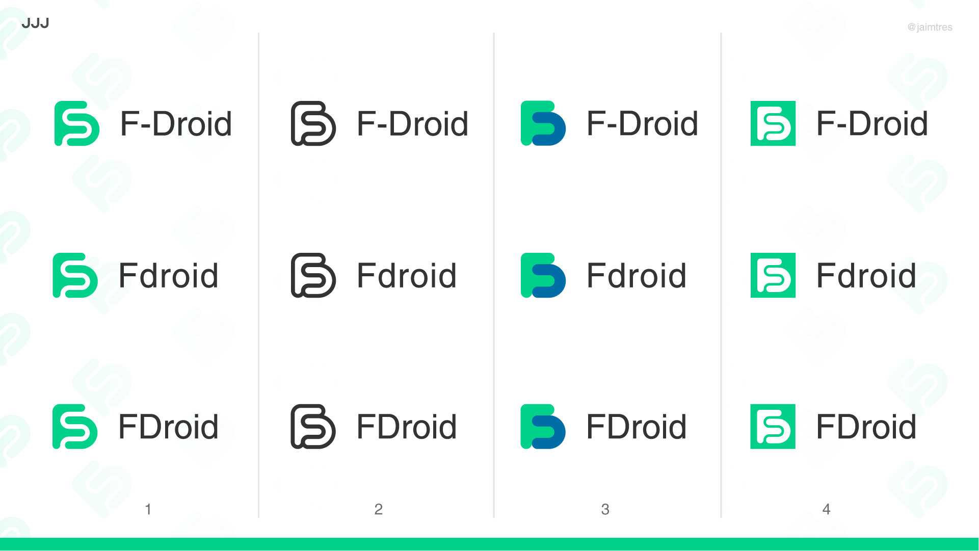
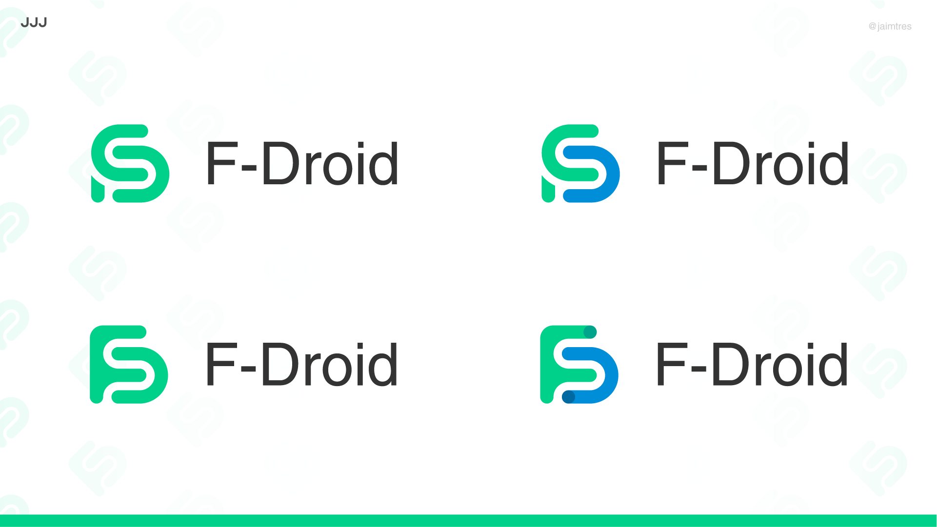
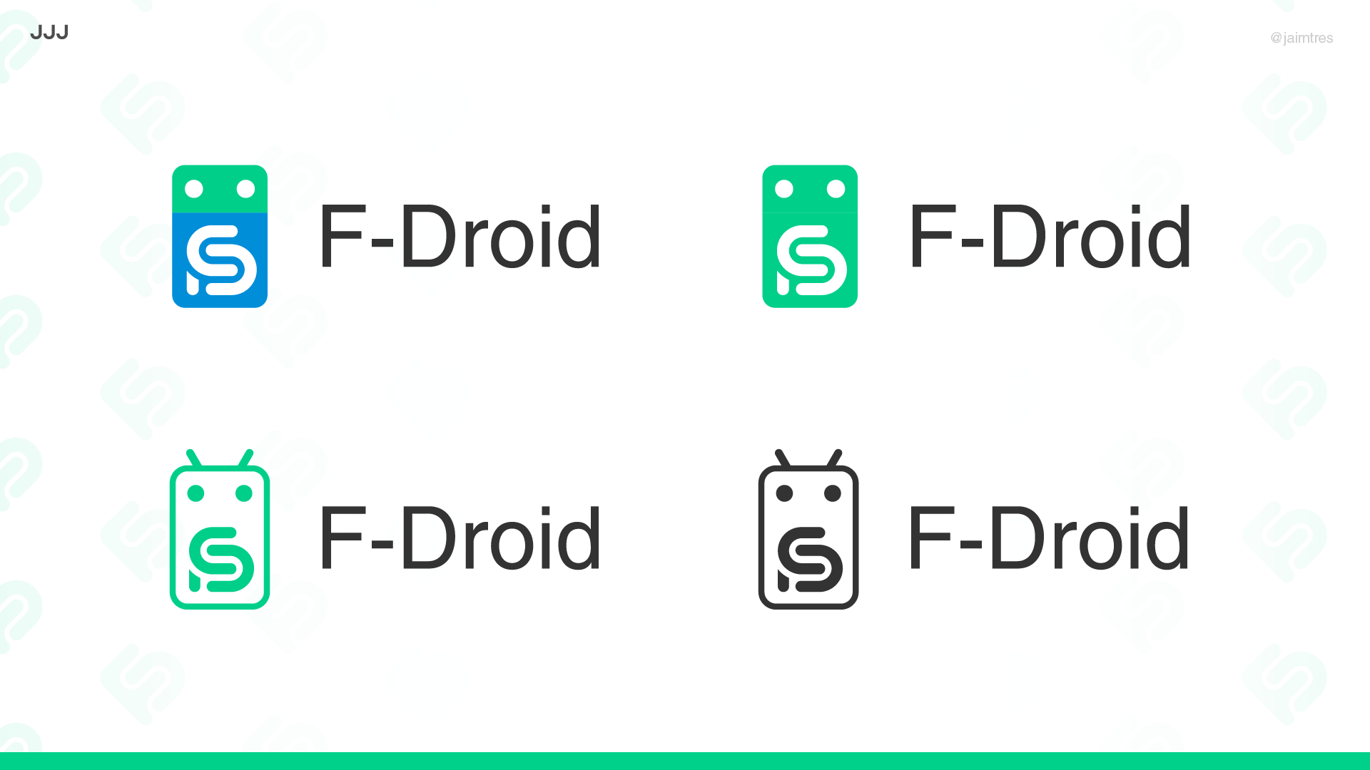
The proposed symbol stems from the name, in a green color that is representative of Android.
The “Store” descriptor is added to fully land the identity (I think this is not trivial and will help the brand be remembered, as is the case with more well known app stores).
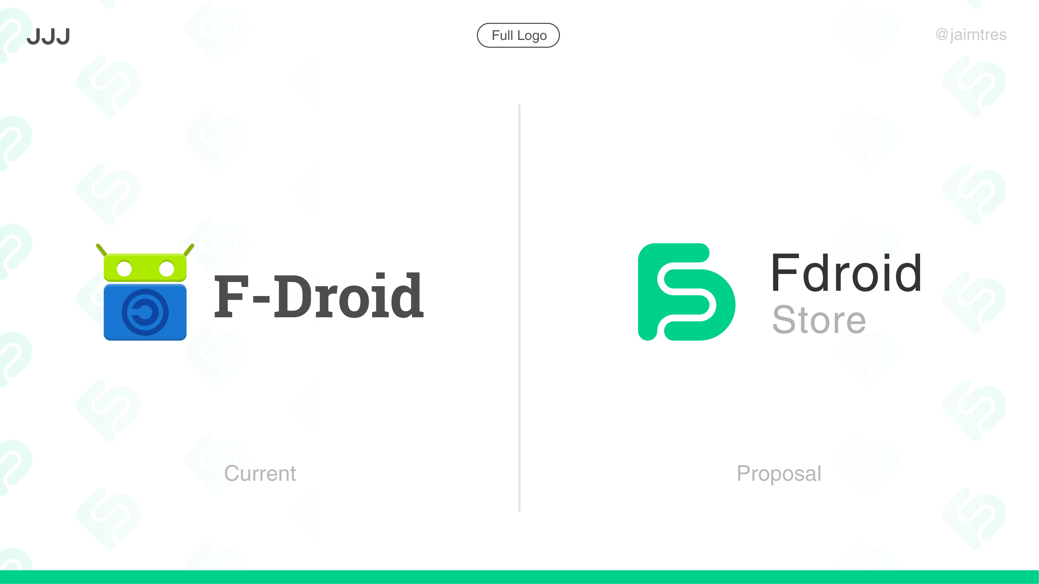
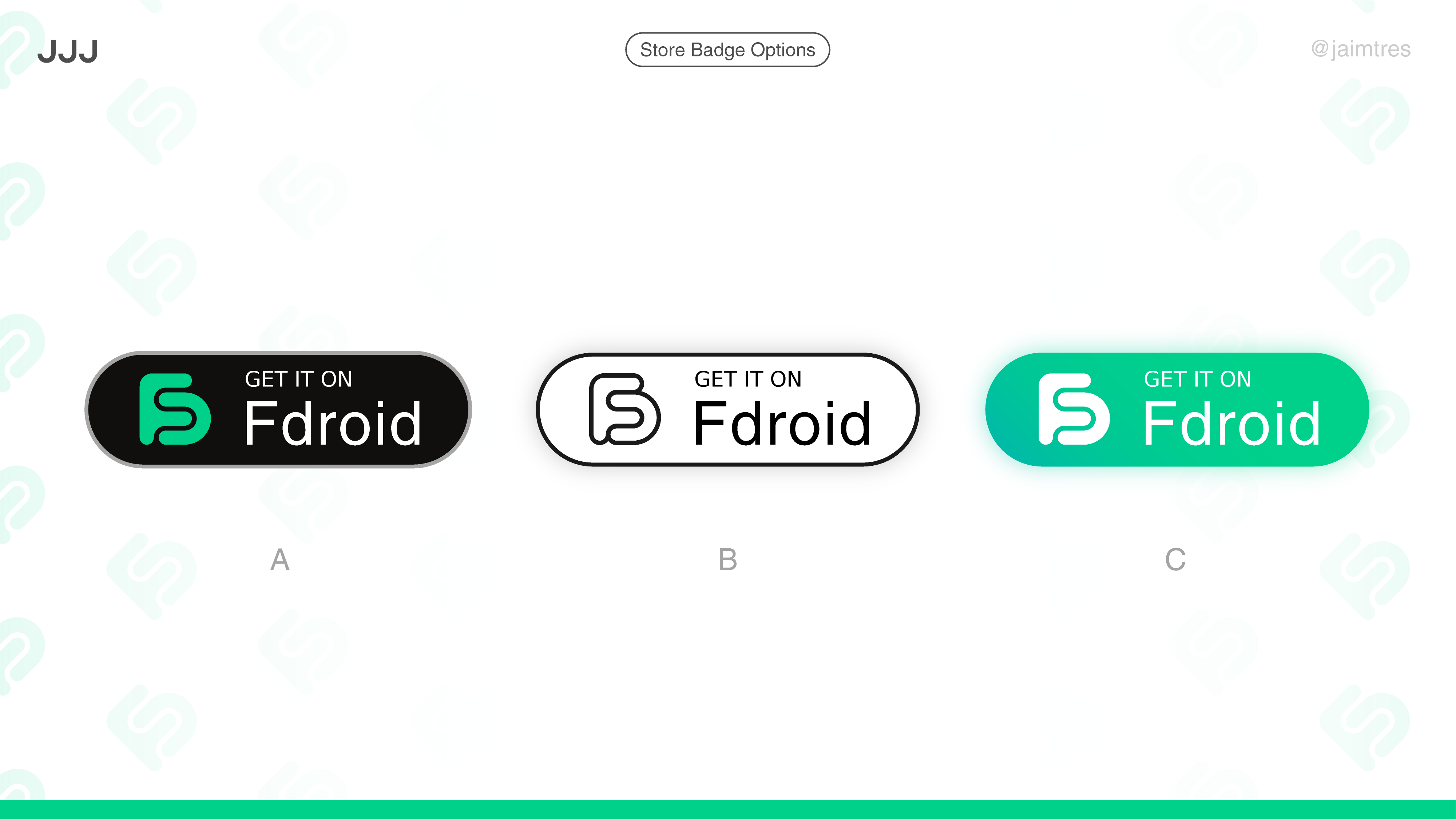
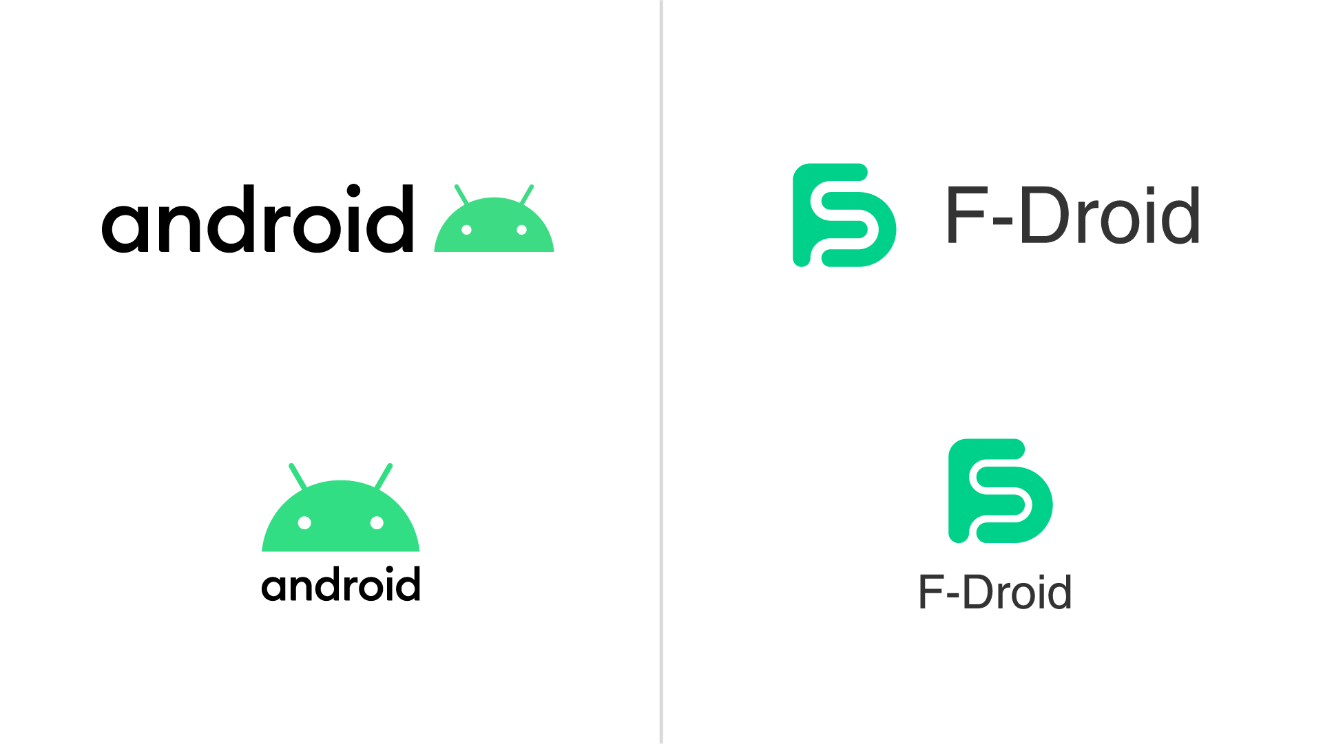
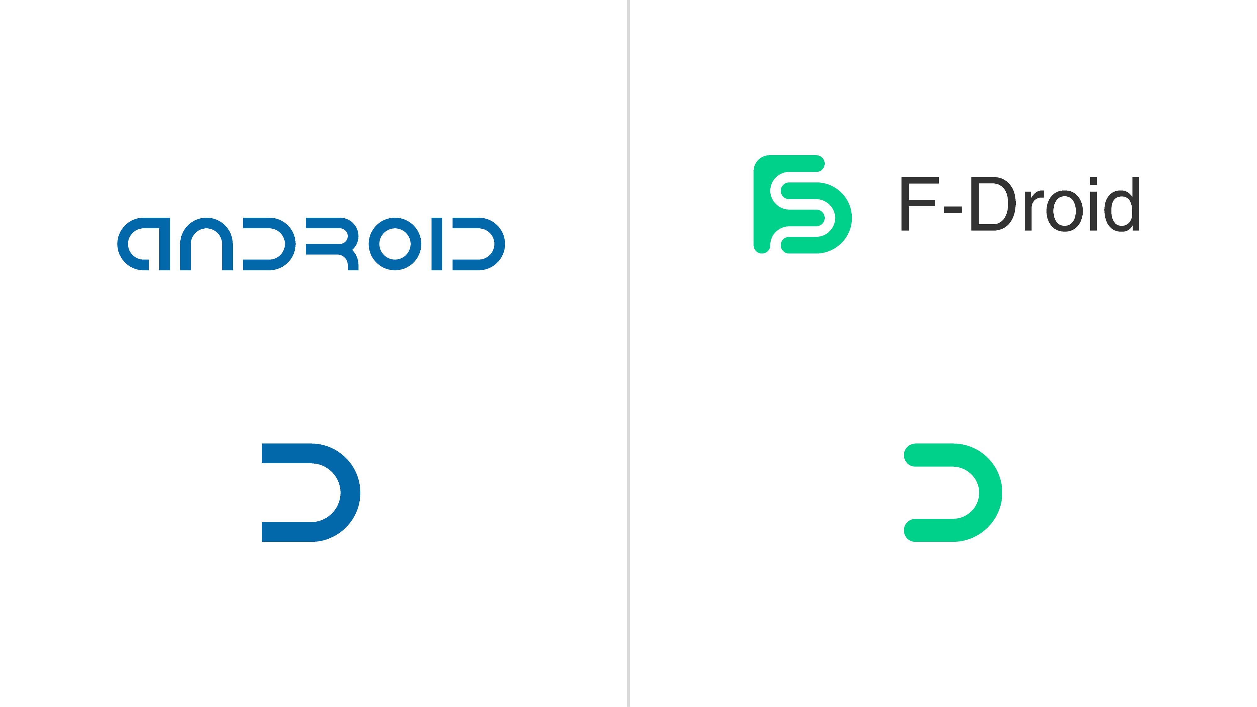
Logo Comparison
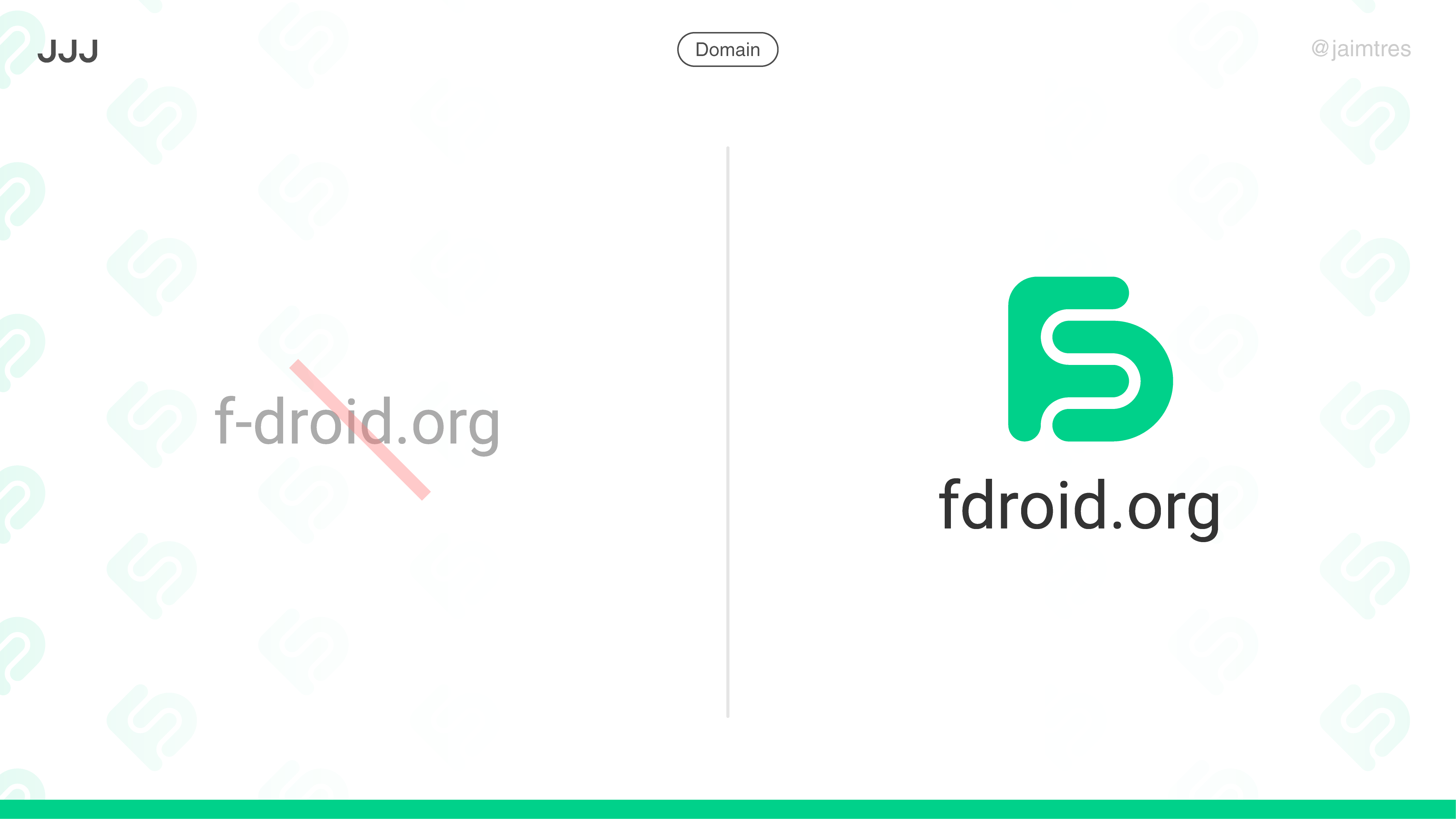
Regarding naming, removing the hyphen consolidates the name and makes it easier to search, and say out loud (again non trivial for a brand)
The fdroid.org domain already redirects to the official site, so I assume its officially owned. Again, much cleaner and easier to share, in tune with the proposed brand.
The green colour might be problematic from a trademark perspective?
Removing the hyphen looks a bit weird from a linguistical perspective and does not make it easier to say out loud IMHO (three consonants directly following each other)
I don’t think so, as it is not the same color as the Android brand. I came across it (#00d18a) on my own while designing, and it is darker and “bluer” than the official (#3ddc84). You can compare them both Compare Colors Tool - ColorTools.net |. I think it should be less of an issue than having a literal Android mascot icon.
You say it out loud the same, and people should write it down or search it much easier (the hyphen is not obvious for me). It may look weird at first, but I think its better to have it be just one word, and in many cases it is already being presented like that (take social media handles, etc).
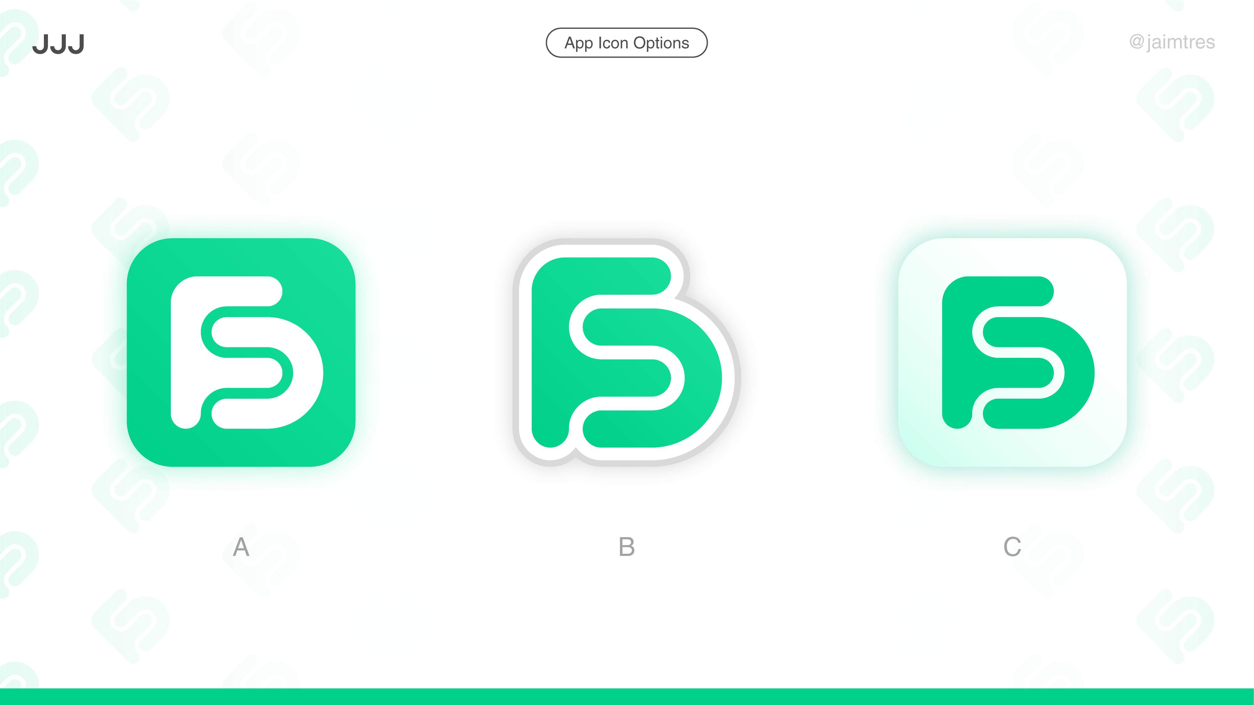
It’s a well thought out logo but I think it lacks character. Using two letters to generate a unique shape through interlocking is ok, but I feel the result here looks a bit amorphous and indistict.
It’s easier to search and remember (the hyphen isn’t obvious), its one word, it is already presented like that in several contexts (social media handles, github repos, …).
You search it on twitter and many people already call it that
It has even been considered to the point that the fdroid.org domain redirects to the official site.
It’s really not a rename of the whole project, just a tweak that i think will be better for the above reasons. Current users will probably not notice, as a lot of them already call it that.
I really don’t see a point in which F-Droid is better.
I get that you wanna keep everything just as it is, but I think it makes perfect sense.
I didn’t change any letter of the name, just removed a hyphen that already joined “F” with “Droid”, so I don’t think your point makes much sense, or it is an exaggeration.
I get why that domain was picked, my point is that the name tweak makes sense and is not a crazy thing to propose. And having that domain already makes the transition easier.
I think this is quite subjective and at least I could imagine people that never heard about F-Droid before struggling to pronounce it without the hyphen.