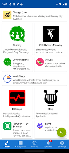
I am a relatively new user and this is not a huge issue, but I actually used the app for quite a while before noticing that the search feature was the green floating action button at the bottom right. I guess I expected (1) the search feature would be accessible from every view (e.g. always in the bottom bar) seeing as it is the most important feature for new users, or (2) the search button would be a consistent color with the main theme color of the app (i.e. blue). The light green kinda looks like some of the third party content. Also my hand covers it when I’m navigating on a moto g play.
Other than that I’ve had no issues so far. Thank you for maintaining a great app.
