Looks great! I have tested the page on my phone and noticed 3 little issues (device: OnePlus 3T)
I am able to scroll the website horizontally to reveal a grey border. When scrolling the screenshots horizontally, this interferes with each other. This is not possible on the “old” website.
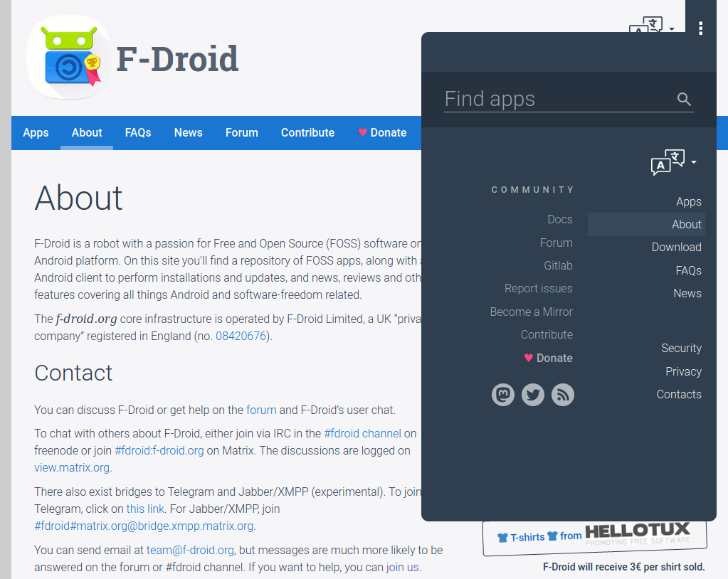
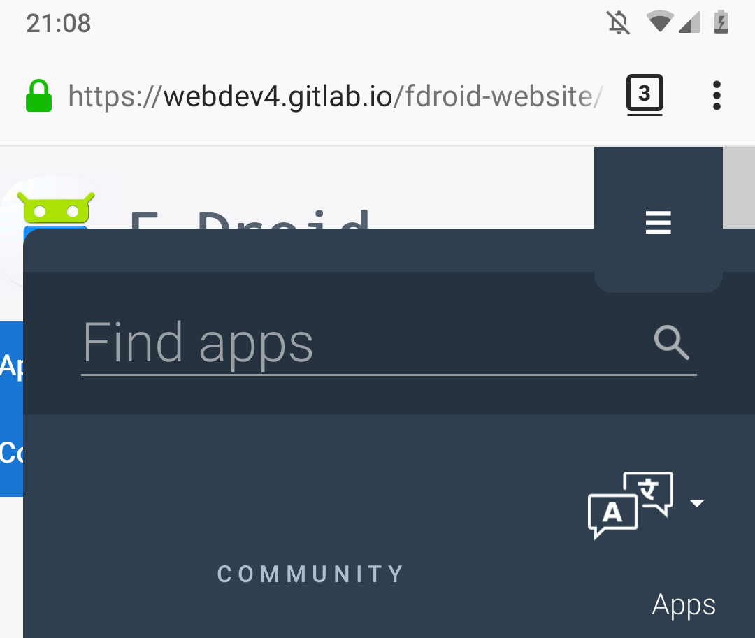
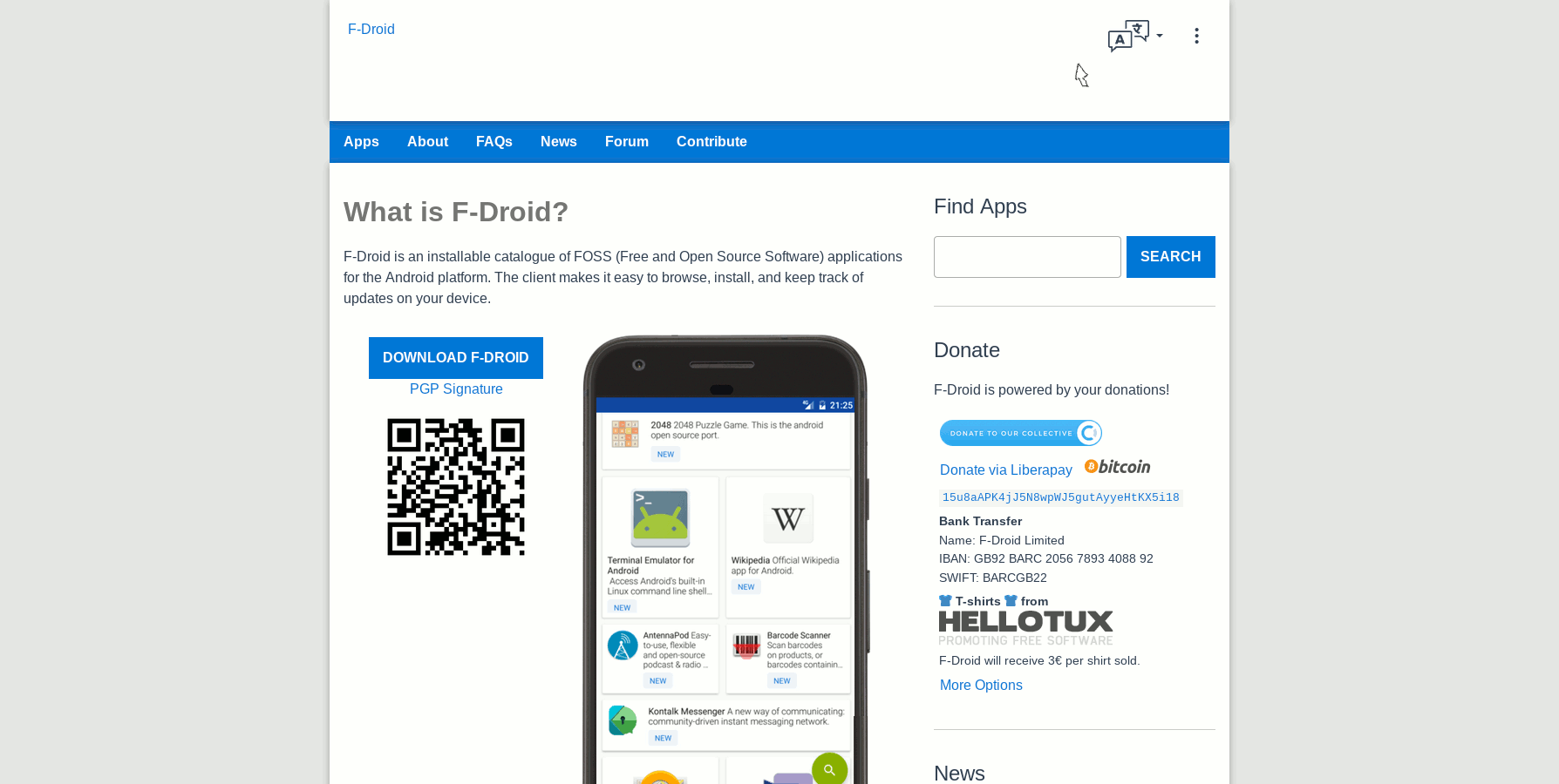
The menu button overlaps the search bar. Additionally, the menu is located a bit too far to the right. When viewing the website horizontally centered, the text of the second menu column is cut off. Might be related to 1.
The contrast between the “squircle” icon on top and the page background is quite low. In my opinion, this looks a bit strange. Maybe you could remove the gradient from the icon (to make it more light) or make it darker.
Edit: I noticed another thing. The language selector icon states (white/dark) have a different resolution. The white version looks a bit blurry when compared to the dark version.
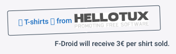
I am wondering how many users of the website have installed a font that does not support all emoji. On my PC, the T-Shirt section looks like the screenshot below. This is not a new problem, though. Some nitpicking: Now that the page background is darker, the hellotux logo has a white background.
To be honest, I do not like the red on blue donation icon. Red on blue always looks a bit strange, I think. I suggest using white instead.
Np. Thank you!
4. Well spotted, and now fixed. Thanks.
5. Good Q! Windows might fail to do emojis on occasion. Even in Tor on other OSes the emojis show. I fixed the white Hellotux logo so it’s transparent, yes thanks. I’ll leave the emojis in place for now but the landing page design that I’m doing will involve removing them yes (see below, ignoring the Paypal, Flattr buttons and the missing ‘s’ at the end of “T-shirt”).
Agree, that’s why I chose a pink variant rather than pure red. I think it draws just the right amount of attention. Not too much or too little. A white heart has no impact. I experimented with a green heart to match F-Droid but it was odd. (new commit)
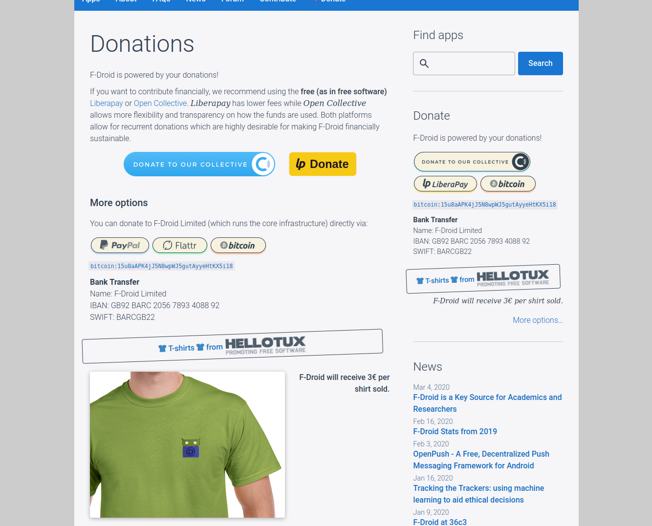
I’ve had a chance to rebase the previous work I done and do the Donate sidebar for Open Collective, the Donate page (some improved code reuse, language reuse, semantic HTML improvments, added an image of the green Tee from Hellotux, alt text, etc).
@webDev By doing “Donate” in a tab of its own, it causes issues sooner for horizontal screen estate, considering also that some translations are longer than English.
The “Donate” is on every page anyhow(?).
I would add it to “contribute”, make that label green, and add the heart there.
I’ve actually done a few things to compensate for this:
-- <text-transform: capitalize;> (no more uppercase)
-- BROWSE
+ Apps
-- ISSUES (this tab has been moved to the dropdown menu)
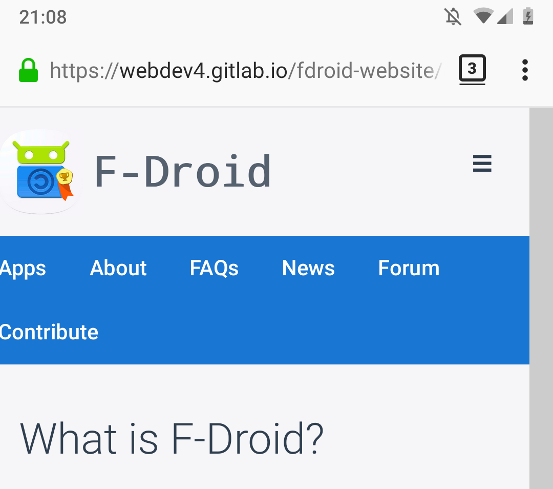
In terms of horizontal real-estate, the menu items wrap to a new line on smaller displays. Its good behaviour for internal pages (the landing page will be different as approved by Contributors in the Communication Strategy).
I did experiment with colours but I found them to be too much. A little pinky-red heart was enough for me.
BTW good news, a re-based version of the Merge Request, without other dependency issues (@uniqx) is built and is able to be tested here. It’s missing the removal of uppercase, that will come later (I’ll bring it forward if people want.)
I have no problem with dark themes, but on the dark menu, I’m with @bubu. That menu looks like it comes from a different site. I think the menus need to use the existing color schemes. It has been the color scheme for 10 years, so changing it will make users think its not the same site: F-Droid · Android FOSS News, Reviews and More
I’m open to updating the color scheme, that needs to happen as its own effort and all at once like including the client. But just tacking on UI elements with a different color scheme looks piecemeal.
Bubu was taking about the light-grey background. The menu I agree didn’t look right when it was charcoal so I made it dark-blue to compliment the F-Droid look-and-feel.
I like to think of the light-grey background as a sign of maturity, a sign that people might want to spend more time browsing the site and a slightly lower contrast and intensity of white is a sensible step forward in accomodating that. Also there are many app icons and screenshots with white so, we are making those apps pop from the background.
Even Stack Overflow have produced a low contrast dark theme.
If we make a change that improves usability and respects the existing look-and-feel, I think that’s the way forward and a good thing.
Thirdly the FDroid apps light theme does use a light grey background, I see it behind the panes. That’s actually a look that I’m using on the Landing page update.
It adds functionality for all users but is especially useful for small device users. They’ll get faster access to a bunch of pages and search functionality. The design was accepted by the community during the design stage (above), but happy to take further suggestions and improvements as always.
EDIT: There’s more Merge Requests and sites being staged but the above are two of the larger changes, for now. I’m trying to split up my previous efforts into smaller bite size portions that are more digestable.
EDIT: To see the font and typography changes (in addition to the margins and positioning changes) they can be tested here.
I have basically set a deadline of the end of COVID lockdown to get the website landing page done.
I thought that 20 days should be sufficient but based on the slow rate merge request adoption I’m eight days in and cannot seem to get anywhere. If I can’t do this by the end of lockdown it’ll probably not get done. As I’ll be forced back into the gulag.
@webDev you’ve done a lot of nice design work, we just need you to submit it as each chunk is finalized. If you want to do it as a single piece, then you have to be willing to remove things that we don’t want to accept. In any case, let’s work through this one merge request at a time.