Fofox:

Maybe replace the Earth by the sun ![]()
I think if Mozilla had a problem with the use of the animal they’d have voiced their disapproval with the use of the name a long time ago.
Any news, when the new icon will be chosen?
That looks a lot like the gitlab icon ![]() .
.
Anyway, someone needs to step up and facilitate the voting here. I don’t have time to do it. After that we still need to integrate it into the fennec build, but we can worry about this later.
Some feedback on the pale “fennec sleeping around earth” icon (last one above), in relation to its use as a launcher icon.
In terms of a material design necessitating a redesign of everything else in Firefox, I’d disagree.
Consider the home screen an “application” that benefits from design coherence (since it’s all shown at the same time).
Once the application is launched, the screen is taken over by the application, and so it now “owns” the design language. So actually having a material design launcher icon, then a (somewhat) different application design language isn’t a conflict.
I actually think the first-draft flattened icon is a very good start - it’s a good colour pairing, it works at a small scale, and it’s distinctive. The only thing I’d say is the same re. the egg shape - it would benefit from a tweak to get rid of the apparent egg shape oddness.
A quick proposal (based on the existing Fennec icon; Earth background adapted from Sam Hewitt’s “Paper Icons” Firefox icon):
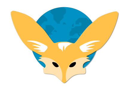
SVG: -svgshare.com
Licence: CC BY-SA 4.0
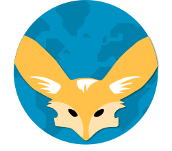
Please make it round (or square)…the (whole) shape (too long on one side) is the problem (in my view) not the colours.
I would love the icon to be adaptive, now that more and more people will be on Oreo.
Some info: Adaptive icons | Android Developers
Maybe we could have the Fennec itself in the foreground, and then as a background the blue bit with the continents’ shape on it? Then the launcher can mask in whatever way users choose.
So user can have a squircle earth, if the wish to ![]()
Same proportions without circle crop:
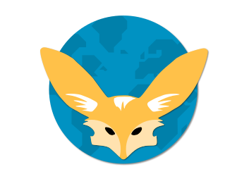
Yeah, the first one’s awesome. ![]()
I guess some won’t like the ears being cut off, but I’d argue it’s better this way since otherwise the head would become too small.
The second one wouldn’t work if we want it to be adaptive, though
Honestly I think ramming everything into an identical shape is a load of crap. It eliminates, or at least diminishes, one of the most useful features for distinguishing between items - shape, all in the pursuit of copying Apple. Meh.
It also does FA for visual cohesion that isn’t already achievable by e.g. icons following material design.
I think the second one might be possible actually, if the icon is entirely in the background layer, so Android just crops the whole thing down.
Just as long as I don’t end up with a forced-circle Fennec icon on a home launcher that isn’t forcing “adaptiveness” :J
Squircle mockup:

SVG following Android adaptive guidelines (made in Inkscape, foreground, background and masks are layers):
PNG using “unadapted” mask (i.e. for Android versions using a plain icon):