I would like to discuss/question some of the decisions of the new design, specifically the main view of the “recent” apps that users are presented with when they start F-Droid. For the record, I am a normal F-Droid user who didn’t even know about the redesign before the app updated; while I’m aware that a lot of work went into the new design, I was not able to find the reasoning behind the new UI there. Issue 866 does describe that the developers thought of doing A-B tests to ensure that the new design is better for most users, but I couldn’t find any public documentation of such tests so there’s no way for me to verify that claim.
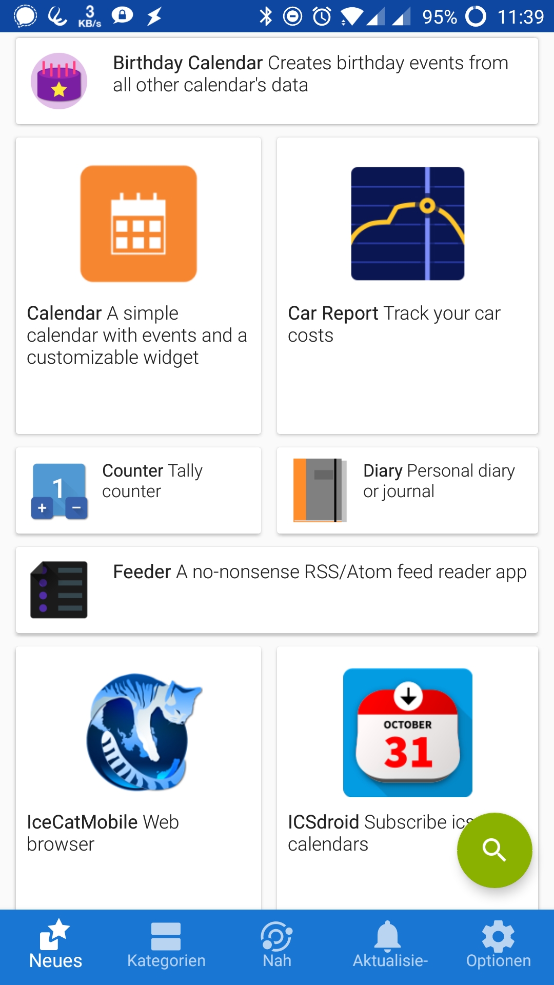
The “newest” app lists the apps in not one, not two, but three different styles, which makes it seem like the UI designer couldn’t decide which of these to go with. The design switches every one or two apps, in the pattern:
loooooong
big - big
small - small
Then this pattern just repeats. I have multiple issues with this:
There is no vertical or horizontal alignment of all shown app icons, app names and descriptions. This makes it very hard for the brain to skim through the list, which was very simple in the old design. Now the eyes have to jump around the screen a lot in an irregular pattern to even read all app names, instead of being able to focus on one or two vertical columns. This gets considerably worse on higher DPI settings, where app descriptions often get cut off. So it’s also an accessibility problem.
The size of the apps makes it seem like the apps shown in big are more important to the user, e.g. because more users downloaded them. This could be a good idea to highlight the most downloaded apps (does F-Droid even have/distribute that information?), but like this it just means 2/5th of the apps are randomly highlighted over the 3/5ths of the others apps. It’s design 101 that you only accentuate information that is actually more relevant to the user.
The app icons in the “big” view are huuuuge. A single app in “big” design takes up like a sixth of the screen, which is clearly waaaay too much. Compare this to Google Play with 9 apps fully shown in way less space, which even additionally displays the user’s app ratings in 1-5 stars (which don’t exist in F-Droid) that allows users to distinguish which apps might be interesting to them.
The user usually sees just one of these patterns fully. That makes it seem chaotic, it took me a while to figure out why some apps are shown differently than others and that it was just a regular pattern. Therefore the design isn’t intuitive to the user.
There is a lot of wasted free space in the “big” view below the description text. For the “Car Report” app in my example screenshot, it’s almost a third of the whole height of the app badge!
Additionally, I find it questionable that the horizontal alignment of the text with the app icon is on top instead of in the center. I can understand this for the “big” view, in the “long” and “small” views it means there is slightly more white space on the bottom than on the top of the app badge, which just feels like the wrong kind of weighting. (This issue exists in the “search” view as well, where for some reason the “download” icon on the right is center-aligned but the app icon on the left is “top”-aligned).
Do you also see these problems that I see, or is it fine in your opinion? I’d really like to get some perspective on this, perhaps I’m the only one who has these issues…
Thank you for this comment, I agree (created an account here just so I could add this). The previous list was quick and easy to review, this tile model is not (Windows…?). Reverted to previous app version immediately.
I generally like the new UI. I think the tile view could be useful . . . if it meant something. Unfortunately it means nothing. Some apps are big and some are small. This seems to mean nothing.
Any changes in size of the apps in a list like this must mean something. If it doesn’t, it only serves to confuse the users.
IMHO, FDroid developers had already find the good UI with f-droid app v.0.102.3.
I don’t understand the utility of the last changes: less information on the screen, space waysted, different size of icons…
I keep the 0.102.3 version for the moment, even if the updating process is not at the top. At least, I understand the UI.
I really, really dislike the new UI. IMO, it follows a general UI design trend of ‘flashiness’ over function.
That tile view is like a jumbled mess for my brain and it’s extremely hard to look through the app list.
For the category view, when I look at categories, I’m interested in one category at a time. Wasting 4/5 of the screen space by showing them all at once makes no sense to me.
IMO, in actual functionality and usability, the old UI is 10x better than the new one.
Yep, also a new signup to comment on this. The update is pretty well unusable for me. Previously I was presented with a nice simple list of apps, now I seem to be presented with a random four or so, it is a very odd interface. A way to select the old interface in settings would be much appreciated.
I have tried to downgrade but this fails if done from within fdroid. Can anyone assist with a method on that?
Someone else who hates it. Changes like this really REALLY shouldn’t happen without being flagged up to the user beforehand. And to make things worse, the newest version broke the repository handling. Guess it’s back to the old-school way of downloading apks manually.
I feel badly to say this, but I keep running back to 0.102.2 - the old UI - with great relief that it still works. While the new UI’s aesthetic is fresh and contemporary from a distance, it is also less functional, awkward and confusing. Form for form’s sake, with seemingly little regard for functionality. The F-22 Raptor’s beautiful appearance is the manifestation of a clearly defined objective and sound engineering. This project has lost sight of the former… IMHO.
Well, it just goes to show that the fact that there was going to be an UI update apparently wasn’t very well known to regular users of the app. I’d have beta-tested and given feedback if anyone had told me before, for instance by adding a small banner at the top of the old app.
I also believe most of the UI update is fine and working. I’m pointing out something very specific. Also, nobody replied so far on these A-B-tests that were supposedly done to decide for the new UI, why don’t you post the results of that tests with concrete numbers? To me it seems at this point that the developers didn’t think this through, made a mistake, and it surely is okay to voice our concerns about this?
I did not enable that option because the software that I install via F-Droid is important for me to have in a stable fashion. Perhaps if it was named “participate in app beta tests”, I would have activated the option. In Google Play I can decide for every app if I want to beta test it, seems like this isn’t a feature of F-Droid?
I disagree with your notion that there is a specific kind of user who beta-tests apps, I do this for some apps but not all. In any case, adding a banner first to the “unstable” version and then a week later pushing this to the “stable” would have been well possible.
Nothing of what you say here changes the fact that out of all users who commented here so far, every single one has agreed that there is a problem. It’s senseless to dwell in the past and tell people what they should have done. I’m a normal user of this app, and I’m participating in the app development by voicing my concerns as soon as I was made aware of this change. The question is how to deal with this situation now.
It’s also not like anyone is asking for a full rollback of the changes. People have suggestions on how to iterate from the current design to one that is a bit better. Nobody is suggesting throwing away months of work. Changing the design to a straight list of type “loooong” would probably be less than 100 lines of code changed. Everyone here is for that change.
I’m willing to discuss if the new design has other upsides, but it really frustrates me that so far, there has been zero concrete explanation why the suggestion itself is bad. You don’t even talk about the issue, you rather have a meta-discussion about “could’ve, should’ve” which wastes everybody’s time.
The new GUI is ridiculous. It could be right from Facebook. That “trendy trending” design is exactly the one that repuls professional users but attracts kids who do not know what to do all day long.
As many stated before the new GUI wastes plenty of precious space for less information, is unclear, confusing, distracting and therefore quite useless. I really really hate it!
How do you get a list of installed apps from fdroid in the new gui?
Is there a way to toggle new apps/recently updated?
I like the new UI in general, but I don’t get the point of having some apps very big and others tiny…
Would be a feature to have if apps with big download numbers get bigger so you can tell which apps are used by a lot of people.